


Converting a Tableau dashboard into a Power BI report sounds straightforward at first—but once you get into it, you quickly realize some parts are simple, while others are much more complex.
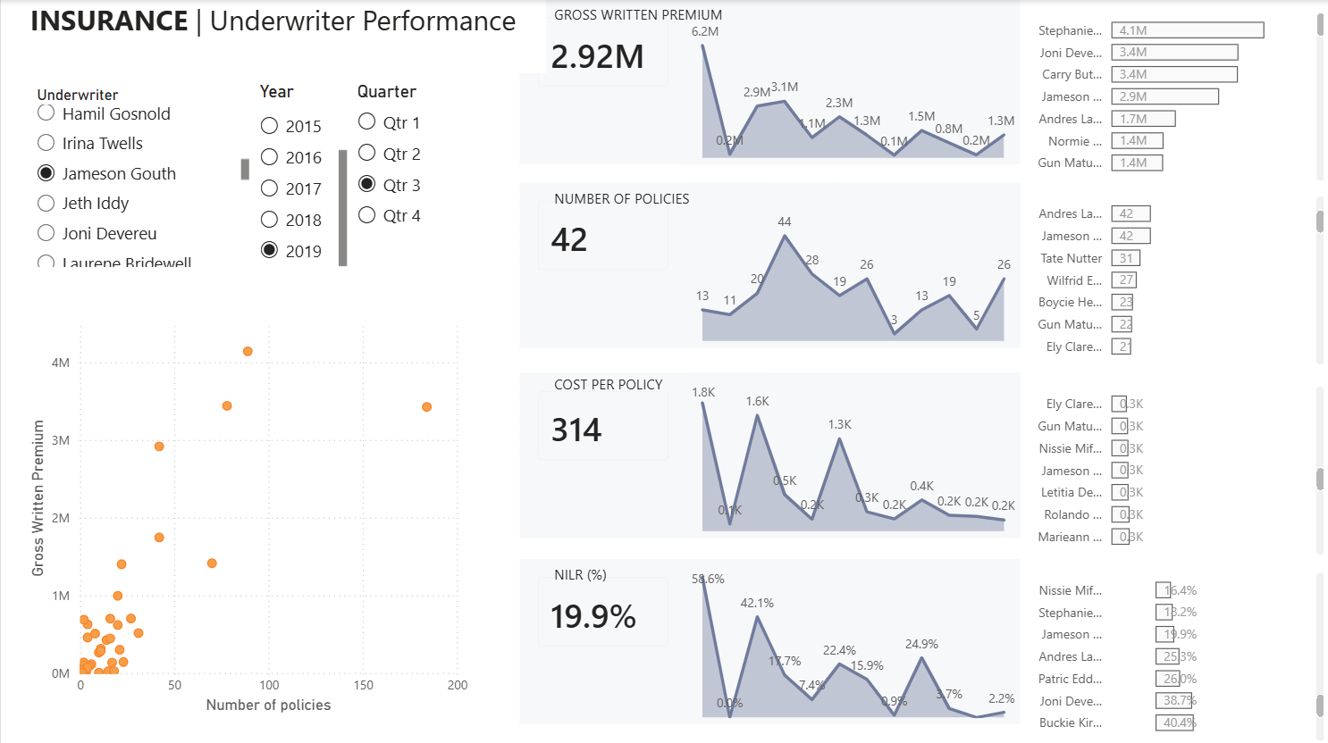
Today, my goal was to recreate this Tableau dashboard by Ellen Blackburn using Power BI.

After about three hours, I had a working Power BI report that effectively recreated parts of the original dashboard—this time using slicers instead of parameters.
Along the way, I picked up a few key lessons that are worth sharing.
1. Chase the Charts, Not the Formats
Rebuilding the charts themselves—whether it's a KPI, bar chart, or scatter plot—is relatively intuitive in Power BI. The platform offers a wide variety of visuals, and creating them is generally straightforward.
What’s not straightforward is replicating the exact formatting and interactivity from Tableau. That’s where most of the effort goes. Instead of obsessing over design and exact interactivity early on, focus on getting the core charts working first.
2. Dashboard Filter Interactivity Is (Mostly) Simple
Power BI’s slicers act as filters and are easy to implement. If your Tableau dashboard relies on global filters or basic cross-chart interactions, you’ll find that these translate fairly smoothly. This is different if your filters are running off of parameters.
3. Parameter Logic Doesn’t Translate Directly
This is where things get tricky.
In Tableau, parameters combined with calculated fields are often used to control logic at the sheet level. Power BI doesn’t work exactly the same. While it does offer parameters, they function differently and don’t map one-to-one.
If your Tableau dashboard is parameter-heavy (like today's), you’ll need to rethink your approach rather than trying to replicate it exactly. Zainul Abedin Natha has a blog called "Why Tableau Parameters Don’t Translate Directly to Power BI", I highly recommend checking it out before tackling migrations about parameters.
A great line from the blog is:
Don’t try to Replace Tableau parameters with field parameters everywhere.
Instead, it’s often better to create a separate table in Power BI to handle that logic. This approach gives you more flexibility and better control over behavior.
4. Formatting Differences Can Be Challenging
Matching Tableau’s formatting in Power BI can be surprisingly difficult.
In Tableau terms, Power BI uses a “floating” layout system, which can make precise positioning and responsiveness harder to control. Features like dynamic zone visibility don’t translate directly either, but you can recreate similar behavior using bookmarks - which you can learn on Vivien Lee's blog here.
Another example is highlighting. In Tableau, you might use parameters to highlight specific bars or elements. In Power BI, achieving the same effect often requires a different approach—again, typically involving additional tables or alternative logic structures rather than direct parameter replacements. One cool thing in Power BI is that you can return a color (hex code) within a calculation to be used directly for color coding.
Power BI also doesn't have a pick screen color option when selecting colors, so its good to be aware of windows shortcuts like Windows + Shift + S, and using the color picker to grab a color on the screen.

Conclusion
The biggest lesson from today: don’t try to force a one-to-one translation from Tableau to Power BI.
Instead, focus on understanding what the dashboard is trying to achieve, and then use Power BI’s strengths to rebuild that experience. Some things will be easier, some harder—but approaching it with flexibility will save you a lot of frustration.