This blog is based on Andrew Ball's blog about Moving table headers to the bottom (Making a table look like a chart), adjusted for heatmaps. You can check out the original blog here.
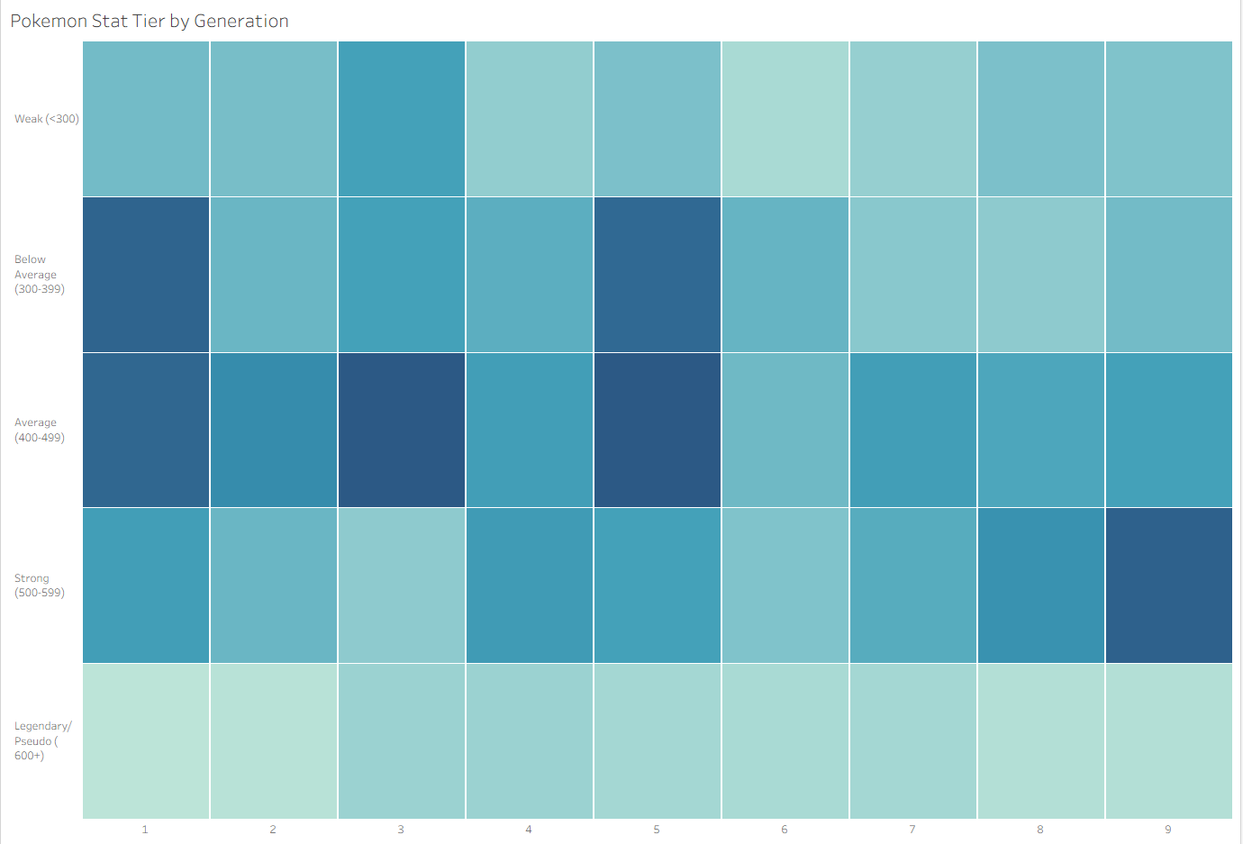
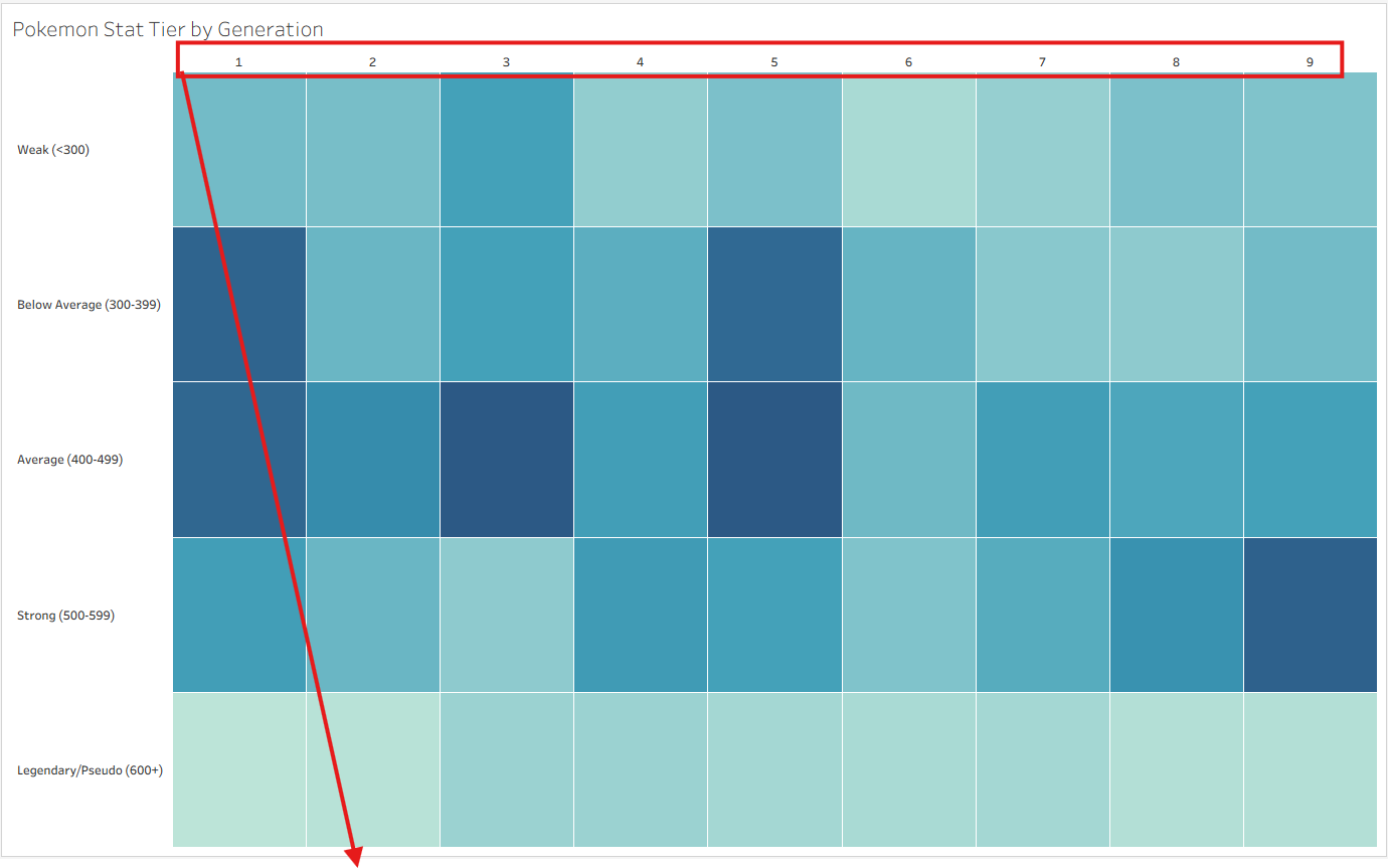
This is a trick to move the field labels on rows to the bottom of the chart. The objective is shown in the screenshot below.
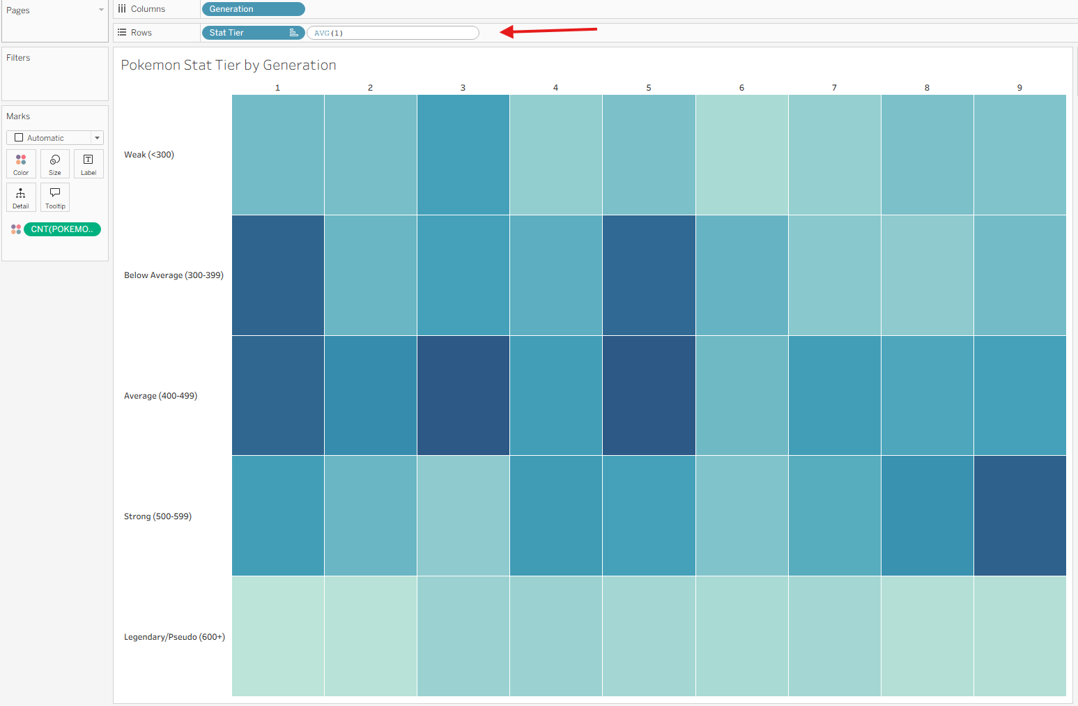
Step 1: Add AVG(1) calculation to Rows
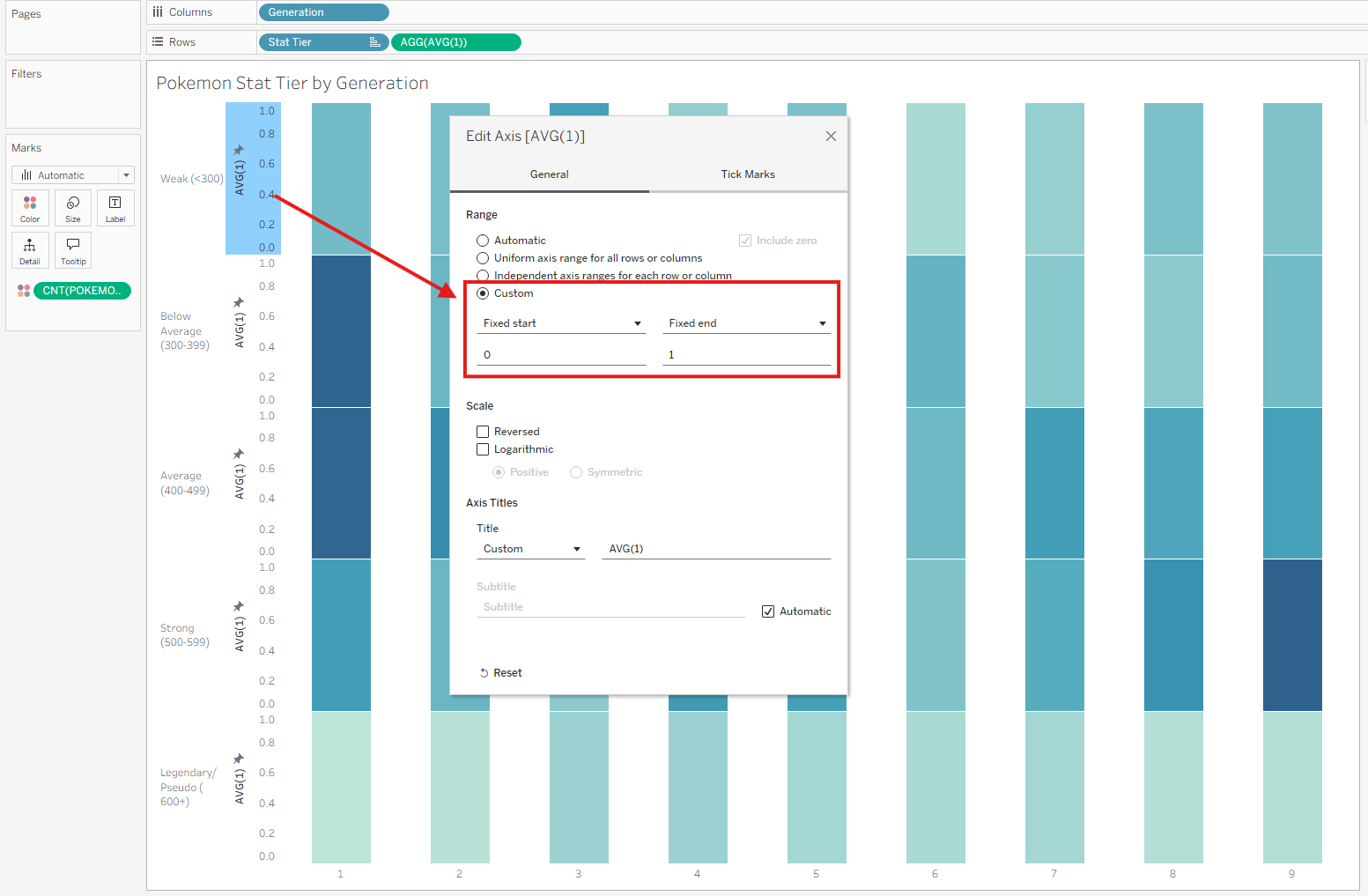
Step 2: Edit AVG(1) Axis, Set Range to 0 and 1
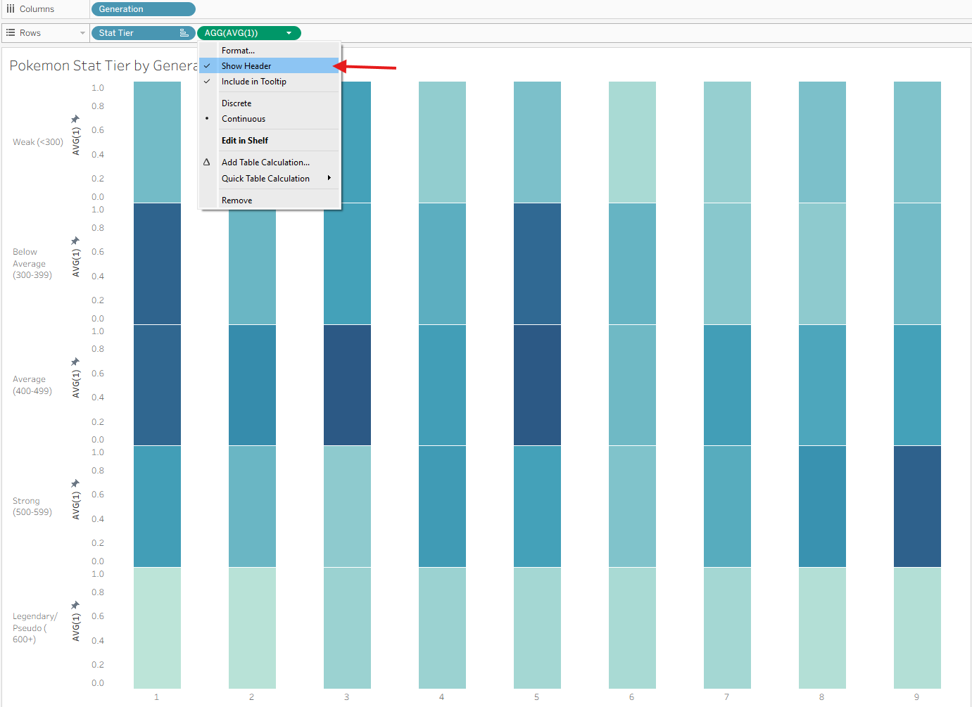
Step 2: Hide headers of AVG(1)
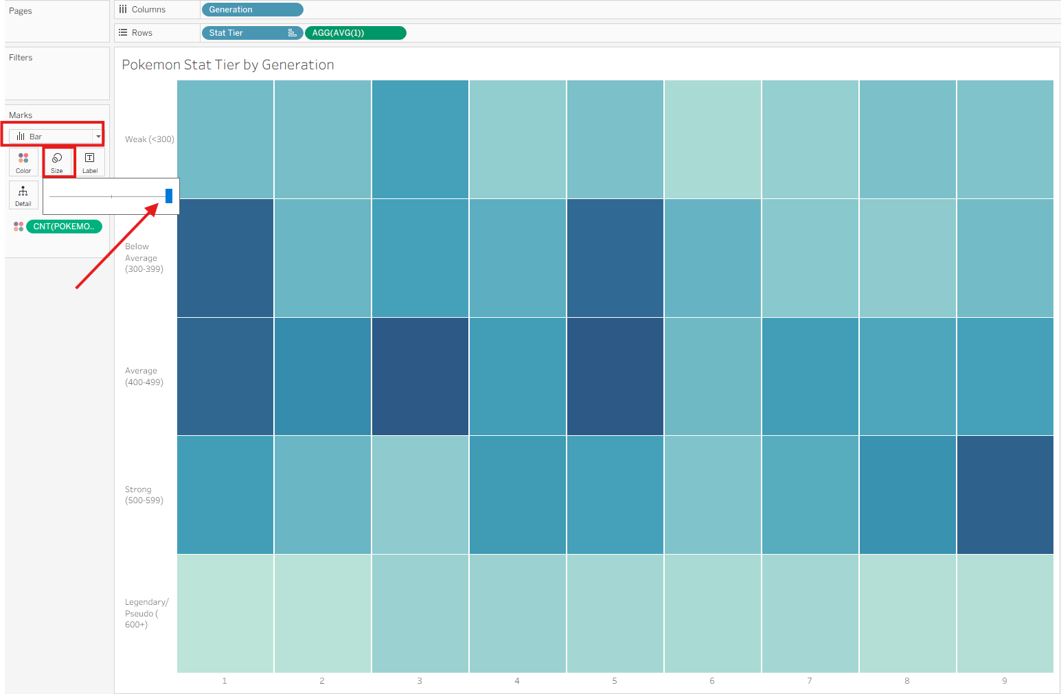
Step 3: Max out the size of the bars
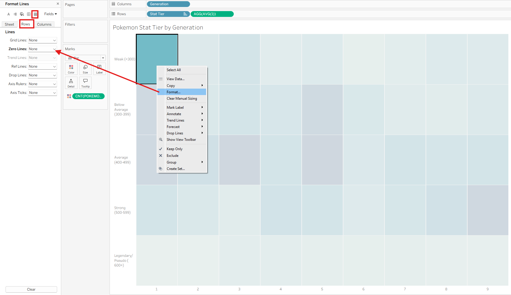
Step 4: Remove Zero Lines on Rows
The final output should look like this, with borders on the bars to make each tile distinguishable.