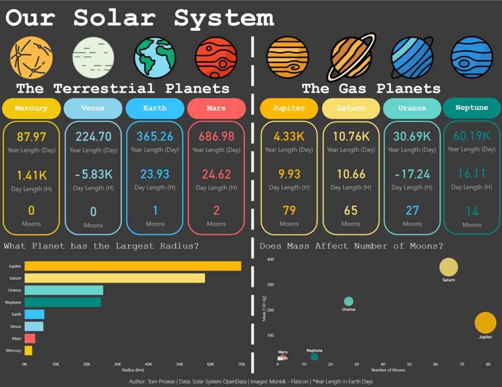
Day 3 of dashboard week was up today, and I was hoping for better improvements compared to yesterday! Andy released the brief to us this morning, it involved using an API from Solar System OpenData, and then creating a visualisation in Power BI!
Alteryx – Connecting to the API
This was a fairly simple exercise as the date was structured in a way which meant we could access all of it from one API call. There was then a little bit of clean up involved, including determining how many moons each planet had, and what their names were. After a quick transpose and some filters, I was able to get a row for each of the planets, whether they had moons or not, and also the names of the moons.
So great… now time to try and understand PowerBI!
Power BI – Visualising the Data
In the past I have worked with a lot of Microsoft software, including other products within their Dynamics Stack, therefore the layouts and menus weren’t completely alien to me. However, trying to navigate some of the menus when creating different chart types was a struggle, with a lot of trial and error going into working out what I could and couldn’t do.
As a result of me having limited functional knowledge, I decided to keep the design nice and simple, by creating an infographic. Initially, I sketched some ideas out on paper, deciding on the types of aspects i’d like to recreate in PowerBI (without knowing if this was possible or not!). I found that moving the elements around the page was nice, and very similar to when creating a PowerPoint, so I was quickly able to get the structure of my design.
I can understand why PowerBI is popular with many people, due to its Microsoft feel and easy ability to create similar but nicer looking Excel workbooks. However, the tool seems very ‘clunky’ compared to Tableau, with some steps seeming to take multiple clicks and not being as intuitive.
After my first day of using PowerBI, I was pretty happy with the overall result, as I think it turned out not so bad!

Overall I enjoyed today and liked getting stuck into a new visualisation tool, but I’m excited to return to Tableau again tomorrow!
