Pass maps are an informative and engaging way to visualise the performance of football players when it comes to passing the ball, and Tableau is a great tool for creating them. This blog will explain the process from preparing the data to final formatting ideas for finishing touches.
Data Prep
For this example we will be using free data from Statsbomb (link). The selected dataset consists of pass data in La Liga from the 2004/05 season to 2020/21, where each row represents a pass and the fields contain variables such as pass type, player name, recipient name and pass length. Most importantly however, we have for each pass its (X,Y) coordinates of where the pass began and the (X,Y) coordinates of where it ended. These coordinates are in yards and values range from 0-120 (for X) and 0-80 (for Y), these correlate with dimensions of a football pitch.
There is a small amount of prep we need to do to our data before we are ready to use it in Tableau. I am using Alteryx for this, but any data prep software and also Excel/Google sheets will work for this!
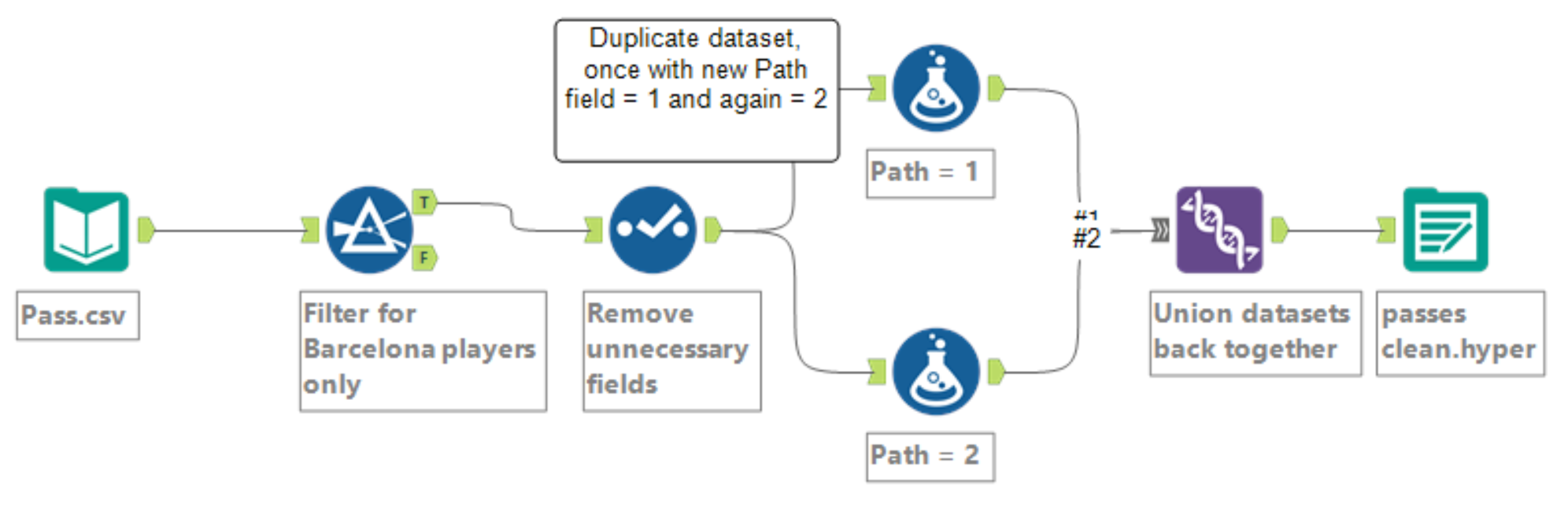
Above is a screenshot of my Alteryx workflow. I started by filtering out passes that weren't made by Barcelona players and removing unnecessary fields. Then, I created a new column called "Path" which I first set equal to 1 for every row. Next, I have to duplicate this dataset and then set Path equal to 2. In Alteryx I can just use a second formula tool, In Excel/Sheets just duplicate the sheet and use find and replace to change 1 to 2! Finally I union my almost identical datasets. In Excel/Sheets just copy one data set underneath the other. Our output should have one more field than the input (Path) and twice the number of rows!
Load into Tableau
- Create calculated fields
We have to make the following calculated fields using the Path column we created before.
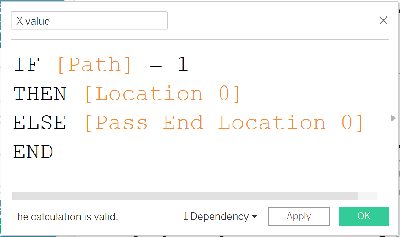
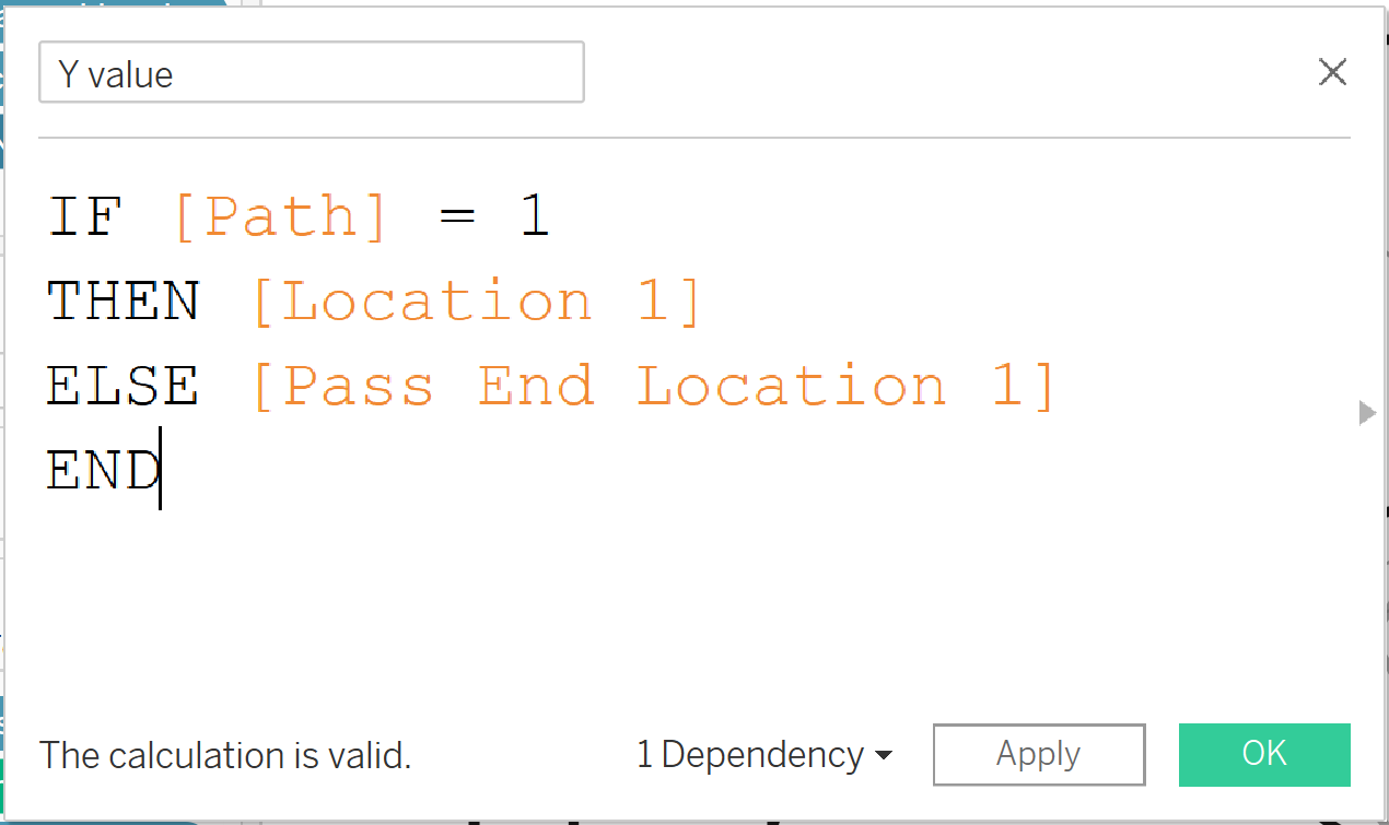
These fields essentially allow Tableau to differentiate between the start and end of each pass so that it can build the map properly later. Be sure to check which fields contain the X coordinates and the Y coordinates if they are not labelled!
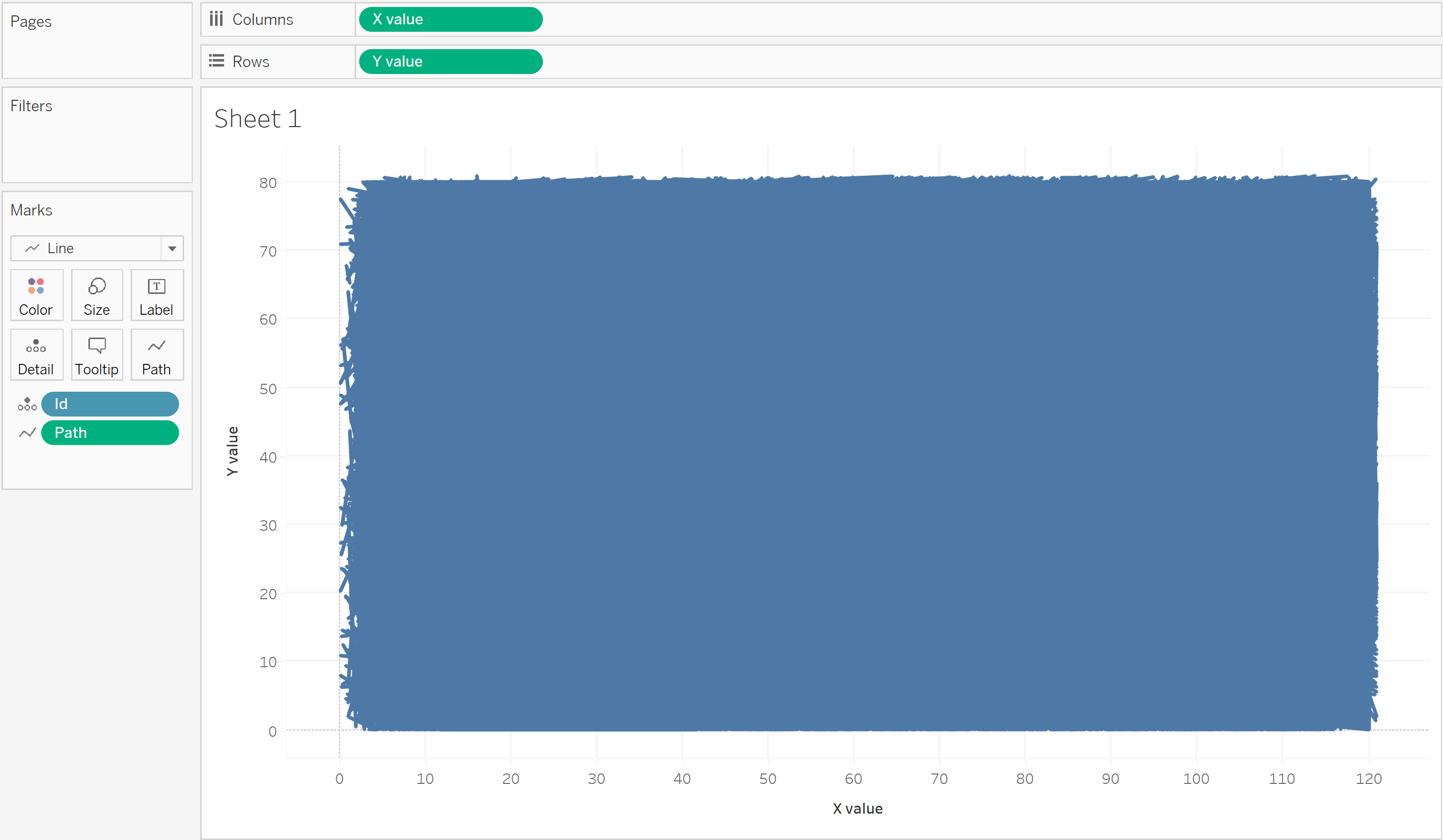
Now drag the new X value field onto columns and the Y value field onto rows, and set both as dimensions by clicking on the caret icon on each pill and selecting "Dimension".
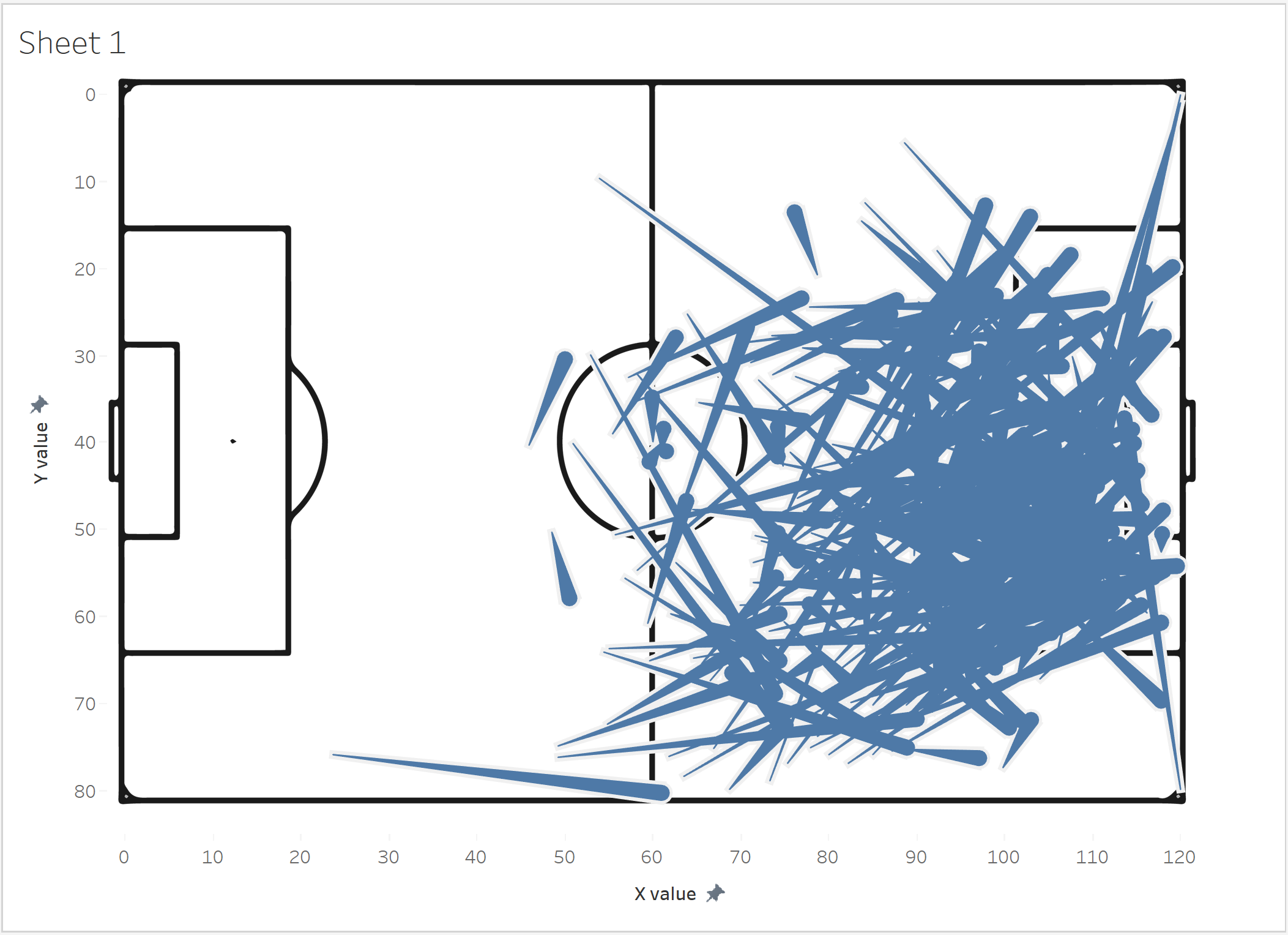
Change the marks type to line and drag the Path field to path, then convert Path to a dimension. Then drag ID onto detail and map is complete. Now, it looks like a block of blue but this is due to the massive number of events in the dataset. At this point I like to clean it up by adding some filters for season, player name and recipient name which will reduce the number of marks on the page dramatically.
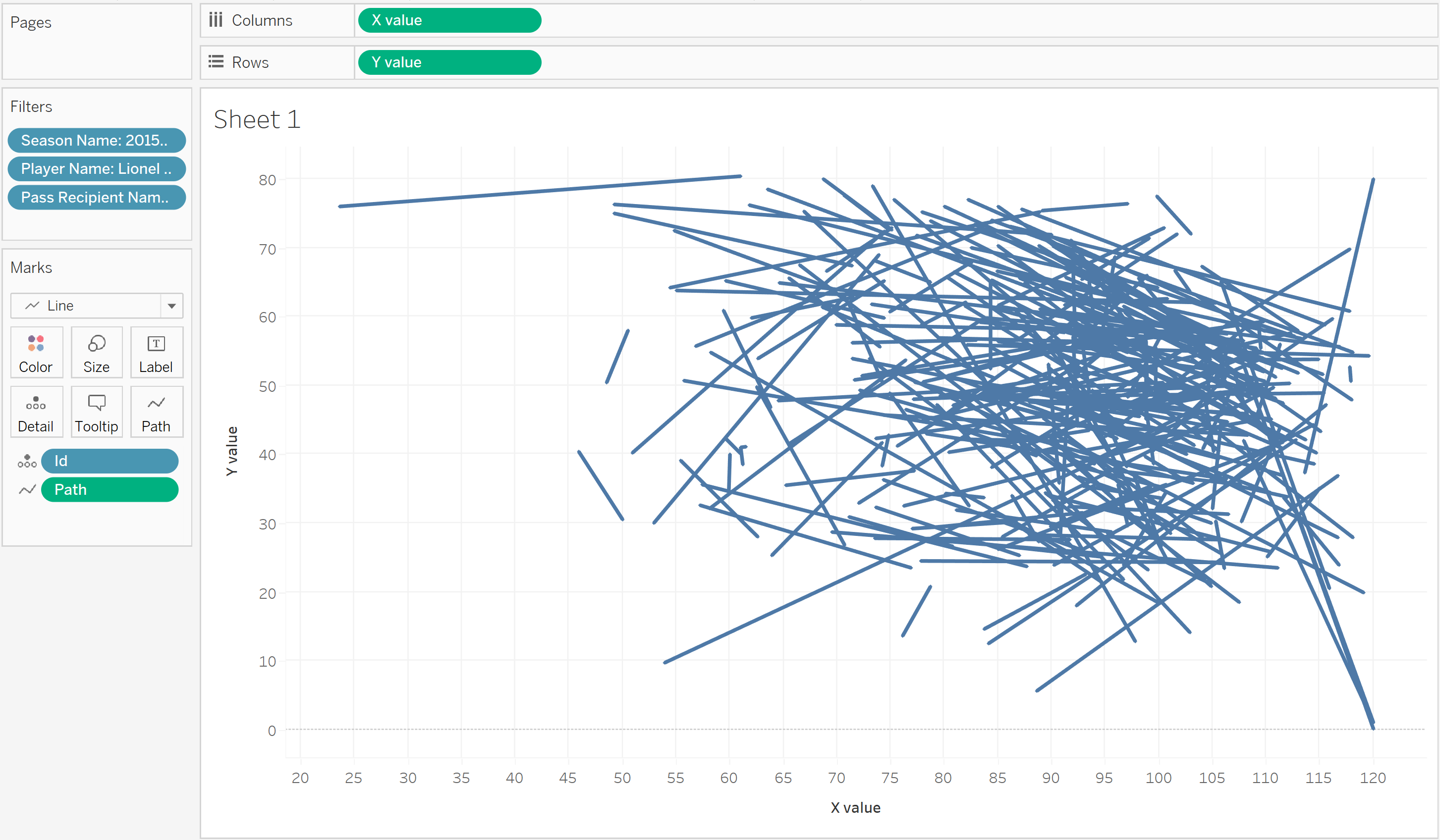
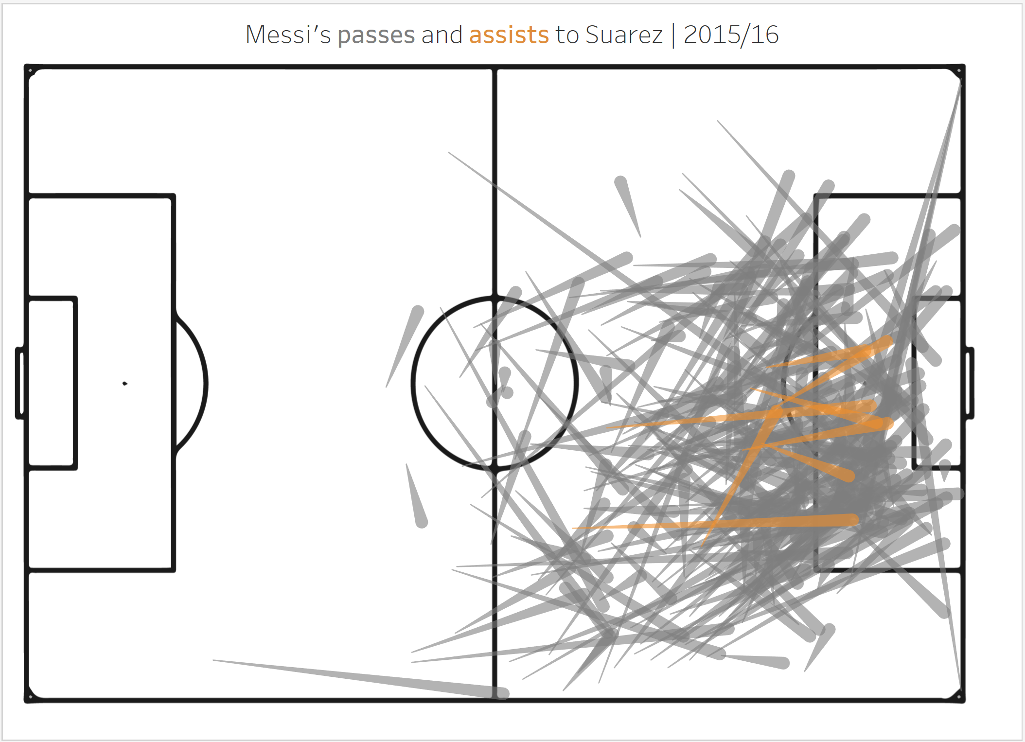
Our pass map is starting to take shape! I have filterd for all of Messi's passes to Suarez in the 2015/16 season.
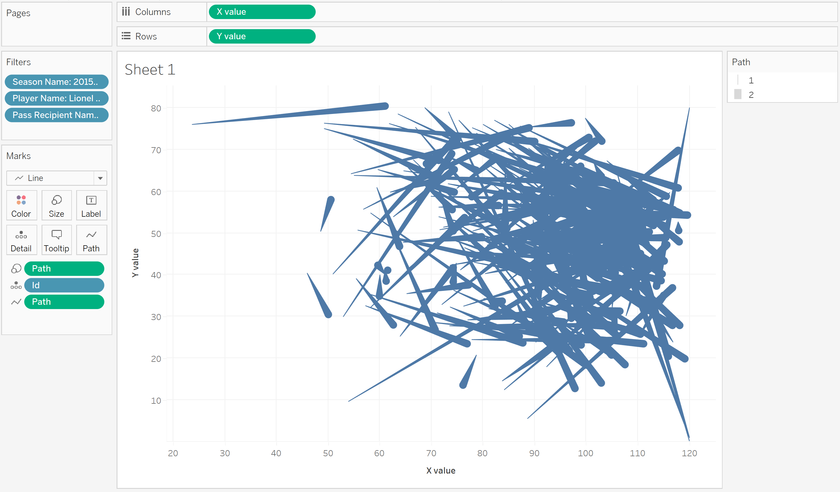
Now drag path to size and convert it to a dimension. Then resize to make 2 noticably bigger than 1. This way the viewer can differentiate between the start and end location of each pass.
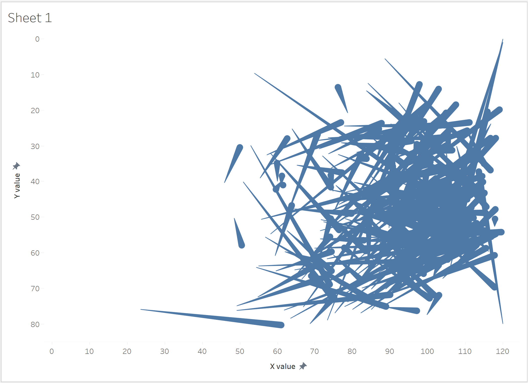
Next, double click on each axis and fix the range of values like so
X value: -2 to 125
Y value: -2 to 85 (also reverse this axis, as Statsbomb reverses its Y axis data)
Then format the worksheet and remove all gridlines, zero lines and axis rulers.
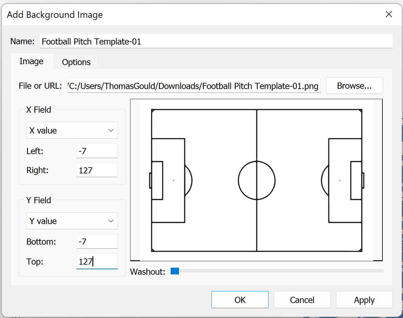
Now we can add a football pitch png as a background layer. I use this one by James Smith. To do this, click "Map" in the tool bar and select the following options:
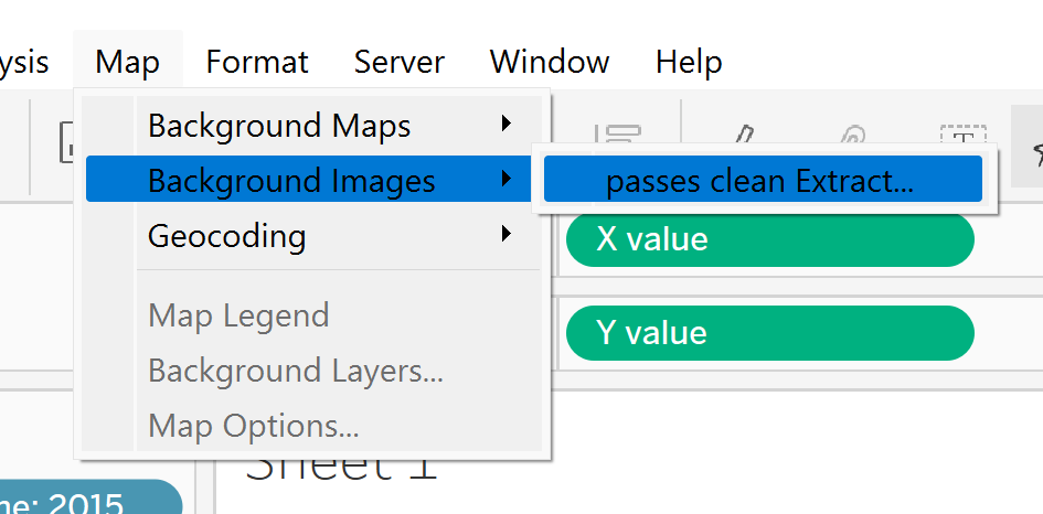
In place of "passes clean Extract" will be the name of the data source you are using.
Select the downloaded png, and adjust the X Field and Y Field sections like so:
Your pass map is complete!
Some formatting tips I like to use include lowering the line opacity so that we can see what going on, and colouring passes by whether or not they led to a goal (drag Pass goal assist onto colour). I like to use a muted colour for non-assists and a bright colour for assists to highlight them!