


The grand final
Our training as part of the Data School concluded today with a morning session where we had to create a visualisation using data from the World Happiness Report!
The data contained various quality of life metrics over time for every country that participated. These included common things like GDP per Capita and life expectancy, as well metrics which asked respondents yes/no questions such as "If you were in trouble, do you have relatives or friends you can count on to help you whenever you need them, or not?".
I wanted to use this data to answer the age-old question "does money buy happiness?" To do this, I wanted to plot GDP against Happiness to find any overall trend so that I could then identify countries that dont fall into the same trend. I then wanted to look at what made these countries different.
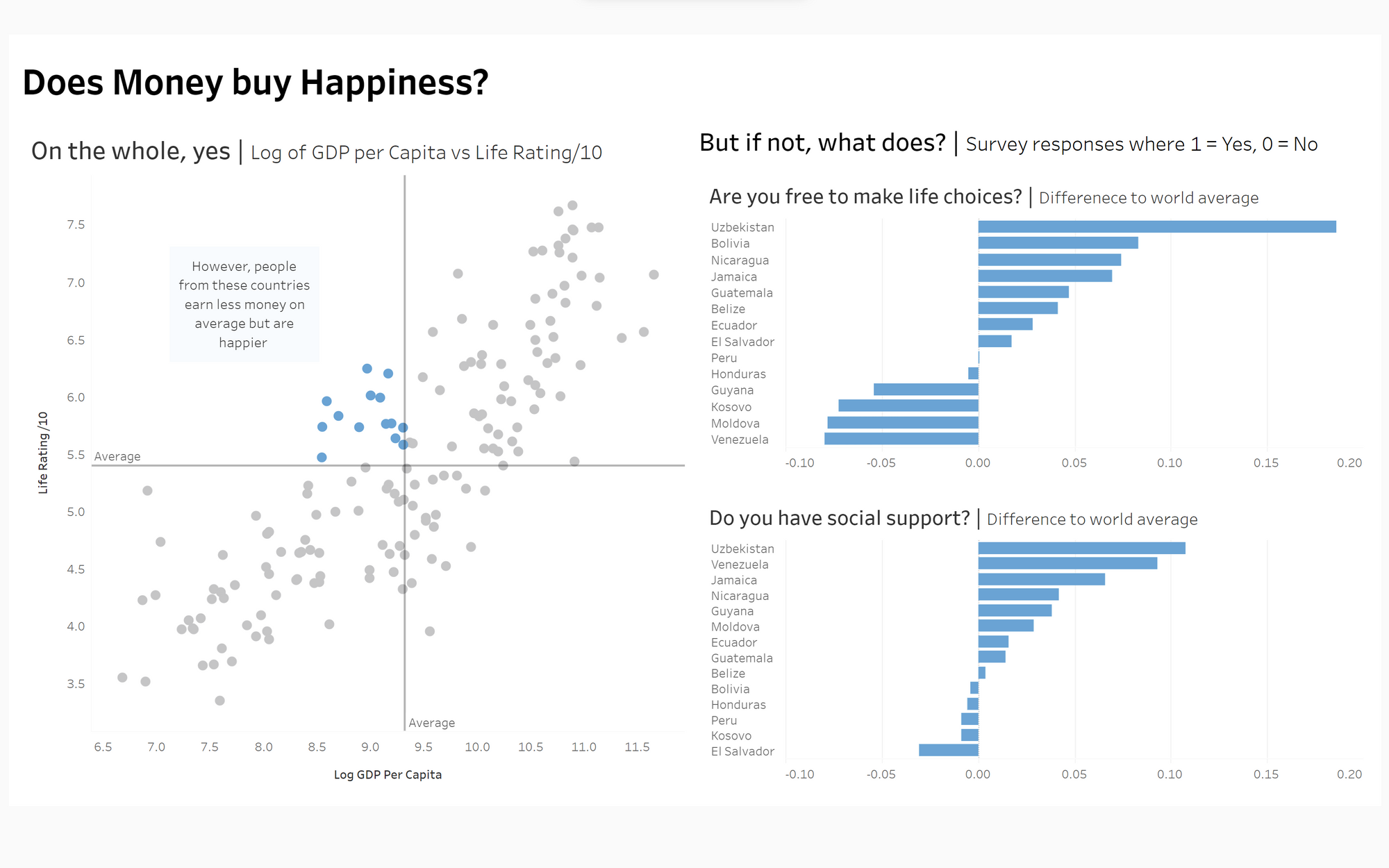
Once I made the scatterplot, I was intrigued by the countries that were less wealthy than average but happier. I decided to look at how these countries differed from the world average when it comes to the other quality of life metrics, I settled on freedom of life choices and social support. What's interesting is that a lot of these poorer but happier countries seem to score quite well on the metrics!