The Data School does not mess around. Just 5 days in we got to do our first project. The task was to enhance the data set we used for our first Tableau Public dashboard (used for the first enrollment step). Enhancing sounds vague, but basically we searched for additional data sources to improve our analysis. So yeah, my dashboard was about cocaine retail prices in Europe in 2019. After a short brainstorm a few ideas quickly came to mind. Would it not be neat to add some years of observation instead of just having one year? Hell yeah! Adding a time component is often a good bet. But what else can be added? Copying others is out of the window since the internet is not exactly full of articles explaining cocaine prices. Gotta go the tougher road and work my own grey matter. After a while three more candidates occurred on stage.
1. Other Countries
2. Democracy Index
3. Press Index
Including other countries from different continents would have been certainly interesting. Maybe cocaine prices in South Korea increased a lot recently. Who knows? Well, I do not and I will not since data sets on cocaine prices outside of Europe are rather sparse too say the least. On to the next one: Democracy Index. Here I was pretty confident that data exists and in fact I quickly found a suitable data set. But another question arises. Why is democracy relevant for cocaine prices? Honestly, I am also not quite sure yet, but in my first analysis the Moral Freedom Score was strongly correlated with cocaine prices. Thus, I thought I give democracy a chance and see if there is also something there. Last but not least I searched the web for the Press Index data and quickly got hold of it. So far so smooth, but again why should the Press Index be related to cocaine prices? And again the same answer as for the Democracy Index, the Moral Freedom score is correlated with cocaine prices and thus, the Press Index might be very well too. Here I concluded the search for complimentary data sets and moved on to new waters.
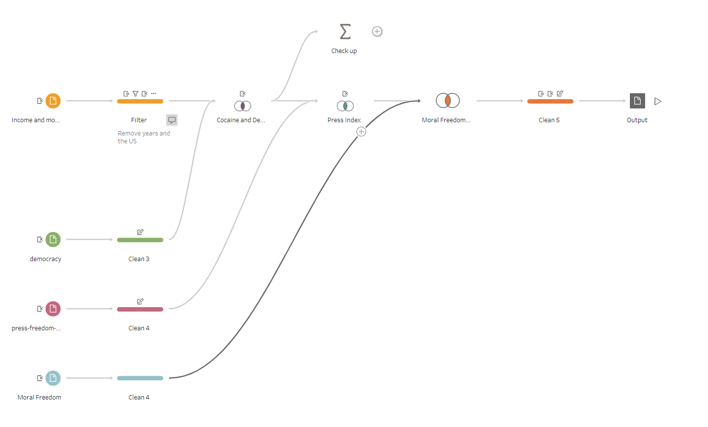
So currently I have four separated data sets which I have to turn to a big one for the final analysis. The plan is to load the data sets in Tableau Prep and to join them one by one. Sounds simple, but usually some unforeseen caveats always happen. Though this time I got lucky. The data sets all had the same ID variables (country name and year in this case) and the joining process went smoother than I ever imagined. Lastly, I ranked countries by cocaine prices, Democracy Index and Press Index for each year. Some polishing of the data set and I was ready to present the results.
My Tableau Prep workflow is shown in the figure below. On the left side you can see the four different data sets which are joined one by one. As a result you can see the output on the right side, which is now just one data set. Note that other cleaning steps were performed in between.

Concluding remarks: the searching and prepping of complimentary data sets went wonderfully and I was so ready to improve my dashboard next Friday in the next project. However, our coach Peter threw a little curveball and changed the task to rework the dashboard presented in the final interview 😊.
Cheers, Tobias
