Hello reader,
A dual axis allows users to overlay two different measures or dimensions on the same chart, enabling richer and more nuanced visualizations.
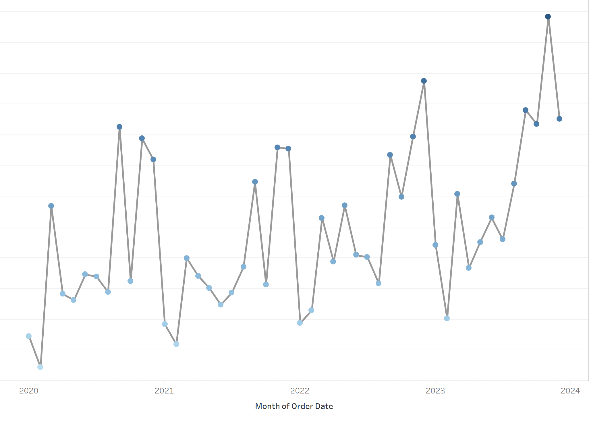
Dual axes can be used to display multiple aggregations of the same measure. This is useful when you want to show, for example, both the sum and average of a measure in the same chart, or highlight key months within a year on a line-graph (the example I will now demonstrate/show).
Let's Dual some Axes:
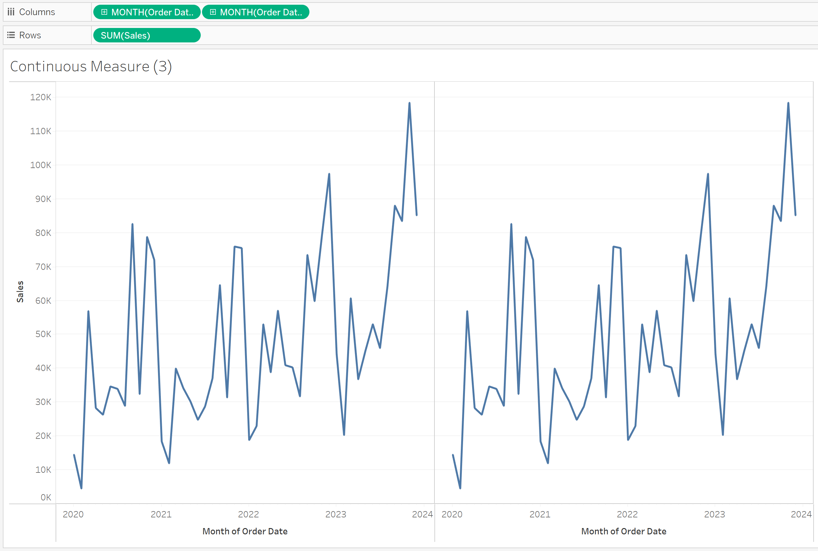
Step 1:
Step Two:
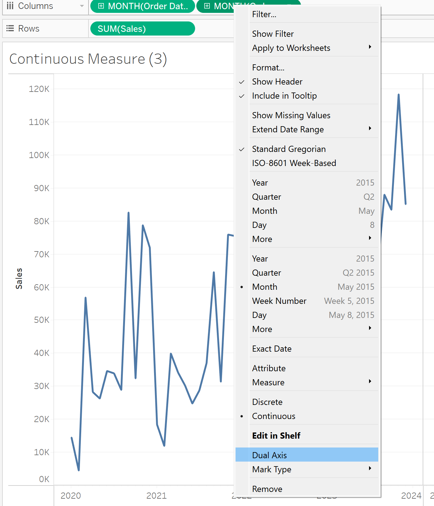
Step 3:
Step 4:
You will now have an additional Marks window for you to customize the first/second graph or (both).
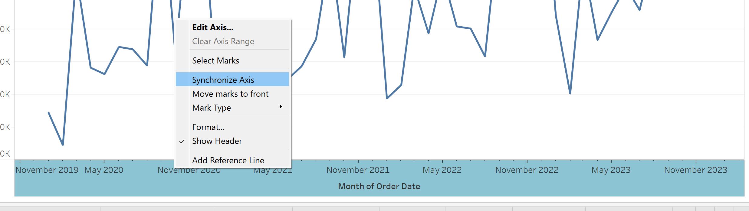
Step 5:
Any additional refinements;