New to Tableau? Here are 2 fundamental things to know about the pills in Tableau.
1. What is the difference between blue and green pills?
They represent dimensions and measures right?
No, they do not. That’s a common misconception and understandably so. Most dimensions you use will be blue and most measures will be green. Blue pills however in fact correspond to discrete data and green pills to continuous data. If you see a red pill at any point, it means there is an error of some kind – a dimension/measure is missing or the calculation you did hasn’t been recognised.
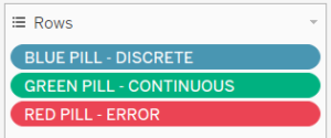 (You won’t actually have a field called ‘BLUE PILL’ of course, this is just for illustration)
2. What are dimensions and measures then?
Dimensions usually cannot be aggregated (summed, averaged etc), whereas measures can be.
Let’s look at a couple of examples (from the Tableau Superstore data set) of blue and green pills, and also dimensions and measures.
a) Product Name – Discrete (Blue Pill) and Dimension
Product name is a dimension – you cannot add up or average names
It is also a discrete data set – you are restricted to each individual name, you cannot have a continuous scale of names.
One thing we can do is to right click on ‘Product Name’ and convert it to a measure, but how can this be? We cannot perform aggregations on names.
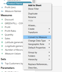
We cannot perform aggregations on the names themselves, BUT we can count how many names there are, and this is the aggregation. The resulting measure looks like this: ![]()
Tableau has assigned the type of aggregation it thought was best for the ‘Product Name’ field, in this case a distinct count, or CNTD.
There are two important things to note here:
- for measures, you must have some type of aggregation and this will always be specified before the field;
- the pill is green now because the number of names is a continuous field.
b) Profit – Continuous (Green Pill) and Measure
Profit is a measure – you can add up or average the profit. You can measure how much profit there is.
It is also a continuous data set – it can take on any value, you can have a profit of 0 or 1 billion or -3.5 for instance.
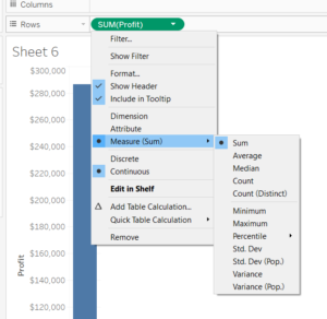
We can see here that Tableau has summed up profit as the form of aggregation, but you have several options, as shown below:
c) Dates – Discrete OR Continuous Dimensions
Date fields are interesting examples are they are dimensions that can be either discrete or continuous. As we can see below, you can have:
- discrete dates, where the value inside (Abc) corresponds to only that year.

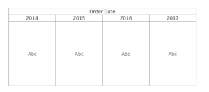
- continuous dates, where the value could correspond to any date within that scale

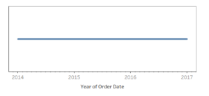
Tableau intuitively places discrete fields in a table and continuous fields on an axis when you haven’t specified what type of chart you want. How your data appears when you double-click a field is therefore another indicator of whether it is discrete or continuous.
Summary
To summarise, I thought I’d share how Andy Kriebel simplified it! I found it very useful:
- Blue things group your data
- Green things count your data
- Dimensions split up the view
- Measures fill the view
I don’t remember what he said for measures so I made it up to fit with the rest. I hope you enjoyed this blog! For more from me, check out my Twitter and LinkedIn pages.
