Today was Day 3 of the infamous dashboard week at The Data School where we are tasked with taking a data set, creating a dashboard, and then blogging about it!
Our task today was to extract data using the Rick and Morty API and then create whatever we wanted with that. I chose to look at how many characters are surviving in any given episode. Here’s the Dashboard I made: (and the link here)
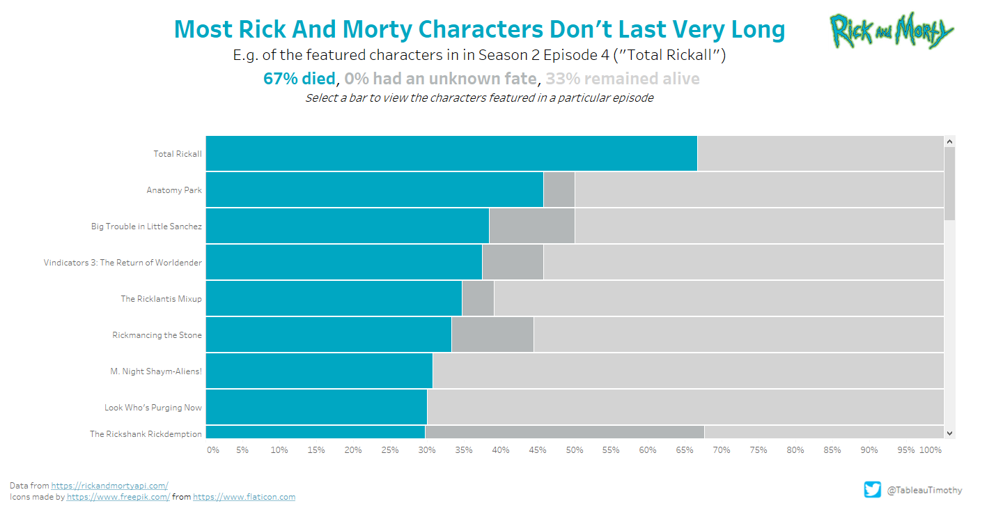

I’ll walk you through a couple of the steps I took to get to my initial bar chart.
1. The Aim
In simple terms, I want to measure, at any given episode, the proportion of current characters which are alive or dead.
2. The Process
Below is the table format we were working with, with all the characters in each episode, and their status: dead, alive or unknown.
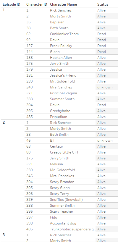
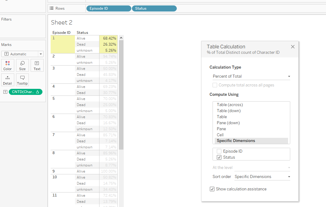
As the chart will be split up by episode number/episode name and status, we can just do a distinct count of Character ID:

This can then be converted into a percentage by adding a table calculation:
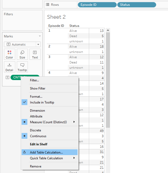
We need to untick Episode ID as we want to calculate the percentage of characters who were dead, alive or unknown for each episode. We can see by the highlighted yellow cells that we have done the correct calculation.
68.42+26.32+5.26=100
We can then create our chart! I dragged Status to the ‘Colour’ mark (so the bars are stacked and coloured by Status) and moved the percent of total calculation to the Columns shelf.
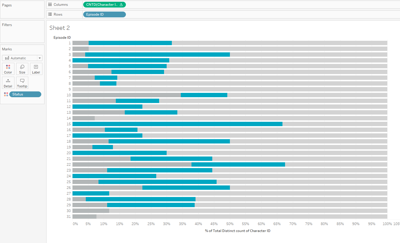
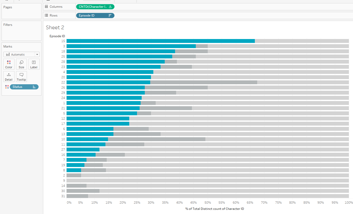
The final step is to sort the bars by the percentage of characters who died in that episode, i.e. sort by the blue bars.
We only want to return a value if the characters died in that episode, so we’re going to use an IF statement like the one below:
IF [Status]=’Dead’ THEN [Character ID] END
We then want to count distinct the number of character IDs to get the number that have died in that given episode.
This is the numerator. The denominator is then simply the total number of characters for that episode.
This was therefore the final syntax I used:
COUNTD ( IF [Status]=’Dead’ THEN [Character ID] END )
/
COUNTD ( [Character ID] )
Then we just sort Episode Number/Name by this new calculated field, and there you have it! A nicely sorted stacked bar chart.
I hope you liked this blog! For more from me, check out my Twitter and LinkedIn pages.
