


Today’s challenge is about UNESCO heritage sites – web scarped from Wikipedia and visualized in Power BI.
The words…”web-scraping” and “Power BI” hit me quite hard as I am not comfortable working with either of them.
So without leaving myself much time to dwell on the difficulty of the task, I quickly jumped on the blog to sketch my plan:
- Explore the content that I want to scrape
- Read about scraping Wikipedia –
- Remember/figure out/ask how to web scrape
- Get the data and prep for PowerBI
As I am quite unfamiliar with this I know it will take longer than yesterday. So will aim to finish it by 2 pm.
Then the next steps:
- Sketch the dashboard
- Build in PowerBI
Aim to finish by 4pm, leaving an hour for the blog post.
Started off as planned with scrolling through the Wikipedia page and continued with looking for blog-post that could help me in web-scraping, and found Robbin Vernooij‘s blog invaluable. It has a great step by step description that allowed me to get the the table, but not the link for each country.
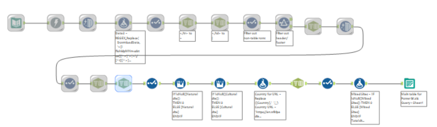
So I created a separate flow for the links.
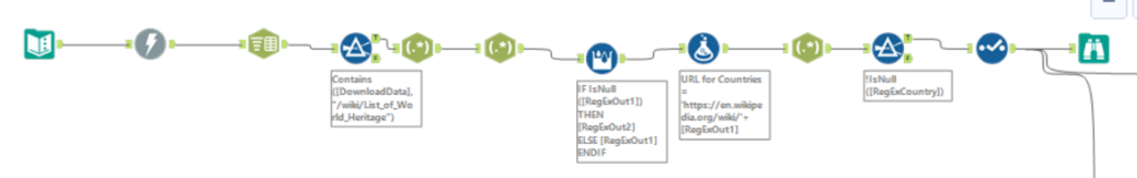
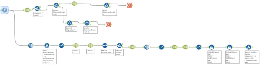
After downloading the data from the country links, I released that the workflow created earlier can’t be used to prep the data from the country tables, as not all tables have the same structure.
And not only the structure wasn’t the same, but the words, and symbols that I could have used to extract the information using RegEx weren’t the same either. So I in the time I had, I couldn’t come up with a unified way to put the individual country data into a table.
Around 13:45 my workflow for downloading and prepping the individual country data looked like this:
So I decided to stop trying for now and check out PowerBi.
After 11 minutes in the software I came to the conclusion that it will be incredibly difficult to explore the data in it. The only thing that seemed more or less familiar, was the charts box, but without knowing what I want to visualize that wasn’t of much use either. So went back to Tableau to explore the data and sketch the dashboard. (Should have followed my advice as sketching was before building in my initial plan)
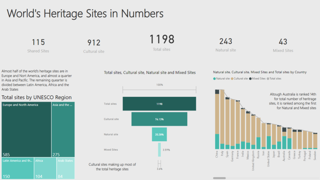
With a Tableau mind I sketched a dashboard that would show how Australia is ranked 14th, for all Natural Heritage sites, but ranked in the top for Natural and Mixed sites. But then realized that I don’t really know how to do this in Power BI. The closest I could get was this bar chart, but still don’t think it really highlight the finding.
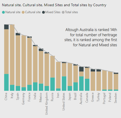
So then I just player around with whatever charts I could find and quite liked the funnel, so kept it, alongside the tree map to show the distribution of heritage sites among regions.
All in all, this day was very useful for me from the web-scraping perspective as I became a lot more confident in using this technique.
I also liked how easy it was to make a funnel in PowerBI and would have loved to do a Ribbon Chart if my data would have allowed it.
That’s it for the day….two more days to go…