


Dashboard Week Day 1 - Use Portugal Golf Course Data to create an exploratory dashboard.
The first day of Dashboard week came with a few challenges, some expected and some unexpected.
The biggest challenge of the day was coming up with a user and a user story. I don’t golf, and while its not hard to imagine why golfers might want to know where golf courses in Portugal are and some basic information about each - it was still difficult to find a specific question or set of questions that I could answer with a dashboard.
Some research led to the fact that it seems a lot of golfers want to make the most out of a trip to Portugal, and therefore might care about visiting courses in Portugal that are nearest to other golf courses, to maximize their options and the possible number of courses they could play on.
Frustratingly in contrast with the first problem listed above, the data is also limited in what it tells us about each golf course. Information that might be a priority for a tourist or visiting golfer, such as price or availability or difficulty are not included in the data.
I spent more time than I would have liked wrestling with the above, and trying to find a more ‘interesting’ or ‘specific’ question to answer. Ultimately I think my user story and question were sufficient, and I'm aiming to be more confident in my instincts moving forward so I can spend more time analyzing data and building dashboards.
I also lost a lot of time dealing with some novel technical issues with Tableau:
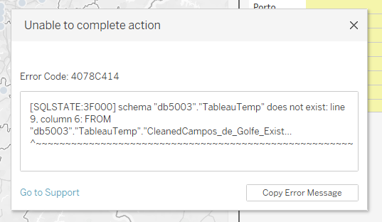
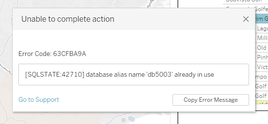
I wasn’t able to completely solve those issues by the time the project was due, but I did figure out that it has something to do with how I processed and cleaned the data in alteryx, and most importantly: that using an extract of the data rather than a live connection helped immensely. Tableau is not necessarily a tool built to handle complex spatial tasks, and while nothing I was doing in Tableau was particularly complex, it was interesting (and a bit frustrating of course!) to encounter some new error messages and tackle a new problem today.
As always, formatting is the last thing I do - and thus this dashboard is not formatted how I would have liked, but I was able to make it functional and clear for a potential user to use.
Some good lessons (re)learned on day 1. Excited for Day 2!