There is a feature that was released with Tableau 2018.3 which can make designing dashboards a whole lot easier, but which might also lead to horrible creations, floating containers and confusion: Transparent Worksheets!
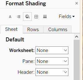
Until recently, going to the format section and selecting “none” as background colour wouldn’t make the worksheet transparent, but simply paint it the colour of whatever lies underneath. The same was true for any other object in a dashboard.

Looks can deceive…
This can be a problem whenever we want to try and design a dashboard whose underlying structure is anything other than rectangular. Containers in Tableau can only be rectangular, and adding round shapes takes up lots of extra blank space in the four corners.
The Problem
As an example I’m using a little dashboard I created last week, displaying what types of coffee are most popular at The Information Lab.
Coffee and Pie
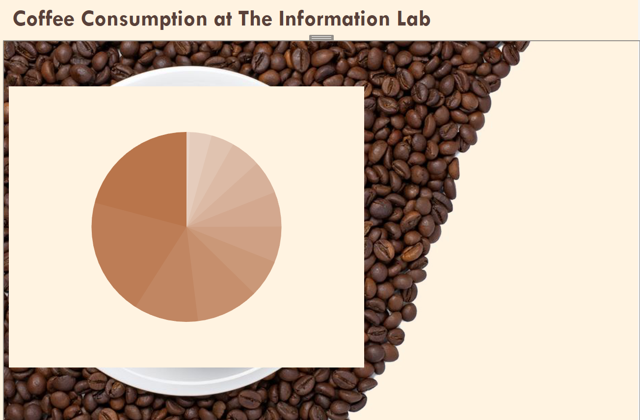
I wanted to give the viz a lighthearted feel, so I downloaded an image of a coffee cup shot from above. My idea was to have a coffee coloured pie chart in place of the actual coffee in the picture. Since I had not yet updated my version of Tableau, floating the pie chart above the background image looked like this, even though I had made the worksheet transparent:

Not quite what I wanted.
What I had to do was to go to an image editor, cut out the “coffee bit” from the underlying image, set both image and worksheet to floating and put the worksheet behind the image in the floating order.
Then I could adjust the size of the two objects so the inside of the coffee cup was now my pie chart.

That’s better!
I now had the look I wanted, but here is where I ran into the next problem: Although we can see the underlying chart, we can’t select it because the transparent bit of the image is on top of it. While you can see through the image, you can’t click through it.
You’re Barred
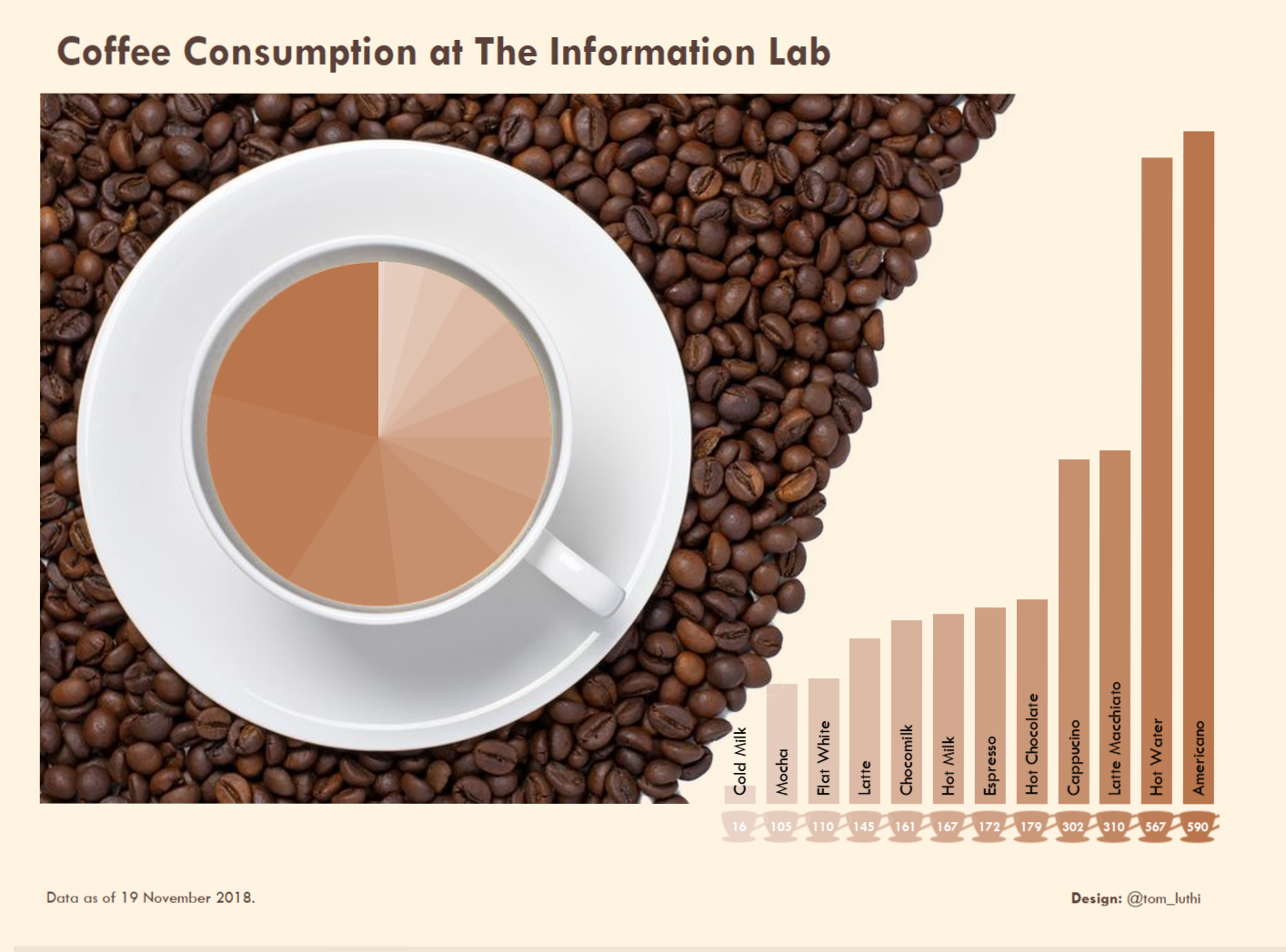
The same is true for the bar charts I later added to the dashboard. The bars fit nicely in the gap that is left by the coffee beans, which looks pretty. But again, the worksheet is floating behind the image so you can’t click or hover over the bars. Instead, I added the little coffee cup shapes below the bars and placed them below the lower edge of the image. I then added a highlight action on the cup shapes. This way, you can use the cups to highlight items in the bar and pie charts. Again, while this is a decent workaround, it is far from ideal.

The finished product.
Since I designed this dashboard purely for humorous effect and no actual use case, this wasn’t much of an issue. But in a different scenario, I would have lost one of the main functionalities of Tableau, i.e. the interactivity provided by tooltips, dashboard actions and so on.
The Solution – Transparent Worksheets
In sweeps Tableau 2018.3 with its transparent worksheets!
What this means is that now, I can fix the background image to a container rather than floating it. I can then add all the worksheets on top of it, setting their backgrounds to transparent. Users can now see the image lying underneath the worksheets and they can hover, select and highlight to their heart’s content.
Knowing this new functionality could have saved me an embarrassing amount of time dragging objects back and forth across the canvas, and it would have improved its user experience. I will definitely be using this new feature a lot, but it should also come with a word of warning: Beware of floating objects, as they don’t always behave the way you might expect, especially if the size of your dashboard isn’t fixed. Also, it’s tempting to go for aesthetics over clearly structured content which may confuse users unless there is a very clear red thread going through your viz.
But if used well, this new little feature can help us make great design choices without having to find overly complicated workarounds – which is exactly what Tableau is supposed to do, after all.
