Over the holidays I finally had some time to pursue a passion project that had been on the back of my mind for some time. Being somewhat of a history buff, I have a great interest in the American Civil War, and I wanted to create a Tableau visualisation using data about that conflict.
Acquiring Data
Shopping around for data sets I came across a brilliant repository curated by historian Jeffrey Arnold on GitHub. This database compiles many different sources, both modern and contemporary to the war, with in-depth information about every single engagement of the conflict. I downloaded his database and started playing with the different data sets to find the one most suitable to what I had in mind.
Inspiration
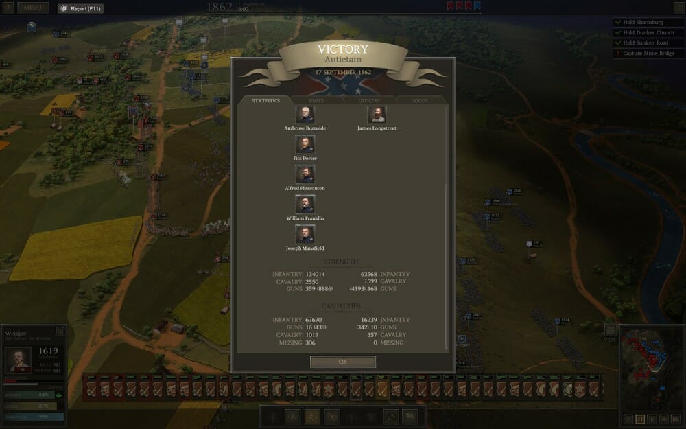
I wanted to create a visualisation that was similar in style to a computer game I had been playing, set in the American Civil War. The game is called Ultimate General and lets the player switch between a campaign overview, where he or she can see the progress of the war on a map, and real-time battles where the players commands the troops of either side of the war. Battles are concluded by a statistics screen that shows the troop strength and casualties for both sides as well as who the historical commanders were for that battle.

The style of my Tableau viz should be similar to this statistics screen, with a map view allow the user to select campaigns and battles. I used Mapbox to import a vintage style map into Tableau which serves as the centrepiece for the viz.
First Concept
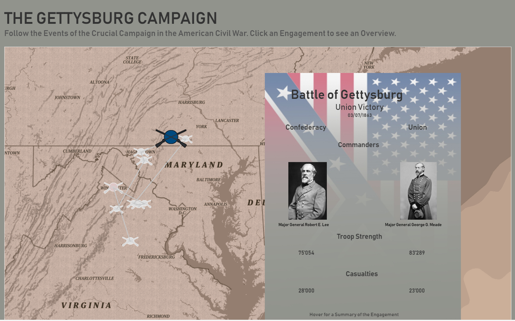
It was an interesting challenge working with predominantly text-based data and attempting to make the viz as dynamic as possible. Floating sheets on top of the base dashboard and hiding them when no data was selected went a long way to help me achieve the interactive nature of the workbook. For commander portraits I downloaded images from Wikipedia and painstakingly imported them as shapes, which could only be done manually, one at a time.
After creating a first iteration that focused on only one campaign, viz. Gettysburg. I posted my viz and asked for feedback which I then incorporated into a second version.

Final Result
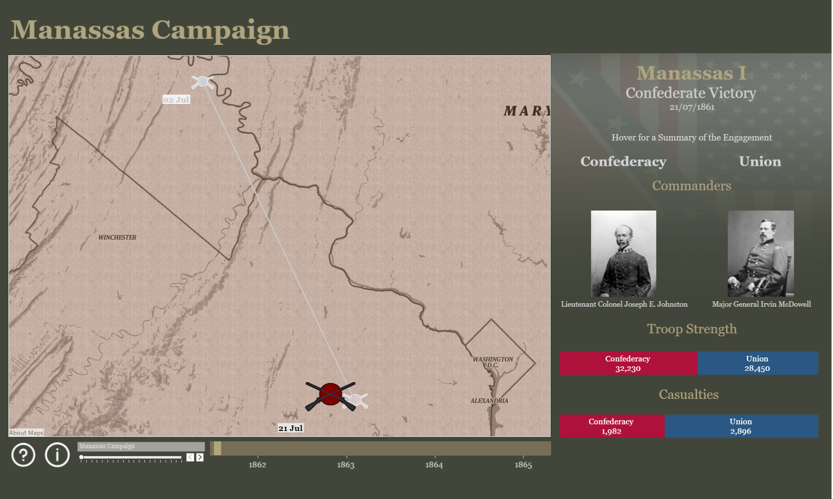
The reworked viz should include all major campaigns of the war from Masassas to Appomattox and be much cleaner visually. I layered the dashboard so that there would be two levels of information: A description of the campaign selected in the filter and the battle stats sheet that would pop up when the user selects a particular engagement. For my filter I used a technique I hadn’t been aware of until Gwilym Lockwood pointed it out to me: In Tableau, you can set a slider filter so that the white slider is hidden and only the left/right buttons are displayed. I combined this with a timeline on which I plotted the start and end dates for each campaign.

I’m pretty happy with the current result, but there is still more that I can do to improve this: Including statistics for the overall progression of the conflict would go a long way to display how the different campaigns compare against each other, for example. Using set actions to proportionally brush the bar charts would also be a useful feature that I want to implement. I’m firmly planning to work further on this project and keep developing it.
Here is the link to the viz on Tableau Public.
