What is Dashboard week?
4 Tasks, 5 days, 6 hours per Task ... and only one goal: have a finished dashboard ready
Todays Task: Create a Vis for a version of the Superstore Data in Power BI.
This Blog will be a bit short so lets show what was accomplished first:
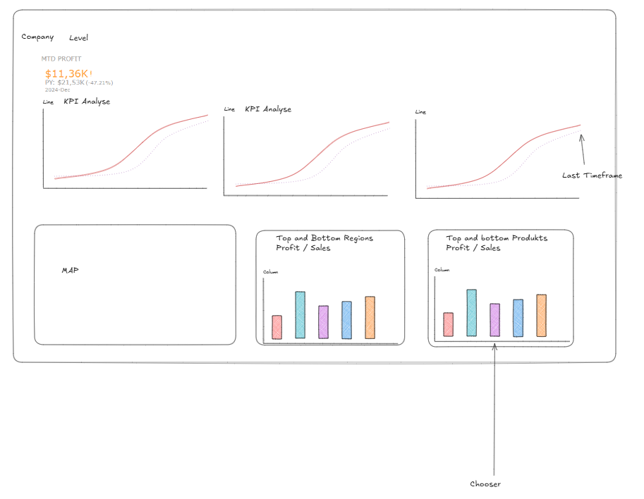
Sketch:
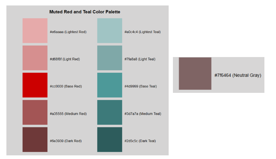
with the colour scheme:
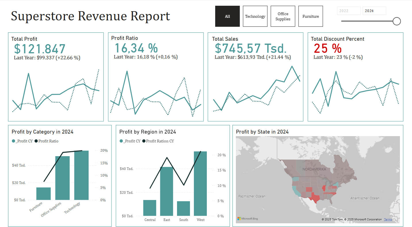
the finished dashboard:
The good:
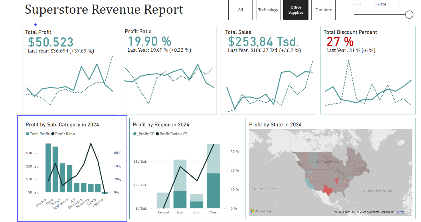
Clean Design, and I like the colors. The KPI Cards work as intended, all bottom charts can be used as Filters and when one of the top cards is clicked a dynamic visible graph behind "Profit by Category will pop up:
What could be improved:
Create a graph that gives quicker insights with the Total Discount Percent. Add axis with value to the KPI line charts. Tooltips to explain how the ratios are calculated.
Now for the Bonus:
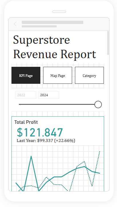
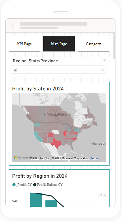
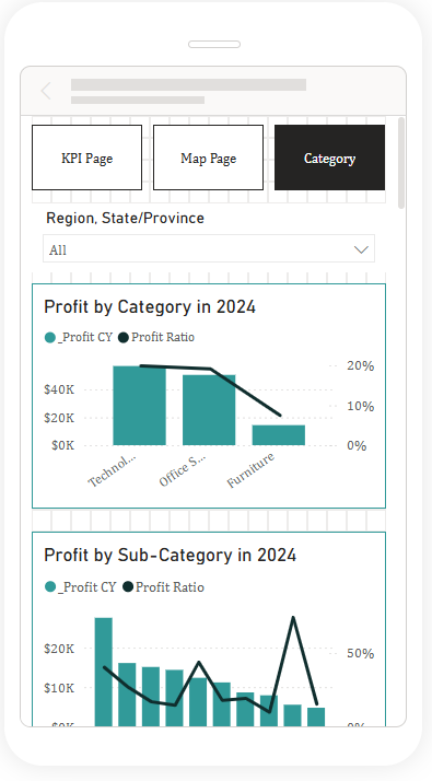
Three whole pages for mobile views. This was kind of a headache to create and I sadly can not test it properly, but had a lot of fun creating them. It took around 30% of my time today to get them working. Especially that filters line up across all views. With that done and no more time today to write.
Lets wrap this up and I will see you tomorrow with a different task.
