


Its Christmas Blog and we are working from Home, in my case from my hometown in Bavaria. Not a lot is happening so lets talk about Makeover Monday (MoM) 🥳
Every Monday new data and a related visualization get’s published. Your task is then to “makeover” the visualization. Generate a new visualization in 1.5-2 hours from the same data. All tasks can be accessed on the website: https://makeovermonday.co.uk/
It is always interesting to find new angles on a dataset different people already worked on. Here are my second and third MoM creations:
My second MoM was about World Energy Mix:
https://public.tableau.com/views/Renewablesintheworldenergymix/Dashboard1?:language=en-US&:sid=&:redirect=auth&:display_count=n&:origin=viz_share_link
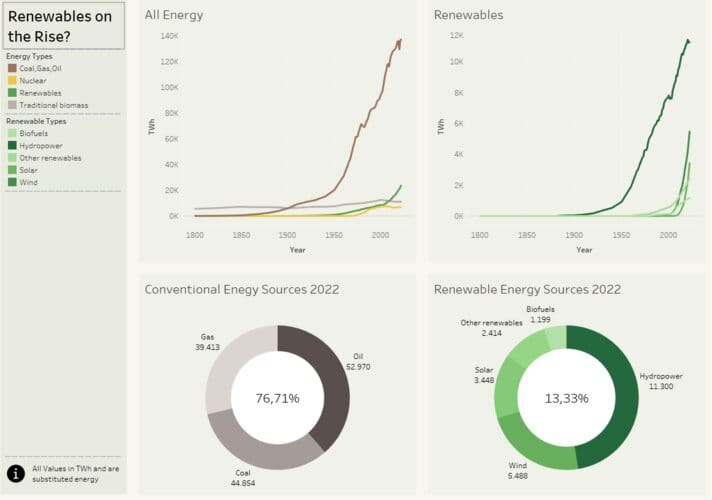
Original Viz:
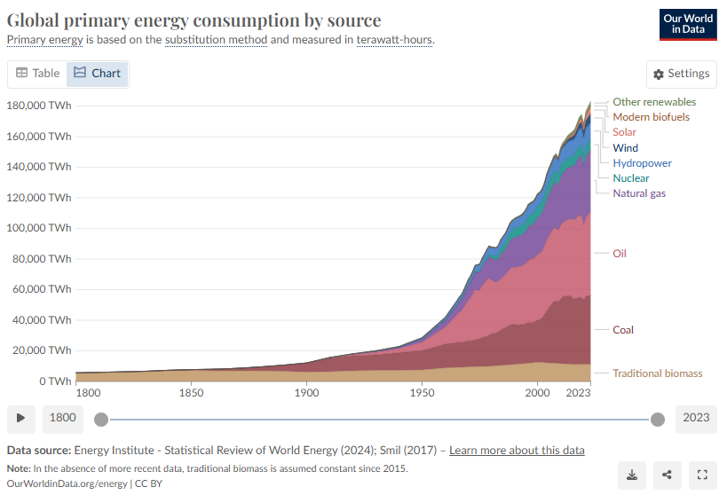
My main goal was to focus on comparing the rising renewables to conventional Energy Sources. Especially the renewables in the original viz are hard to distinguish. We have a hard time finding out if wind or solar is producing more.
My focus laid on creating a good color language in shades of green. In an afterthought it came to me, that it should be checked, if a person with red / green color weakness could still differentiate the shades used.
Soooo then week our third MoM Project came and i felt a little too confident in trying something new: https://public.tableau.com/views/MoM2024_Wk24_Engagement_Ring/Dashboard?:language=de-DE&:sid=&:redirect=auth&:display_count=n&:origin=viz_share_link
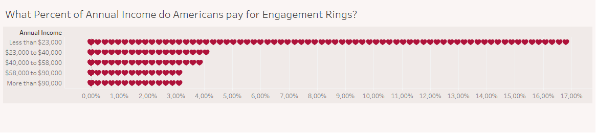
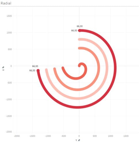
Original Viz:
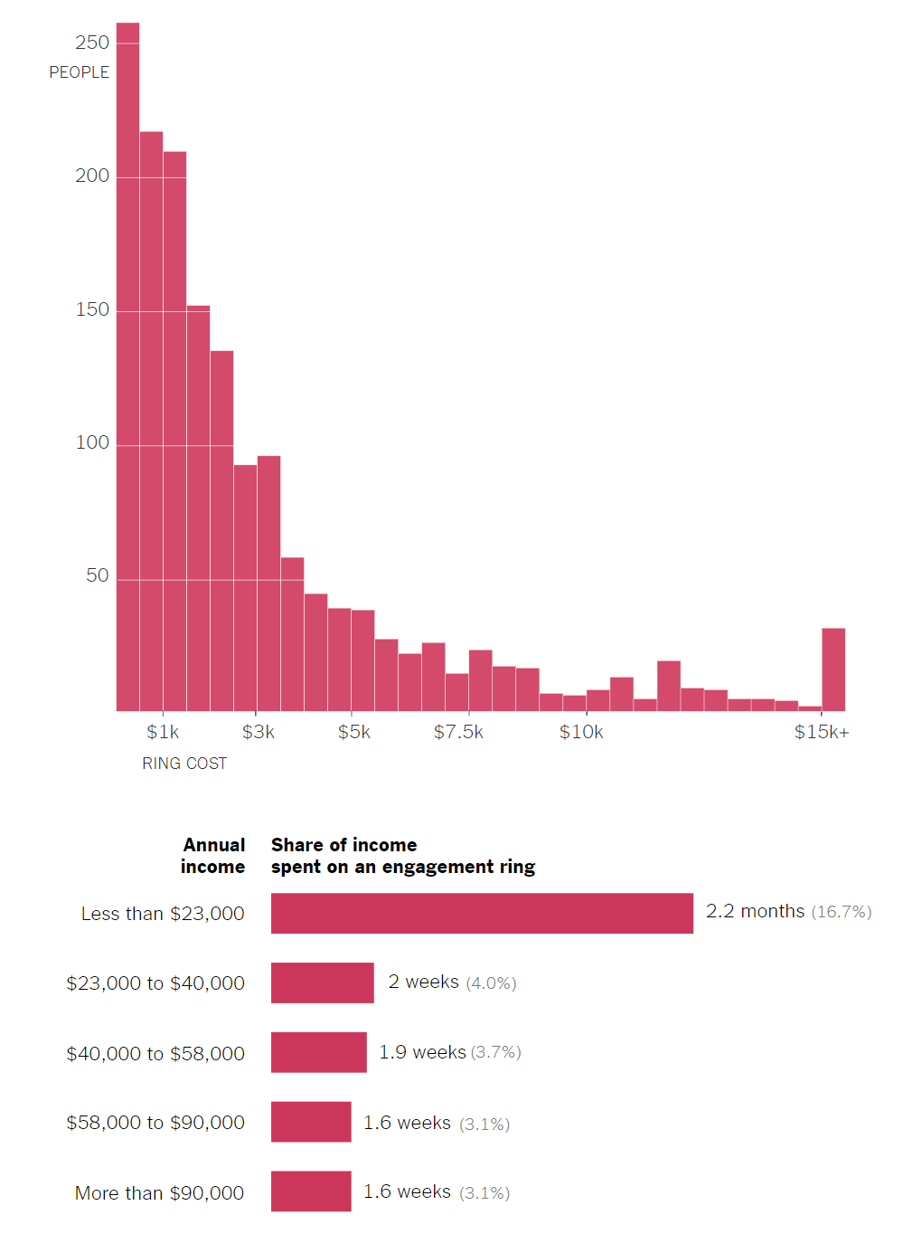
This Data gave me a big headache ... the whole set was just 5 Rows with 3 Columns. So not a lot to work with. It was the perfect time to experiment with new and exciting graphs.
One of those got into the final vis as seen above, but it took wayyyy more time than i thought to "just" replace my bars with hearts. And my second idea crashed because i just did not think before what kind of data the chart could depict.
The Journey to these two graphs are a bit long for this blog, so this one will close on a Cliffhanger. Next week i will report in more detail how i created these charts and ALL the obstacles i had to overcome, just to create bars out of hearts.