


The topic of my blog posts a few weeks ago was Makeover Monday. A cool Idea from our coach is to now revisit one of our old dashboards we did for MoM and do it again.
Now in this position I have four dashboards to choose from:
Waterworld, Energy Production, Engagement Rings and Marvel Movies.
With the dashboard from Energy Production I am fairly happy, see:
https://thedataschool.co.uk/thomas-hoefer/make-over-monday-2/
for more on that.
Engagement Rings was a disaster I am tempted to get back to someday ... but that day is not today. If you want to read a report on the mess that was my Makeover Monday Engagement Rings:
https://thedataschool.co.uk/thomas-hoefer/how-to-create-a-bar-out-of-shapes-and-some-radial-bar-chart-catastrophe/
Two Boards remain.
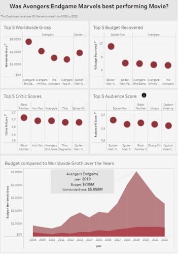
My Dashboard about Marvel Movies:
Data: https://data.world/makeovermonday/what-is-the-best-performing-marvel-movie
original viz: https://informationisbeautiful.net/visualizations/which-is-the-best-performing-marvel-movie/
my viz: https://public.tableau.com/views/MoM_15_04_2024_Marvel_Movies/Dashboard1?:language=en-US&:sid=&:redirect=auth&:display_count=n&:origin=viz_share_link
and Waterworld:
Data: https://data.world/makeovermonday/2024-w42-water-world
original viz: https://informationisbeautiful.net/visualizations/water-world-distribution-of-the-all-the-water-in-all-the-world/
my viz: https://public.tableau.com/views/MoM_14_10_2024_Too_much_Salt_v1/Dashboard1?:language=de-DE&:sid=&:redirect=auth&:display_count=n&:origin=viz_share_link
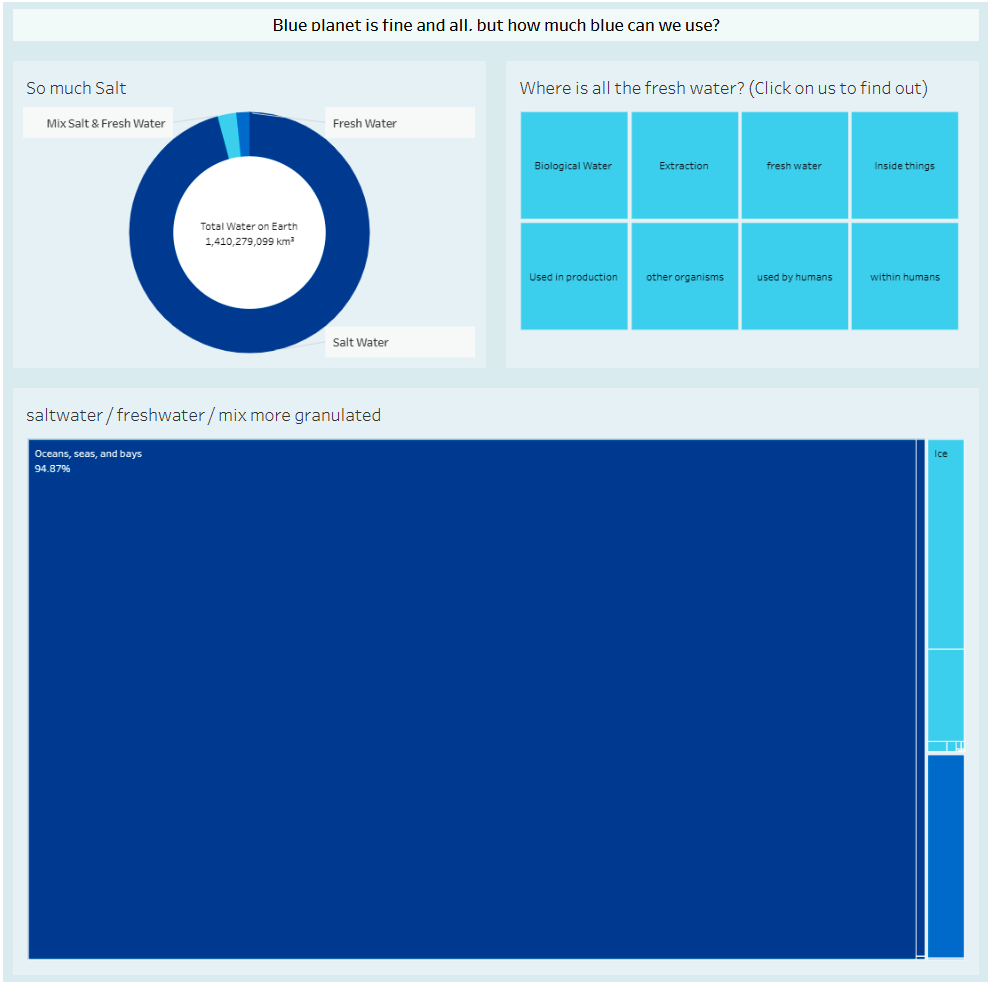
The Marvel dashboard was created just last week. This seemed a bit too close to revisit, so my choice fell on Waterworld.
One thing i would have loved to do with that dataset:
1. Create a drilldown through clicking watertypes on the Treemap.
2. Help the viewer grasp on how little of the water is freshwater and how little we actually use.
The first would be relatively easy in Power BI, but then Marcel (on of my colleagues from DSDE9 created the exact drilldown I wanted to creat for his last dashboard with the following tutorial (highly recommended; it is easy, quick and all around a good youtube tutorial) :
https://www.youtube.com/watch?v=dnUqcQy8PWs
After following every step my Treemap with a drilldown was finished and worked like a charm. My new dashboard now has just two Treemaps and a Header, both with the same data. The left ones boxes have their size changed relative to the amount water in each type, while the right ones are equally sized.
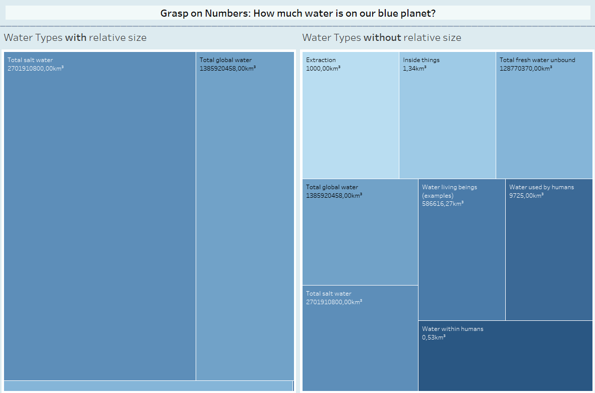
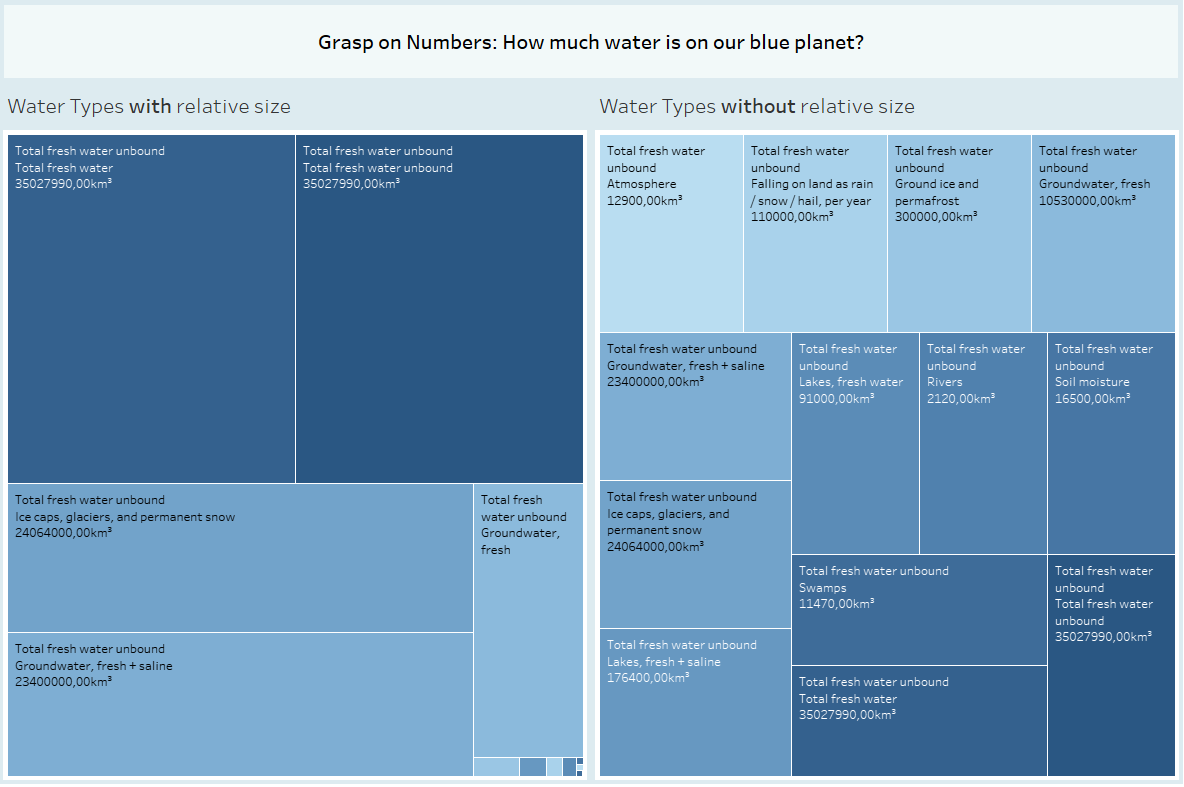
The Second Picture shows an example Drilldown if the user clicks on Total fresh water unbound.
My viz can be accessed under:
https://haproxy-traffic-splitter/views/MoM_14_10_2024_WaterWorld_v2/Dashboard2?:language=de-DE&:sid=&:redirect=auth&:display_count=n&:origin=viz_share_link
As always with MoMs, its a MVP (Minimum Viable Product). Time is always short. Things that need more work:
- info button that explains how to interact with the dashboard
- padding and other beautification steps
- Consistent use of color. If u drill down, there are just too many nearly identical shades of blue.
But I am pretty happy that I learned a bit about parameter interactions and am happy that I got to revisit my first MoM. Even somewhat accomplishing my two goals.