


Before reading this Blog pls visit last weeks blog about Makeover Mondays. The concept is explained there.
As promised there, this weeks blog will concentrate on my third MoM all about engagement ring spending. For reference:
original article and vis:
https://www.nytimes.com/2020/02/06/learning/whats-going-on-in-this-graph-engagement-ring-costs.html
Data:
https://data.world/makeovermonday/w242024-whats-going-on-in-this-graph-engagement-ring-c
If links aren't your thing:
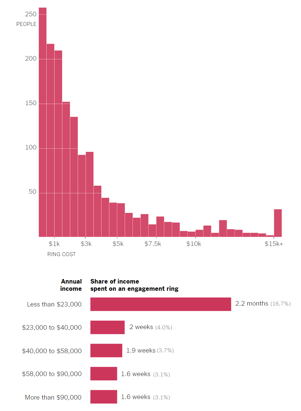
It shows you the expenses from people for their engagement rings and how much of their income converted in workweeks/months it represents.
The data sadly had not really more in it than these answers, so I focused on cosmetics for my viz. My first Idea was to replace my boring charts with cute Hearts, as described in:
https://www.thedataschool.co.uk/damiana-spadafora/bars-are-boring-use-cute-little-shapes-instead/
After cleaning the data a bit and following the steps from said guide I end up with:
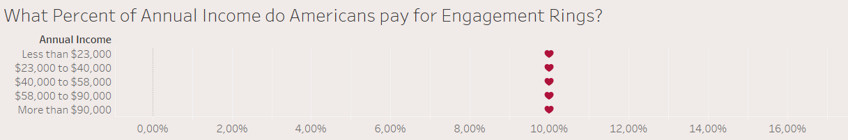
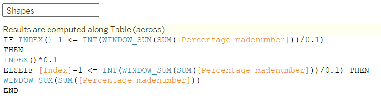
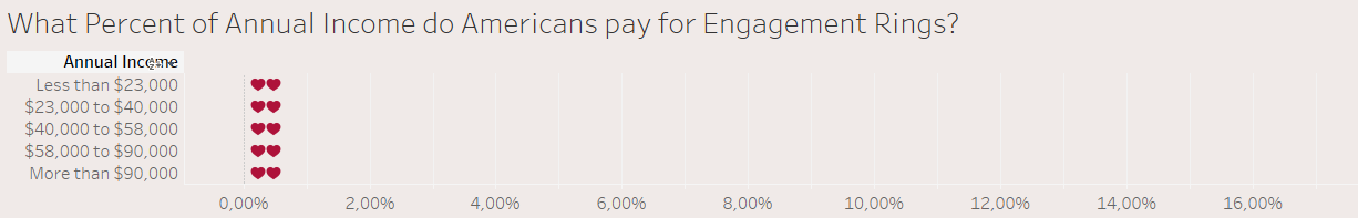
soooooo that is just one heart at the wrong place for each Income Group. What was wrong? I tried a lot of different modification of the described calculated fields and ended up with heart one heart for each bar exactly where I sliced my Index in
line 3:
This already took 45 minutes and with it not working for a reason i just could not figure out I startet to stress a little. Half the time gone with nothing to show.
Instead of just doing a cute and simple visualization i moved on to another guide:
https://www.thedataschool.co.uk/jack-parry/create-a-radial-bar-chart-in-tableau/
We have Engagement rings, so why not showing the stats as a radial bar chart with a diamond shape at the end of my rotation. In theory good but in practice ... This guide worked like a charm. 20minutes later my chart looked like:
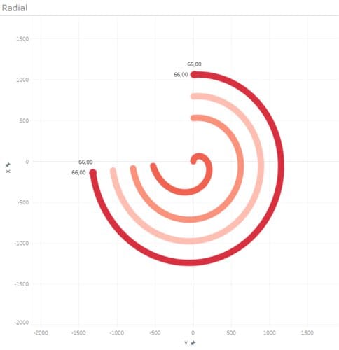
looked promising, until i registered ... there are only 4 curves ...
Of course there are only 4 curves, this type of graph cannot show 2 bars with the same value, as it places them in the same distance from the center!
Flipping back to my heart bars i suddenly had 2 hearts ???
Why ??? I just changed ... the data !!!
One step in the creation of the radial chart was the duplication of every row to create a column with points my path will follow, like 1 degree to 270 degree and so on.
Now i understood my problem. Tableaus Index function cant go above the Row Number even if we try to force it to. So i quickly created 100 empty rows with just the dimension in it and fiddled a bit with the numbers ... and voilà:
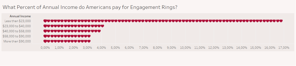
Now nearly two hours were gone and at least my initial Idea of the bar chart was done so i called it done and ended my MoM with just on bar chart which looks like 5 minute work on the first glance.
Give both guides a try, they worked great besides my problem with the index() function.
See you next week with a report about Friday Projects and Power BI.
Tl.dr: You need a row for each shape you want to create in a shaped bar chart and do not use radial bar charts if u have categories with the same values.