The second day of Dashboard Week introduced us to a new set of challenges and rules to guide our work. While the rules are straightforward, the task itself required thoughtful planning and efficient execution.
Dashboard Week Rules
- Work independently unless otherwise specified.
- Use tools like Alteryx, Prep, Power Query, or Snowflake for data preparation if needed.
- Create and present a sketch of your dashboard plan during the presentation.
- Publish the dashboard on Tableau Public or Power BI Service, embedding it into the blog post.
- Write and publish a blog post detailing the day’s work before starting the next day.
- Present at 3:30pm, showcasing the data prep, sketch, visualisation, and any additional insights.
Analysing UK Street Crime Data
For today’s task, we analysed UK street crime data spanning September 2023 to September 2024. The objective was to build an Alteryx App that allows users to:
- Select a specific date range, category, and area via a map interface or postcode.
- Update the data source on Tableau Server, Tableau Public (using Google Sheets), or Power BI Workspace.
- Visualise the updated data in a Tableau or Power BI KPI dashboard.
Use Case Scenario
The app’s functionality was centred around user interactivity:
- The user runs the app.
- They select their area of interest and desired timeframe.
- The visualisation updates accordingly, reflecting their selections.
My Approach
Here’s how I tackled the challenge:
1. Data Preparation in Alteryx
I began by importing the provided zip file into Alteryx. To optimise performance, I used the Input Tool connected to an Auto Field Tool and outputted the data as a .yxdb file. This format significantly sped up the workflow since Alteryx processes .yxdb files much faster than other files such as CSV.
2. Building the Alteryx App
I designed the app with five user-selectable options:
- Start Date.
- End Date.
- Crime Type.
- LSOA Area Name.
- Radius Size.
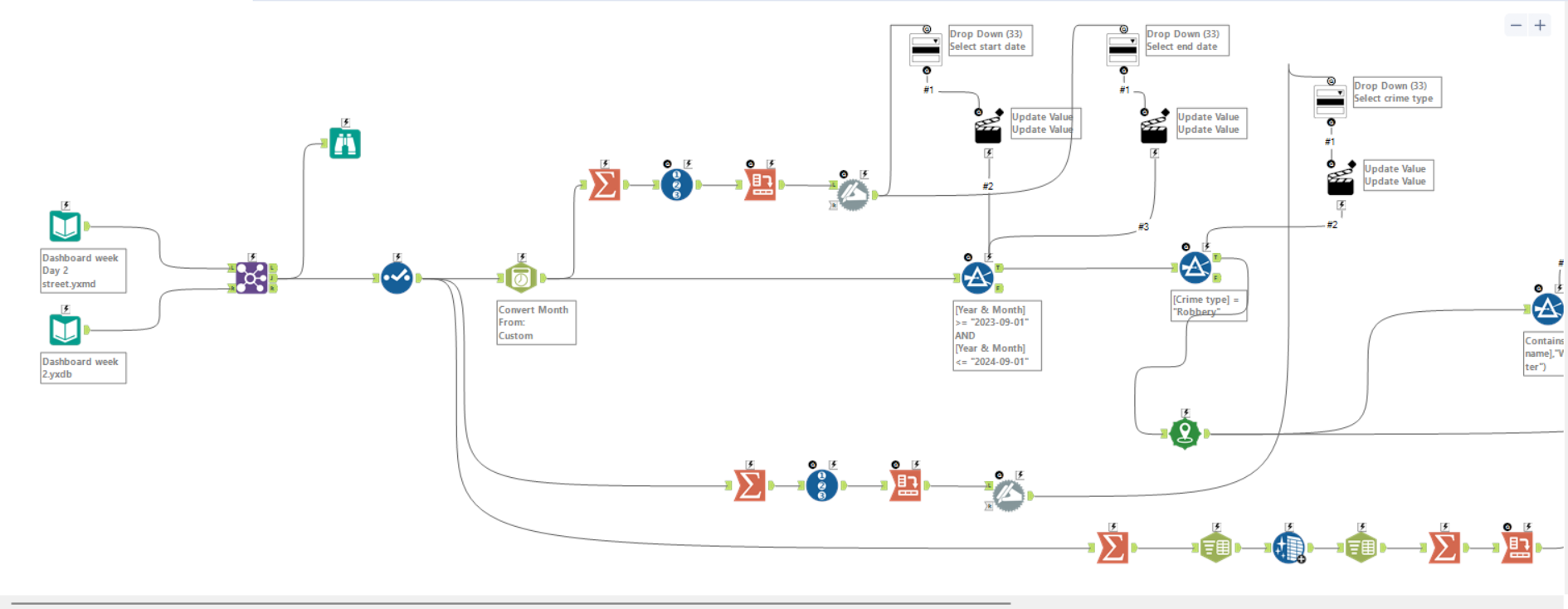
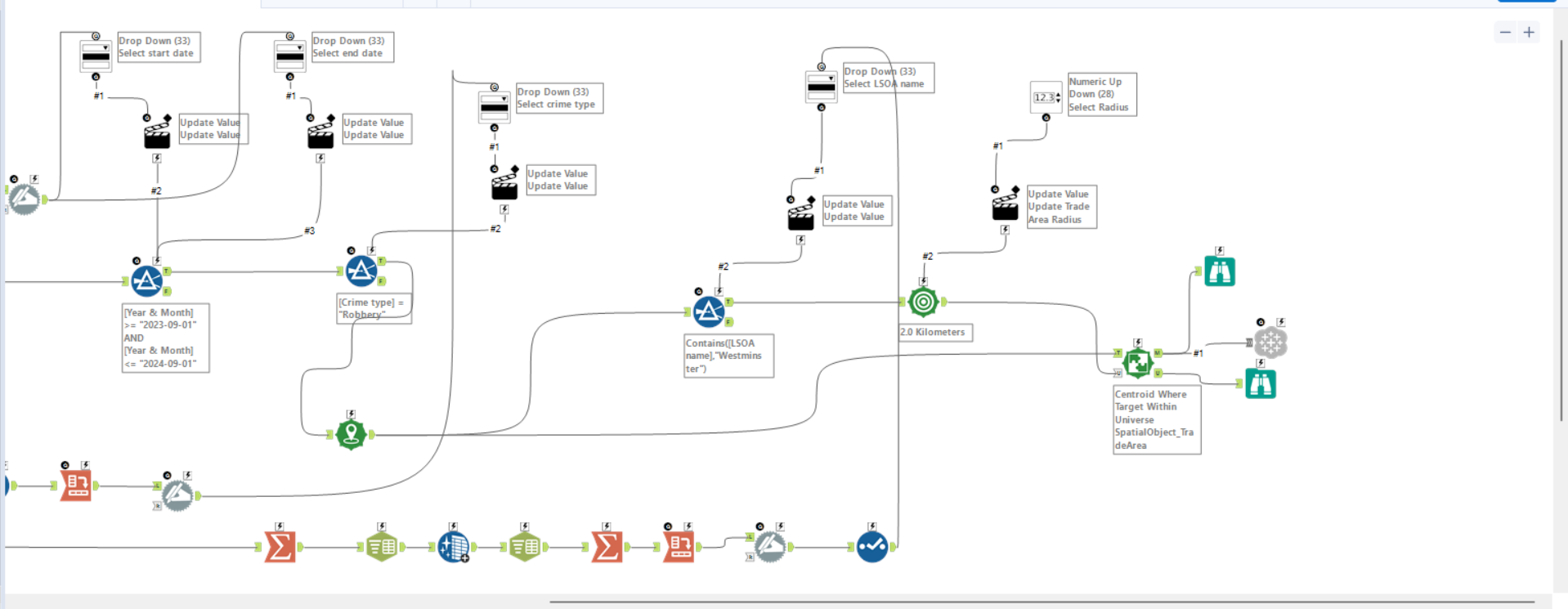
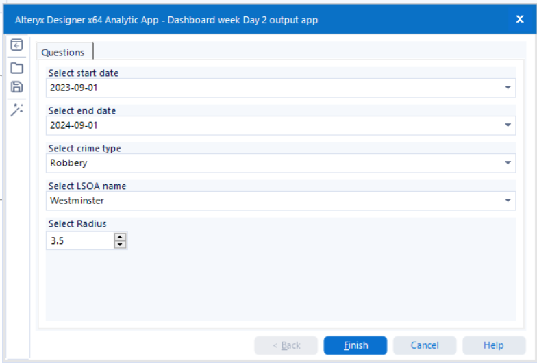
The output was configured to update the Tableau Server data source dynamically, ensuring seamless integration with Tableau for visualisation. For that I used the Tableau Output Tool, which is an Add-Ons you would need to install first.
3. Dashboard Design
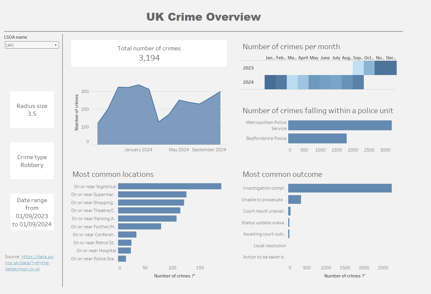
With the prepared data connected to Tableau, I sketched a layout for the dashboard. The plan was to create a simple yet informative KPI dashboard, aligning with the brief’s requirements.
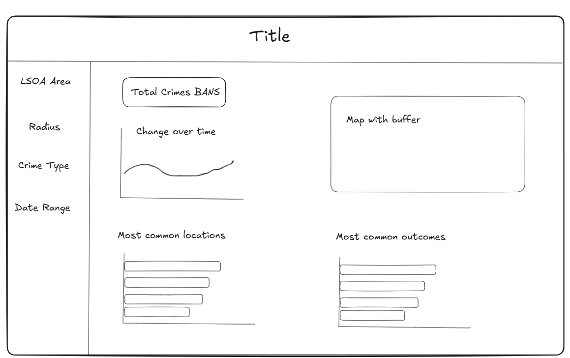
Due to time constraints, I opted against using a map visualisation and instead focused on a design that prominently displayed the user’s selections and the most relevant information.
Tips
Here are a few things I learned today that would have made the process smoother for me:
- Make a Plan
Before diving in, sketch your dashboard layout and clarify your priorities. A clear plan saves time later when things inevitably get hectic. - Ask for Help
Don’t hesitate to reach out if you get stuck. A fresh perspective can make all the difference. - Check with the Stakeholder
It’s important to verify that your dashboard aligns with the brief or end-user requirements. A quick check-in early on can prevent last-minute rework.
Final Thoughts
Today’s task was both challenging and rewarding. I didn’t manage to include everything I initially envisioned, but I learned a lot about prioritising under time pressure. Sometimes, keeping things simple is the best approach.
Dashboard Week is proving to be a crash course in balancing technical execution with practical decision-making—and I’m learning something new every day.
