The fourth and final day of Dashboard Week brought an exciting challenge: creating an infographic dashboard. Unlike typical dashboards, infographics are static, highly stylised, and designed to be print-ready—perfect for displaying information in a visually striking way.
Our dataset for the day was the Internet Boy Band Database, which covers boy bands that charted on the US Billboard Hot 100 between 1980 and 2018. Given that it was the last day of both Dashboard Week and our training programme, I decided to experiment a bit and push my design skills by building a sunburst chart.
The Task
My dashboard compared two groups:
- Top 10 Boy Bands: Groups that had at least one song reach the Top 10 of the Billboard Hot 100.
- The Unlucky Ones: Boy bands that charted on the Billboard Hot 100 but never cracked the Top 10.
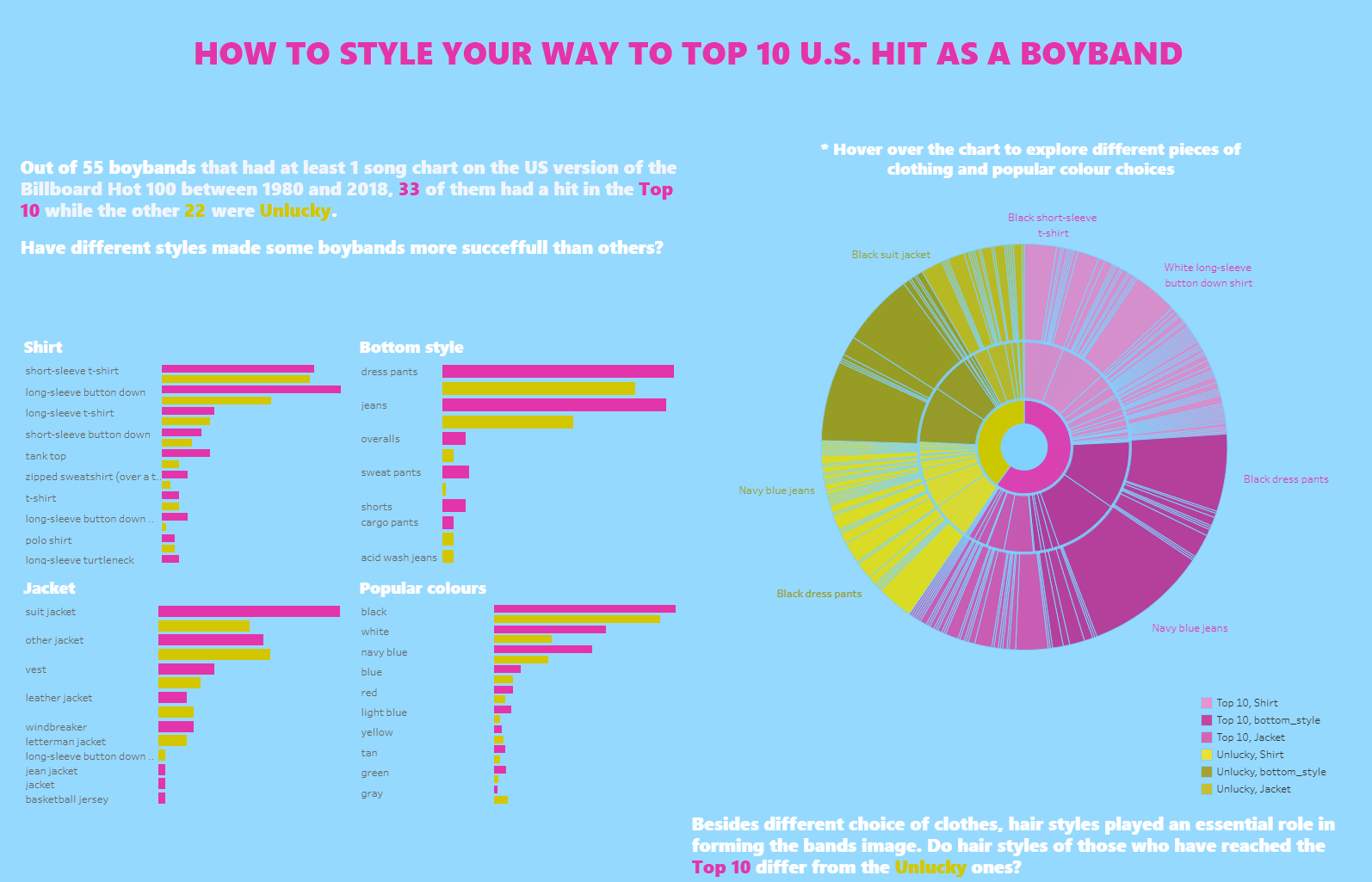
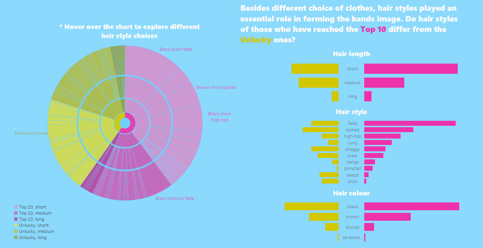
Out of 55 boy bands in the dataset, 33 made it to the Top 10, while 22 didn’t. My goal was to visualise this comparison in an engaging way that would suit the infographic format. I decided to compare the boy bands' clothing and hair styles.
My Approach
1. Data Exploration and Preparation
I began by exploring the data and preparing it for visualisation:
- The dataset consisted of two tables, which I joined together.
- I performed some light data transformations to ensure the structure was compatible with the requirements for building a sunburst chart.

2. Sketching the Dashboard
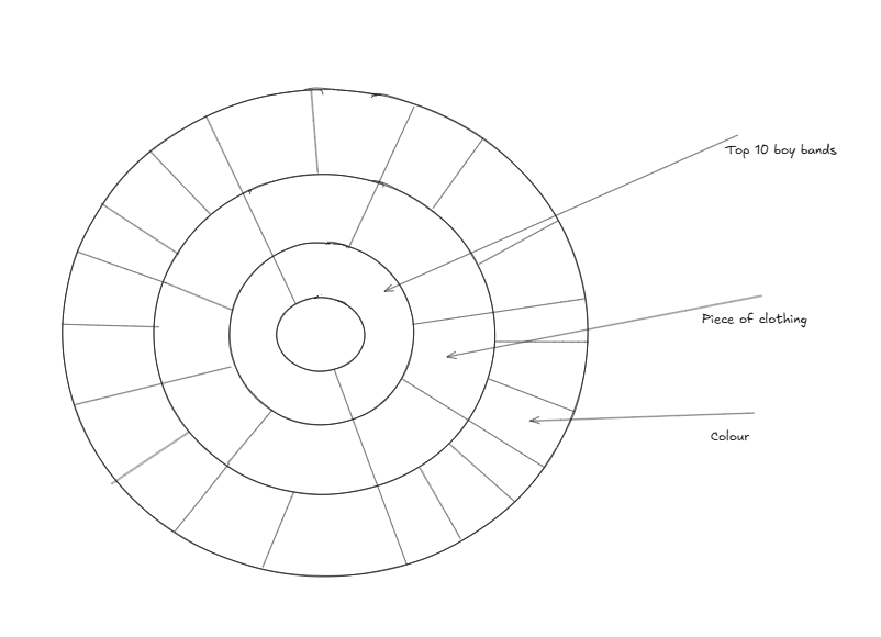
Once the data was prepped, I sketched out the design for the sunburst chart and the overall dashboard. The sketch served as a blueprint, keeping my design focused and helping me stay on track.

3. Building the Sunburst Chart
The centrepiece of my dashboard was the sunburst chart, which offered an intuitive way to compare the Top 10 boy bands with the “unlucky ones” in terms of their choice of clothing and hair styles. This chart style allowed me to experiment with a more artistic and infographic-like aesthetic.


Reflecting on the Journey
With the end of Dashboard Week and our training programme, I can confidently say it’s been an intense, challenging, and rewarding experience. Each day tested different skills—data prep, design, analysis, and creativity. Today’s infographic challenge was a fitting conclusion, blending everything we’ve learned into one final piece of work.
While I’m glad to have crossed the finish line, I’m also looking forward to what comes next in my data journey.
