


For Day Three of Dashboard Week, the challenge took us into uncharted territory—building a dashboard using data from the video game Path of Exile. As someone unfamiliar with the game, this was an entirely new experience for me.
The Challenge
The goal was to create a dashboard that explored the game’s economy by analysing data sets about Path of Exile. Specifically, I aimed to build a dashboard that would allow users to investigate how item values fluctuate over the duration of each league in the game.
In Path of Exile, item values are expressed in terms of Chaos Orbs (e.g., an item with a value of 1 requires 1 Chaos Orb to purchase). My dashboard needed to highlight trends in item values for selected leagues and items, giving users insight into the game’s in-game economy.
My Approach
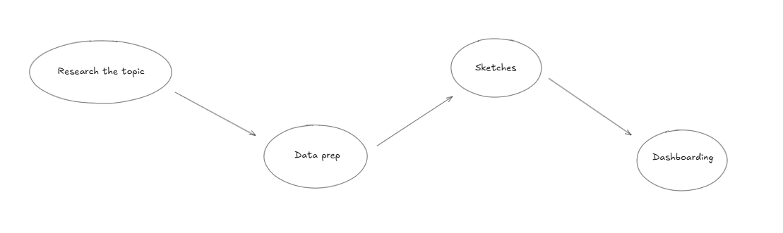
1. Research
I started the day by doing some research on the game and its economy. Googling and using ChatGPT was particularly helpful.
2. Data Preparation
Preparing the data was straightforward:
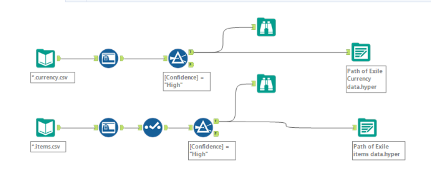
- I downloaded the relevant files and used a wildcard input in Alteryx to pull all necessary data files at once.
- To handle the large dataset efficiently, I extracted the data as a Hyper file. When saved as a CSV, the file frequently caused Tableau to crash, but the Hyper format resolved this issue.
3. Data Filtering
The original dataset contained almost 60 million rows, which made processing and analysis cumbersome. To streamline the data:
- I filtered it to include only high-confidence data points. This ensured that the visualisations were based on reliable information and excluded noise from low-confidence data.
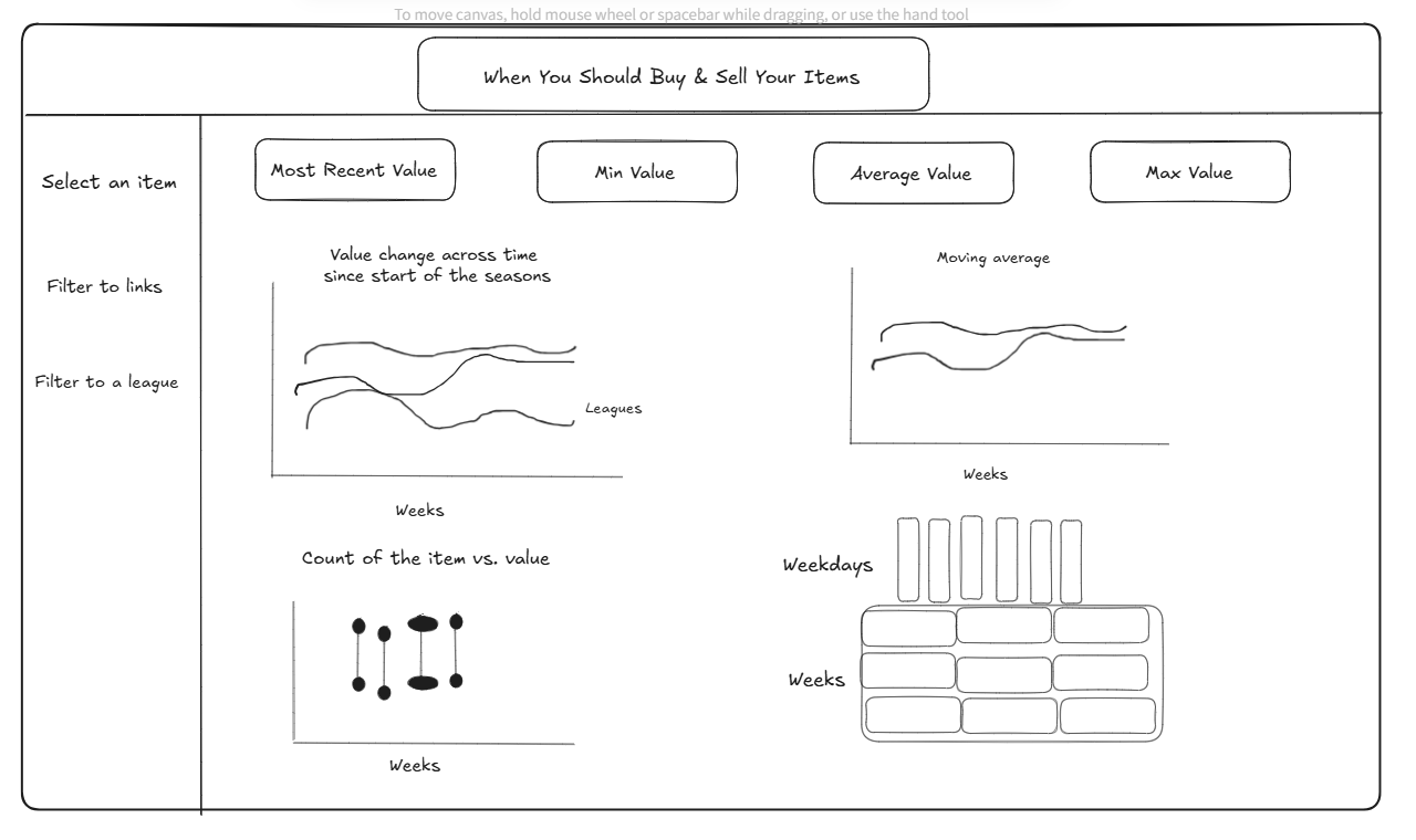
3. Sketching the Dashboard
Once the data was prepared, I created a sketch of the dashboard layout. My focus was on building a tool that allowed users to:
- Select a specific league and item.
- View how the value of that item changed over the duration of the league.
The sketch helped me stay focused on what was feasible within the remaining time while still providing valuable insights.
The Dashboard
The final dashboard was designed to highlight trends in the game’s economy by tracking item value changes across leagues. While I couldn’t include every feature I envisioned due to time constraints, the end result was somewhat functional and insightful.

Lessons Learned
One of the lessons from today was the importance of saving work regularly. What I would recommend is to save all workbooks directly to Google Drive, which automatically saves every few minutes.
Lastly, be mindful of the choice of your colour palette, especially when presenting on a big presentation screen, as some colours (such as dark colours in my case) may not be fully visible like they are on the laptop screen.