Unit charts, also known as Pictogram Charts, use icons to represent quantities of a total broken down by a dimension. While they might not be as clear as the industry-standard bar charts, they can effectively highlight specific information and add a creative flair to your visualisations. Commonly seen in online stores displaying an item's star rating, Unit Charts can make your dashboards more engaging, especially when you're looking to diversify beyond traditional bar charts.
In this guide, I'll walk you through creating your own Dynamic Unit Chart in Tableau Desktop. A big shoutout to Chris Love's blog for the foundational knowledge—without his insights, this would have taken me much longer to figure out. I've adapted his steps and calculations to craft my version, and I'm excited to share this process with you.
Words of Advice
Before diving in, here are a few tips to keep in mind:
- Explore Alternatives: Unit charts aren't always the best choice. Consider other visualisation types like Dot Matrix Charts, Donut Charts, Treemaps, Stacked Bar Graphs, Pie Charts, Marimekko Charts, Packed Bubbles, or Highlight Tables based on your data and audience.
- Choose Recognisable Icons: Use simple and familiar icons to ensure your audience understands what each represents.
- Maintain Consistent Icon Sizes: Opt for icon sizes in multiples of 5 or 10, preferably 10, to keep the chart clean and understandable.
- Include Legends and Labels: Provide clear legends and labels to offer context and additional information to your viewers.
For this tutorial, we'll be using Tableau's Sample Superstore dataset, focusing on the fields Region (Rows), Order ID (Details), and Category (Colours).
Step 1: Create the Parameters
Parameters allow you to make your Unit Chart dynamic and adjustable. We'll create two parameters:
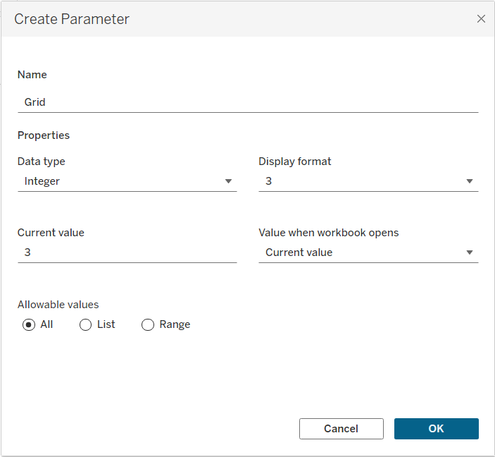
- Grid (Integer)
- Default Value: 3
- Purpose: Determines the number of rows of icons per column.
- Icon Size (Integer)
- Default Value: 10
- Purpose: Specifies the number each icon represents.
To create a parameter:
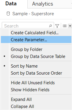
- Right-click in the Data pane and select Create > Parameter.
- Name the parameter (e.g., "Grid" or "Icon Size").
- Set the Data Type to Integer.
- Enter the Default Value.
- Repeat the process for both parameters.
Remember to display these parameters:
- Right-click each parameter in the Data pane and select Show Parameter. This allows users to adjust them directly from the dashboard.
Step 2: Create the Calculated Fields
Next, we'll create calculated fields 1, 2, 3 and 4
1 - ColumnID - Drag it to Columns
INT(((INDEX()-1) / [Icon Size]) / [Grid]) + 1
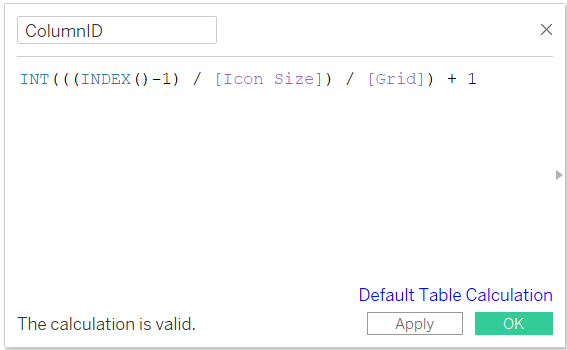
2 - RowID - Drag it to Rows
((INDEX()-1) / [Icon Size] % [Grid]) + 1
(Important: Change RowID from continuous to Discrete by right-clicking on it and selecting Convert to Discrete)
Purpose: These calculations divide your data into columns and rows based on the parameters you've set, effectively creating a grid layout for your icons.

3 - Icon Filter - Drag it to filters and tick True
(INDEX()-1) % [Icon Size] = 0
For all the calculated fields above: Edit table calculation, choose specific dimensions, select OrderID and Category as we want the calculation to re-start at every Region.
Purpose: This filter ensures that only every nth item (based on the "Icon Size" parameter) is displayed as an icon, preventing overcrowding and maintaining clarity.
4 - Sum Label - Drag it to Label
IF [RowID] = 1 THEN STR(WINDOW_SUM(COUNTD([Order ID]))) END
Purpose: Filter the data to display only the first item in each group defined by "Icon Size".
Only for Sum Label: Edit table calculation, choose specific dimensions, select OrderID (only) as we want the calculation to re-start at every Category and Region.
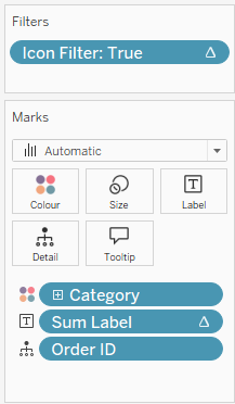
Step 3: Change the Mark Type to Shape
- Set Mark Type
- In the Marks card, change the mark type from Automatic (usually a bar) to Shape.
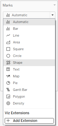
- Choose a Shape
- Click on the Shape button in the Marks card.
- Select an appropriate icon (e.g., a person, product, etc.) from the shape palette. You can also import custom shapes if desired.
- Adjust Size and Layout
- Click on the Size button in the Marks card to adjust the icon size. A medium size usually works best.
Visual Aid: At this stage, your visualisation should display a grid of icons representing your data, but it might still look a bit raw.

Step 5: Finalise the Layout and Add Labels
- Hide Headers and Gridlines
- Right-click on both RowID and ColumnID headers and select Hide.
- Remove gridlines for a cleaner look by navigating to Format > Lines and setting Grid Lines to None.
- Add Legends and Parameters
- Create a separate worksheet for the legend if necessary.
- Ensure that the Grid and Icon Size parameters are visible on the dashboard for interactivity.
- Organise Your Workbook
- Group all related calculations into a folder within the Data pane for better organisation and easier navigation.
- Finalise Formatting
- Tidy up fonts, sizes, and alignments to ensure a polished and professional look.
- Remove any unnecessary borders or backgrounds to maintain focus on the data.
Tip: Consistent formatting enhances readability, accessibility and makes your visualisation more appealing to the audience.
Ti
