


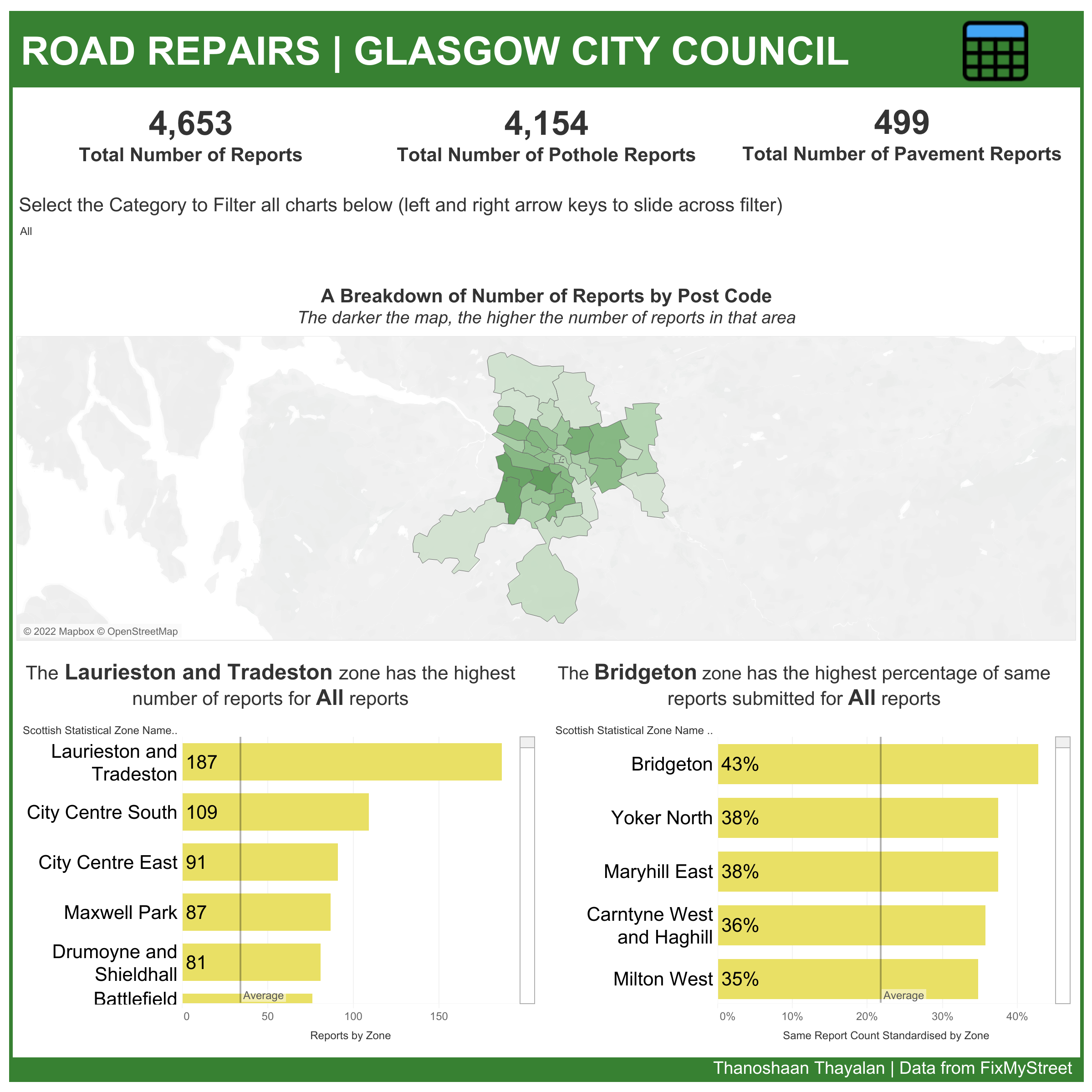
Whilst this is the second day of dashboard week, this was our first dashboard output and it was focused on producing a dashboard that was accessible to the residents of Glasgow who wanted to be able to see the road repair data.
The Key Inclusions
- KPI's were in a sheet so it can be read by a screen reader and in big letters for visually impaired
- The titles for the charts explain the results of the chart so when a screen reader reads out the title, it gives an easy explanation to the user of what the chart is showcasing
- Bar charts are very simple to give the user more familiarity and big in size to give the user more visibility
- Font used was Arial as sans-serif fonts are easier to read for users
- Colour choice was based on the Glasgow City Council logo but it was contrasted well with the background and also was colour-blind friendly
- A tabular format was included as a dashboard navigation button to make it easier to read out data that was included in the bar charts
Challenges and Feedback
- Main challenge was to try and make it user-friendly for multiple accessibility use cases
- Include a text next to the table navigation button to inform the user via sight as to what the button represents
- Having a dropdown filter rather than a slider as you can edit the size of the values within the filter and the navigation with a tab will still be easier given that there are only 3 options
A link to the dashboard in Tableau Public: https://public.tableau.com/app/profile/thanoshaan.thayalan/viz/RoadRepairsGlasgowCityCouncil/RoadRepairsDash