


There was a lot of growth from me learning about Tableau during my Fullstack Academy bootcamp to me submitting my initial application for the data school.
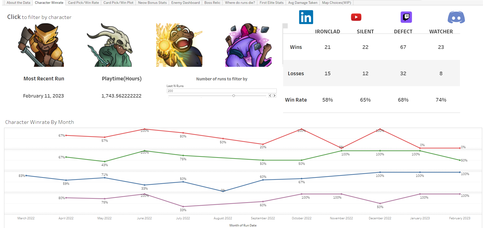
After learning and starting to get the hang of Tableau, I immediately started working on answering as many questions as I could about Slay the Spire. Slay the Spire is a single player strategy card game that I have set some world records in and held until some point late in 2022 (no longer have them getting them back soon). There are so many areas in Slay the Spire where data can help to make decisions and it is a difficult game where most people win around 9% of the time at the highest difficulty, while a few win over 65% of the time regularly. There are plenty of questions from those trying to improve at the game. Which card is picked the most? Which card performs the best? Is this card going to help more in the early game or late game? Is this card being detrimental early worth the risk late game? How much does the boss I'm fighting change the rating on these cards? Which enemy is the most dangerous? How can I prepare for that enemy? This is just a few of the many questions.
There is a simple answer to all these question. "It depends." That is what I would say to most questions people would ask me about the game. There are so many different factors in the game so a lot of context is needed to be able to give advice. That is where Tableau comes in. With the use of filters and parameters I can help users with advice that is tailored to the situation they are in. All of the data in the game is not available so there will still be other factors to consider and at the end of the day the answer will still be it depends. However, a generally good answer and guideline for someone to use until they are at a point where they can better assess the full situation themselves can be provided with my dashboards.
Here is what my original dashboard looks like.
There are multiple worksheets where I did my best to provide data that could answer questions about different areas of Slay the Spire. I didn't pay much attention to formatting or how it looked. I just tried to answer questions with the data and as soon as I did I moved on to the next question to answer.
When I started thinking about how I could turn this into a single dashboard I had to figure out how to combine the various sheets and mini dashboards together in a way that makes sense and is useful. I decided to focus mainly on the first portion of the game, Act 1, since there is less variance and factors leading a player in a particular direction.
What I focused on.
- Formatting: This was a big focus and change from my original project. I made sure all of my font and titles were the same formatting.
- Colors: Making sure that my use of color makes sense. There are 4 characters in the game that are each associated with a color. So when adding color to the background of the dashboard and trying to not repeat colors it became difficult deciding on which color to use for other areas I would like to use color in.
- Interactivity callouts: I would sometimes instruct users that my dashboard was interactive in my earlier dashboards but I was more intentional about instructing the users on interactivity this time around.
- Providing context: This was very important and hard to fit into a 5 min presentation. When doing this as a personal project I could just assume the reader has some knowledge of how Slay the Spire works but for my data school application I had to balance explaining basic concepts of the game with data driven insights related to them.