Its dashboard week. This week everyday starting at 9am DSNY4 will be given a topic and a place to get data from and must come up with a Blog and Dashboard each day.
Todays topic is Bundesliga, a German football league.
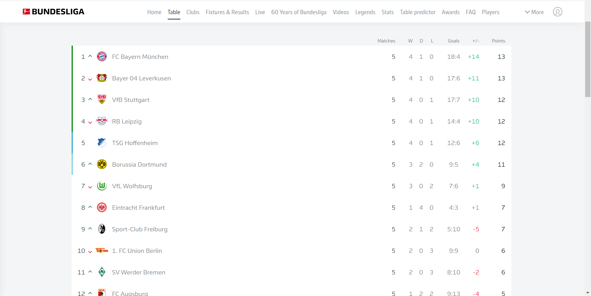
The following table and the requirement of including at least the last 20 years of data were the only real guideline we were given.
Webscraping:
Since our starting point was a website I knew webscraping would be involved and went straight to Alteryx.
I had to remind myself a little about the process of webscraping and tools that you can use to aid you. Sublime was a helpful tool for this portion.
Started off with just the URL for the main page and didn't worry about any of the other 19 years at first. Just wanted to get all of the information for 1 year 1st.
Ran the URL through the download tool and thats when the problems began...
None of the information for the table was present in the portion Alteryx outputted. I remembered you can use the browse tool to see more of the data but that did not help. I copied the output of the browse tool and pasted it in both notepad and Sublime. To my horror none of the information I was looking for was there when I used ctrl + f. I stumbled around with inspect element and checking the different webpages before another member of DSNY 4 mentioned something that got me on track. Even with the browse tool the data Alteryx is showing you is still truncated.
The way I handled this was to see what was the farthest point I could see in the data I would be able to use Regex to narrow down to. This allowed that to be the new starting point and for me to see farther into the html code. After two or 3 times I found the data related to the table!
The flow becomes pretty straight forward from here.
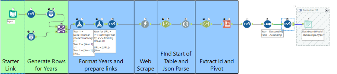
The data was in the form of a dictionary in python or json data so after a Json Parse tool, some pivoting, and some cleaning up I was good to go.
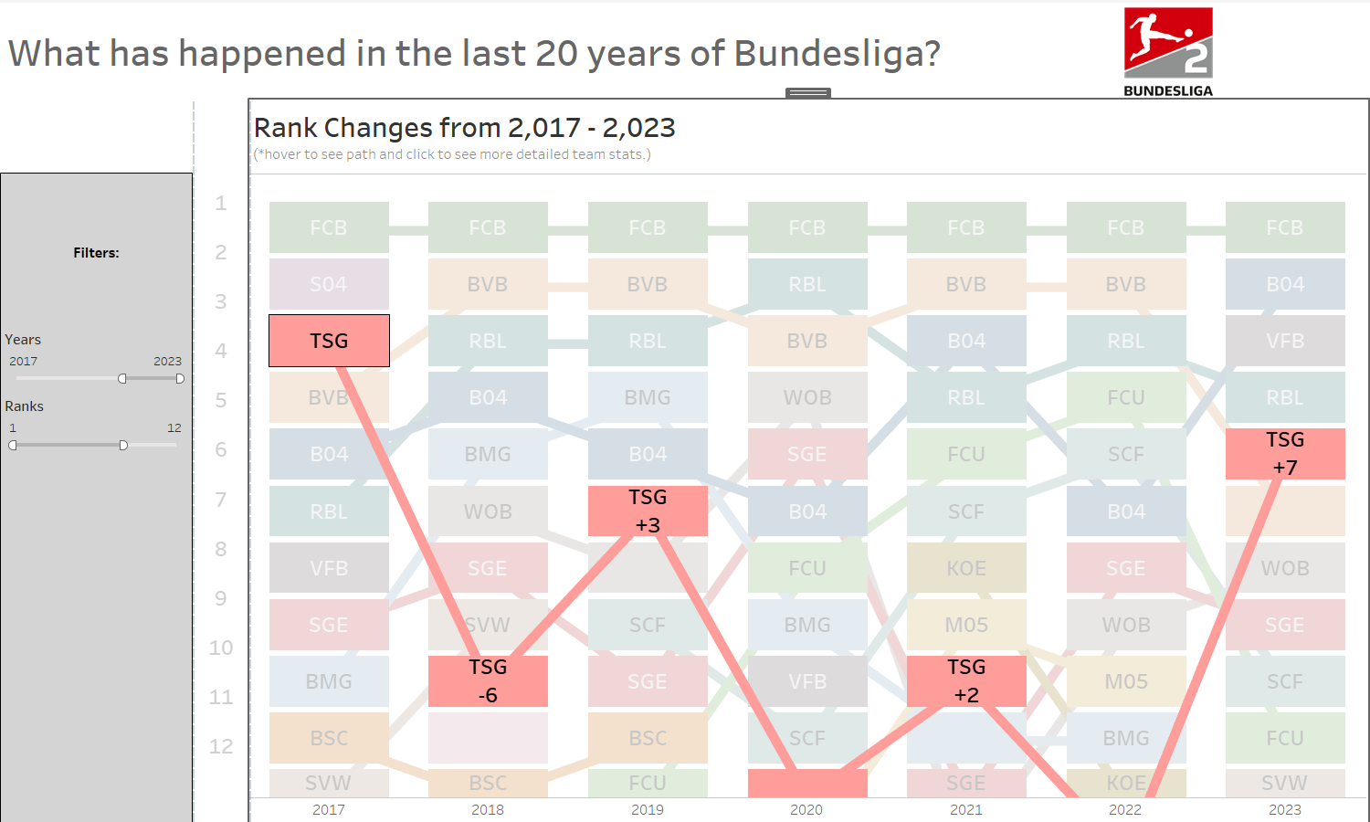
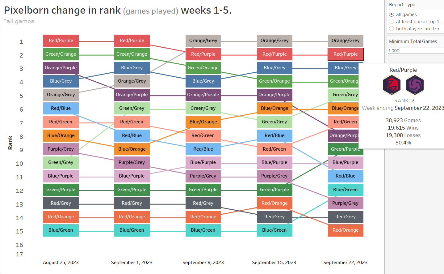
Just last week I was working with a rank chart and this data also had ranks so I knew I wanted to incorporate that. Here is what I was working on last week.
This leads me to my excalidraw... which was made after playing around in Tableau. I prefer to just visually explplore the data myself for a bit and find interesting things and narrow down rather to have a full plan going in.
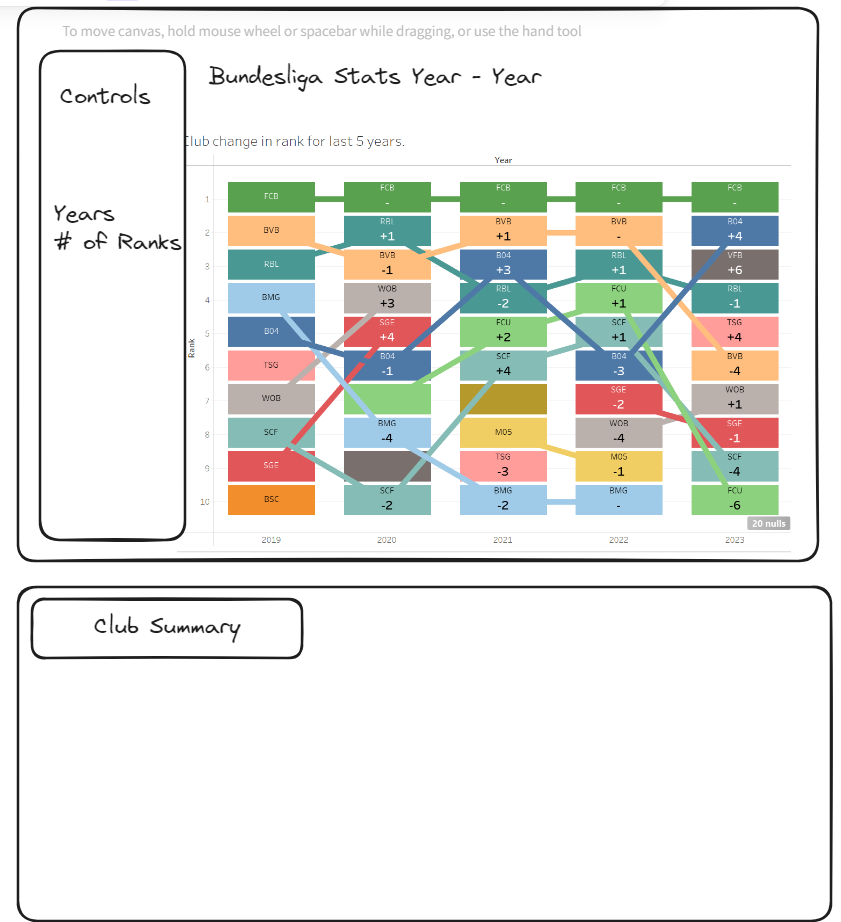
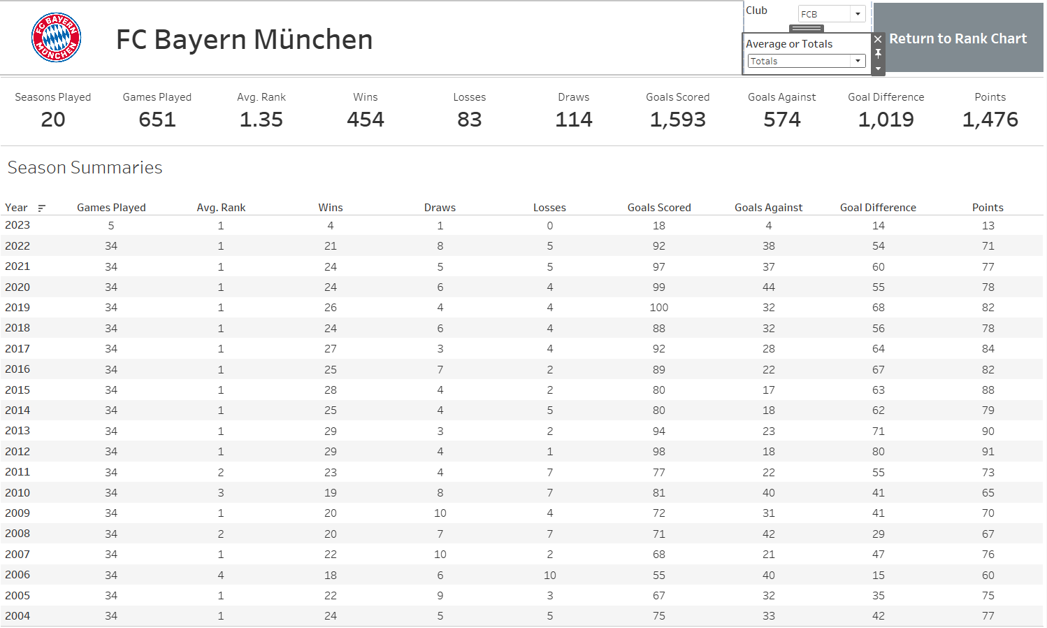
I incorporated the rank chart as well as how many ranks a team has gone up after each season. So all that was left is to create the summary for each team that can be reached by clicking on a team in the rank chart.