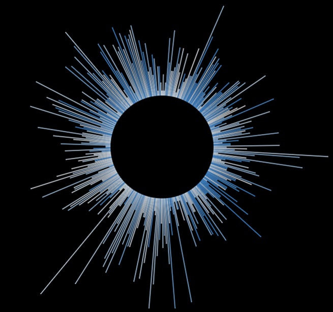
During Dashboard Week I wanted to explore some chart types I hadn't done before. This way I came across the Radial Line Chart which some people refer to as Radial Bar Chart. It might not be THE most easy chart to read or to quickly communicate insights, but it is a nice way to fancy things up a bit and works very well if you are looking at some sort of reocurring periods like years as in this example. So here is how to do it:
After connecting to your data you'll have to create a union of it onto itself which will create a field for the table name to then be able to calculate a "Path" Field: IIF([Table Name] = "tablename.csv", 0, 1). This will later serve to connect the inner starting point of the lines with their outer ending point. It will be needed as dimension on the Path card (works on Detail as well).
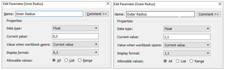
Next up we will need two parameters for the inner and outer circle, where both are floating values and the outer radius will obviously have to be larger than the inner radius. You can adjust the values later, depending on the length you want your lines to be.
Then we'll have to create a calculated field to define the radial angle:
(INDEX()-1)*(1/WINDOW_COUNT(COUNT([measure of interest])))*2*PI()
where the measure of interest will be the field that will define the lengths of our lines in the chart. This calculation distributes the number of days/months/whatever your measure radially, hence the Pi value.
We'll also need a calculation for the normalised length:
[Inner Radius]+ IIF(ATTR([Path])=0, 0, SUM([Measure of Interest]) /WINDOW_MAX(SUM([Measure of Interest]))*([Outer Radius]-[Inner Radius]))
This calculation adds the Sum of our measure divided by its window max to the length of our inner radius but only if our Path does not equal zero. So our original data will serve as the starting point for the lines and our ending point will be calculated with the duplicated data we unioned onto the original in the beginning. The last part of the calculation does the normalizing.
Then we'll come to the point in our lives where we actually will be needing the sinus and cosinus function again - my 15 year old self would be shocked! We'll have those two calcs to let Tableau know that our radially distributed lines are supposed to form a circle:
Radial X: [Normalised Length] * COS([Radial Angle])
Radial Y: [Normalised Length] * SIN([Radial Angle])
The Radial X will then go to Columns and the Radial Y to Rows. We'll also need the field that defines the period of our circle on Detail (for me that was DAY(Date)) and make sure that our Radial X and Y are computed using this field. If everything is going according to plan you should be able to get some sort of (skewed) circle already at this point. Fixing both axis to the range of -1 to 1 will make your circle nice and round. You can also adjust the inner and outer circle by editing the two parameters you created before.
Now all that's left to do is some formatting, like hiding headers and removing gridlines. Depending on the unit of your period field (day, month, quarter, etc.) you might want to change the size of your lines. And that's it, enjoy your brand new radial line chart!