


As in every cohort of the Data School the Dashboard Week marks the end of our training period. This means that each day we are getting a data source in the morning, which we then have to prep and visualize in a way that our dashboard answers some sort of question and/or adds value.
On the first day of DSDE2’s dashboard week we received data on migration to and from Hamburg, including numbers for all the states but also Hamburg’s surrounding communities and abroad. The excel files we could download were relatively clean – compared to previous experiences in some customer projects. I used Alteryx to remove all the unnecessary rows unioned the seven files and played around with some RegEx to remove some numbers from the state names. I also extracted the year from the file name and created dates for the quarters as each file contained data for one quarter. There was another sheet in the files which contained data for the previous year, which I decided to only use when I had time left. During the training period and especially during the client projects I learned to scope my work. I’d rather stick to simpler stuff and make sure that all the numbers are correct and the actions work as intended than having a super complicated dashboard where I am not sure whether it will break during my presentation.
That being said I decided to have just one visualization on my dashboard which I knew would require a manageable amount of work. My idea was to create a map view with paths that represent the flow of migration to and from Hamburg - I remembered that we had a session with Andy where we created such a map for flight routes.
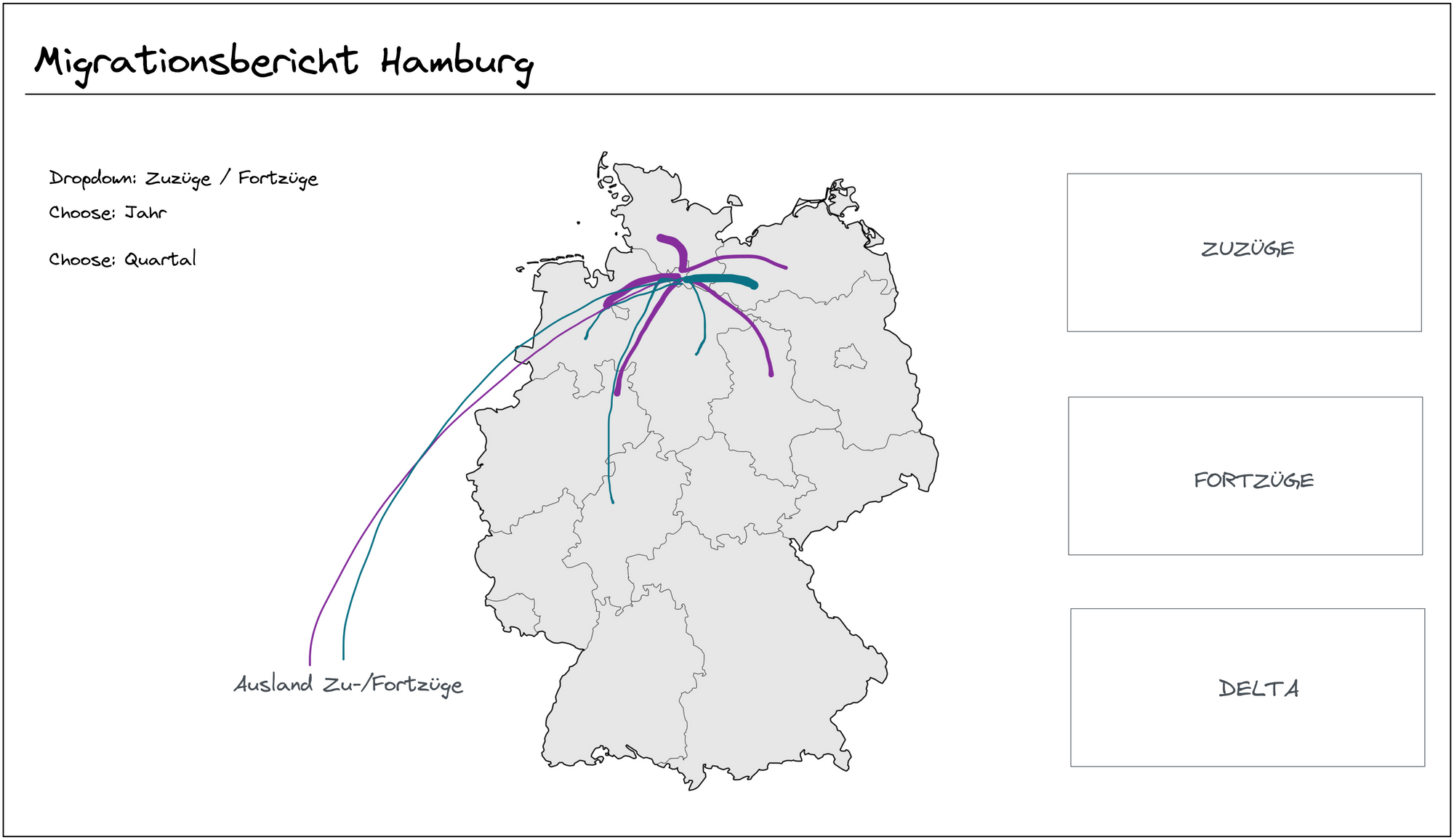
For this task I first needed data on the longitudes and latitudes of the German states. On another blogpost from the Data School I found a quick fix for this. As I already were able to generate a map just with the names of the states I could then easily select all the points on the map and with a right click on “View Data” see all the longitudinal and latitudinal data for the states. I exported these in a separate file and joined this file back together with my original data. With those new columns I could now create destination points for the paths with MAKEPOINT. As I also needed an origin point (Hamburg) which was not included in the original data, I created two calculated fields, one for the latitude and one for the longitude of Hamburg. With the MAKELINE function I was then able to create the paths from Hamburg to all the other states. I colored the lines in regard to the number of people who migrated and edited labels and tooltips.
I also added a parameter dropdown which allowed you to choose between the directions of the migration and filters for the year and quarter. The rest was just some BANs to have summarizing numbers at a glance and a bit of formatting.
Overall I really enjoyed the first day of dashboard week. I was able to use a lot of the things I learned in the last four month and even had a bit time left. So for tomorrow I will try to bring in a bit more content while still keeping it clean and understandable (and also still being able to take breaks).
You can see the final result of my dashboard here.