


So, I had some time at hand and played around in Power BI. It's been a while since I used it last so the dashboard I built was super basic just to get a bit of a feeling for the programme. Still, I wanted to publish it somewhere, because a) everything is content and b) to document the learning process. Having Tableau Public in mind I naturally headed for the official PBI community - their Data Stories Gallery seemed to be just about what I was looking for. Even better, you can actually sort posts when searching for a certain topics, a feature that's definitely missing in Tableau Public. But one thing I noticed was how long it took each time to load the site, so you might need to be patient here.
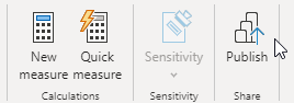
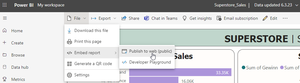
I went back to my PBI Desktop and "published" the dashboard by clicking the according item in the menu.
I was hoping for an option to publish directly to the community but were only offered two options, of which I chose "My workplace" to not clutter our team environment.
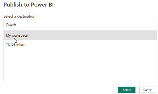
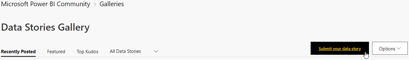
I got a short message telling me that the upload was successful and then it took me quite a bit to remember how to get to "My workplace" but I finally found it and there was my published dashboard. But this was still only accessible to me and myself only so I went back to the Data Stories Gallery and selected "Submit your data story":
Next up opens the following view:
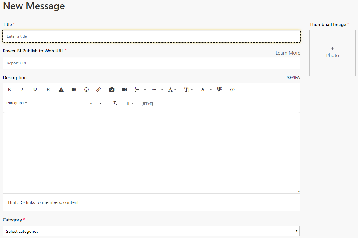
While Title, Description and Category made perfectly sense to me, it took me another Google search to figure out which URL they wanted from me: You need to go back to your workplace or wherever you published your dashboard. Select the dashboard. Select File, Embed report, Publish to web (public).
In the window opening up then, select the first link "you can send in email":
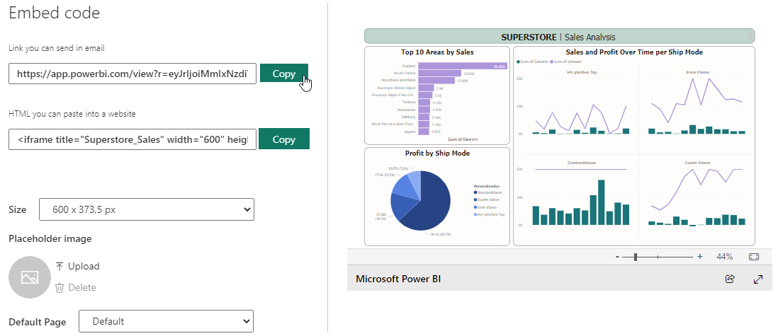
Paste that to the URL field and you're almost good to go. Last thing required is a mandatory thumbnail image, so I just took a screenshot of the dashboard and uploaded that. You can now look at my very basic but published Superstore dashboard here.
So a few Pro Points for the Data Stories community (compared to Tableau Public):
+ you can like and comment posts, it's really more of a classic discussion forum
+ better search experience
And a few Cons:
- not really intuitive
- quite sure it's not meant to be used for building a portfolio. When you have a look at someone's profile you don't get the nice portfolio layout you have in TP.
- I wish it could just take like an auto-thumbnail from the dashboard.
I also was today years old when I learned that the Data Stories Gallery is not really A THING, or at least not the thing I was hoping for. Apparently all the cool kids are building their portfolio at novyPro right now. I had a very quick look at it as well, of course. Signed up using my Google account, clicked the little plus sign on the top right and added a report. You have to put in a title, a picture, a link and something called a slug, which I only knew from my garden to be honest. Edit now that I know: it's the project name/id which will be displayed in the URL.
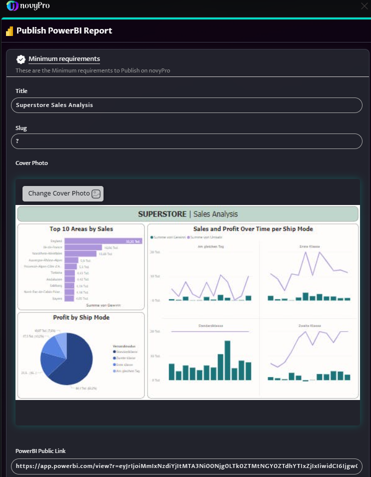
As you can tell, my screenshot did not meet the requirements for a nice resolution, so there are still a few points on my end to improve when using this plattform but it seems to offer a better portfolio view and also gets an extra point from me personally for the dark mode view.