The first dashboard challenge of the week was creating a visual CV using Tableau.
I started by writing a user story, which was the following:
- someone wants to have an overview of my experiences and competencies
- they want an interactive dashboard and the possibility to filter by time
My scope included the following:
- my academic and work experience
- my volunteering experience
- competences: language, software and interests
- links: LinkedIn, Tableau Public profile, Data School profile
- annotations
Data needed:
- start + end date, title, activity, type (academic, work, volunteering), description
- competences & relevant experiences
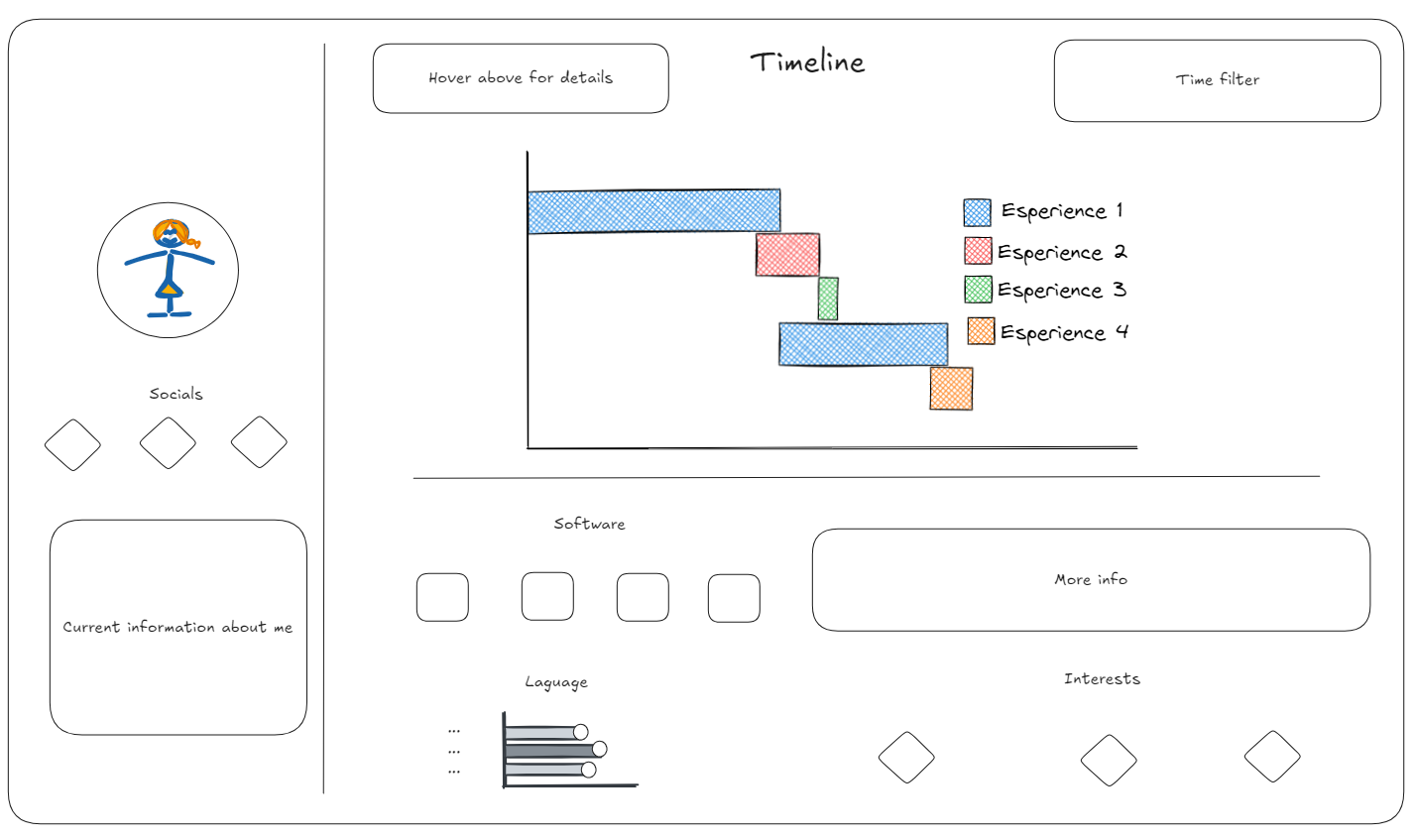
I opened Tableau Public and searched for visualizations that appealed to me. The one I was referring to the most was this one. Soon afterwards I started to sketch and the result looks like this:

The next step was creating and preparing data in Excel. The fields included those that were mentioned earlier. The result, version 1, is liked here and is interactive. The interactivity includes buttons that are used to redirect to the corresponding web page. Moreover, hovering above Activity items and Software items will give the viewer more information in the tooltips.
What changed
I did not implement the filter because the timeline was already in chronological order and I did not have any other time-related items on the dashboard. I chose not to use a bar chart for languages because the measures can be subjective and decided to write them down as text, which is more precise.
Do better next time
- incorporate an information button saying "Hover above the items for more details"
- include more information in the Software buttons such as dashboards created; use shapes instead of images for Software and put additional information in tooltips
- visualize languages with flags
- add more information to Interests
- include SQL
- incorporate a time filter to highlight both experiences and skills
