Does it make sense to have a presenting structure?
A well-designed dashboard serves as a powerful solution to extensive data analysis, supporting important decision-making, therefore, a clear communication of its content is essential. While every dashboard is unique, sticking to a certain structure can help convey messages effectively, providing a familiar framework for the audience to rely on. In this guide, I will explore best practices for structuring and presenting dashboards, focusing on strategies that apply to most visual reports. It’s important to remember that what makes sense to the creator may not be immediately clear to the audience. Therefore, ensuring accessibility by offering clear guidance both within the dashboard and during its presentation is crucial.
Preparation is key
Most sources on dashboard design start with the same sentence: "Know your audience,” and this certainly applies to presentations as well. Write a user story to clarify the audience’s needs and goals. This will reflect on what value the data can add to them, providing a great roadmap to what the deliverables should be. Formulate questions and hypotheses as a base for the analysis and organize the data by relevance and importance.

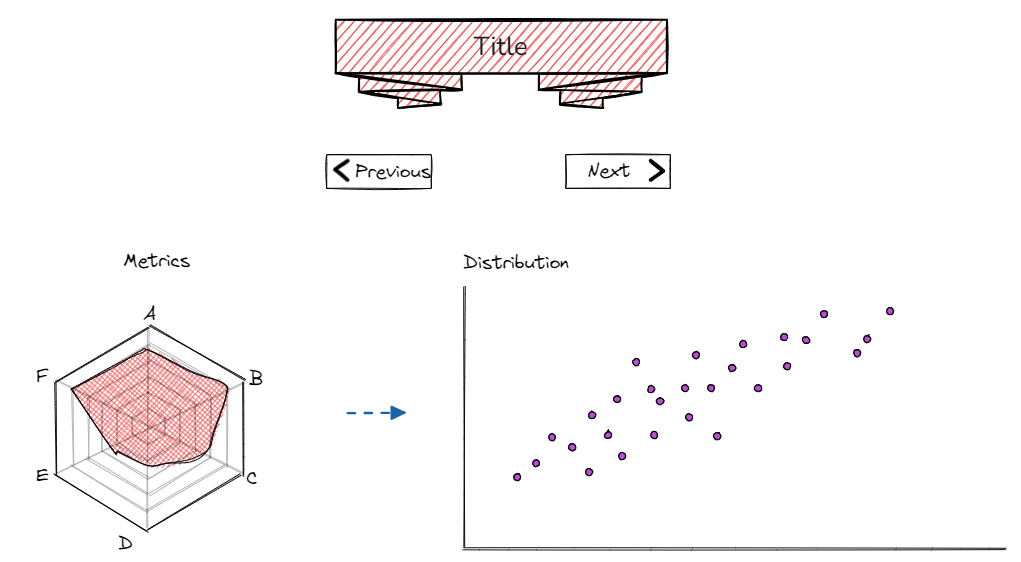
An explanatory dashboard should have at least one takeaway message. Answer the question “So what?” and make your purpose clear. Brainstorm and write down all the points you want to make in your presentation, from problem to analysis/action to outcome. Afterwards, organize them in a storyboard. For more information on storyboards and storytelling with data, see storytelling with data: let’s practice. Before building the actual visualization, it is helpful to draw the storyboard/sketch and get feedback.
Use visuals to elevate your presentation flow
Visuals should be appropriately labeled and thematically similar charts grouped together to make sure the audience understands the link between the visuals the same way as you do. Build a seamless progression from one visual to the next, where each analytical exploration builds on the previous one. Do a test to see where your eyes are drawn when you first look at the visualization and use the insights to make adjustments to the colors, position and size. Avoid unnecessary information and eliminate clutter—use the white space efficiently.

Dashboard presentation guide
When it comes to the actual delivery, there are some best practices that you can follow to make your next presentation more structured and compelling. Design principles suggest that a user-friendly dashboard often follows a Z-pattern, aligning with the natural eye movement from left to right and top to bottom. This layout emphasizes the high-attention areas at the top-left and bottom-right corners, as illustrated here. With multiple elements on the dashboard, the Z-pattern can also serve as a general guideline for organizing the presentation flow effectively.
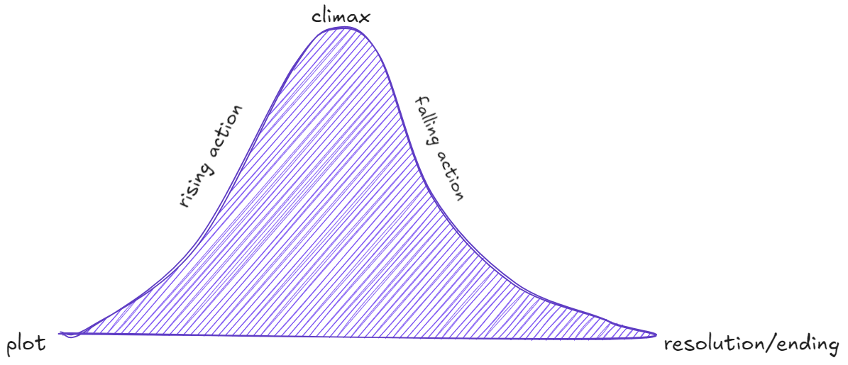
A widely discussed concept in storytelling literature is the narrative arc, which typically includes the plot, rising action, climax, falling action, and resolution. Consider how your data aligns with these stages—refer to the list of keypoints that you created earlier. Feel free to adjust, add, reorder, or even remove elements of the arc to better fit your story and ensure it flows logically. Here it may be useful to think about whether and how tension and conflict can help your message stick with your audience. Things like positive vs. negative framing or a pitchy, repeatable phrase can make stories more memorable and help move the information from short-term to long-term memory.

When it comes to presenting a particular graph, write down a few sentences articulating 3 different observations from this data, then narrow it down to one that describes it and articulates the takeaway most clearly. It might include some aspects of the other sentences in it. Determine changes that need to be made to better focus the audience's attention on the chosen takeaway.
The last piece of advice would be to imagine what the audience might want to do and show them a concrete example so that they can see the impact, instead of telling them what you did. For example, you could start with “If you are X and would like to do Y, you start here … ”.
In the end, every presentation is unique and it is difficult to develop a strict guideline for presenting a dashboard. However, there are best practices and it is good to be aware of them. Once you master the best practices, you can adjust them later intentionally, depending on your goals.
