The last day of Dashboard Week was dedicated to our personal projects. Therefore, my task for the day was to visualize my Nextflix data to understand my habits and preferences better and discover useful recommendations.
The raw data only included two fields, which were title and date. Although you can get interesting insights from that information alone, I wanted to include additional data. In Alteryx, I began merging my own watch history with a dataset found on Kaggle and my workflow looked like this:

The first two inputs are my own data, which required some cleaning due to thhe inconsistent date formats. Then the datasets were unioned, which worked perfectly well. Joining the external dataset led to some loss of data due to the lack of matches. With more time available, my improvement steps would be to prevent that from happening and include as much data as possible.
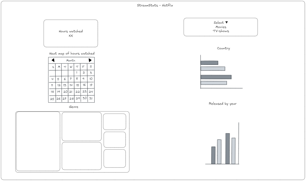
The sketch included two major parts — the static one on the left and the interactive one on the right to switch between movies and TV shows.

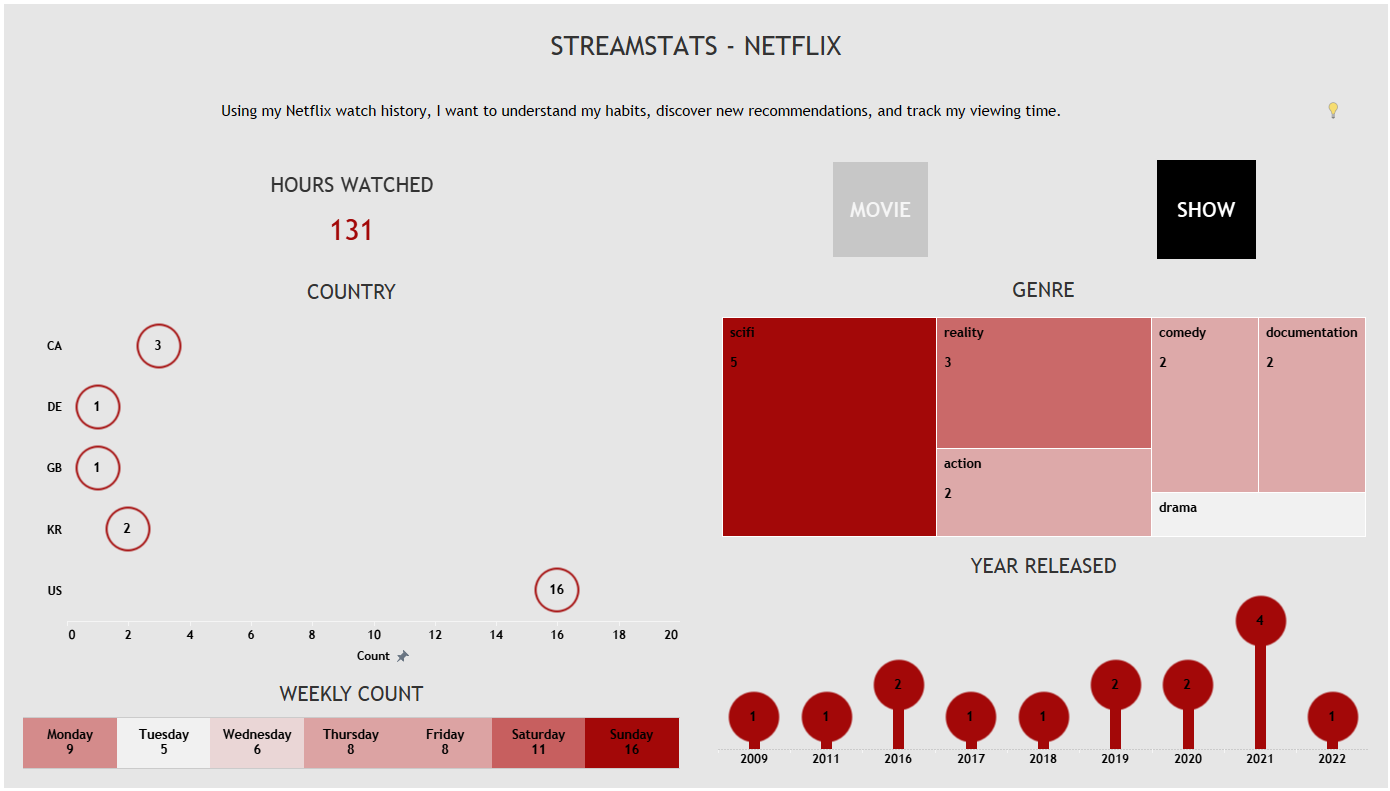
Some of the feedback after the presentation was to include story/explanation elements, change the country shapes and have a lighter background or no background. After making those adjustments, the final version looks like this:

Ideas for version two:
- URL actions for each movie & show with further information
- visualize the total number, and view it in a timeline
