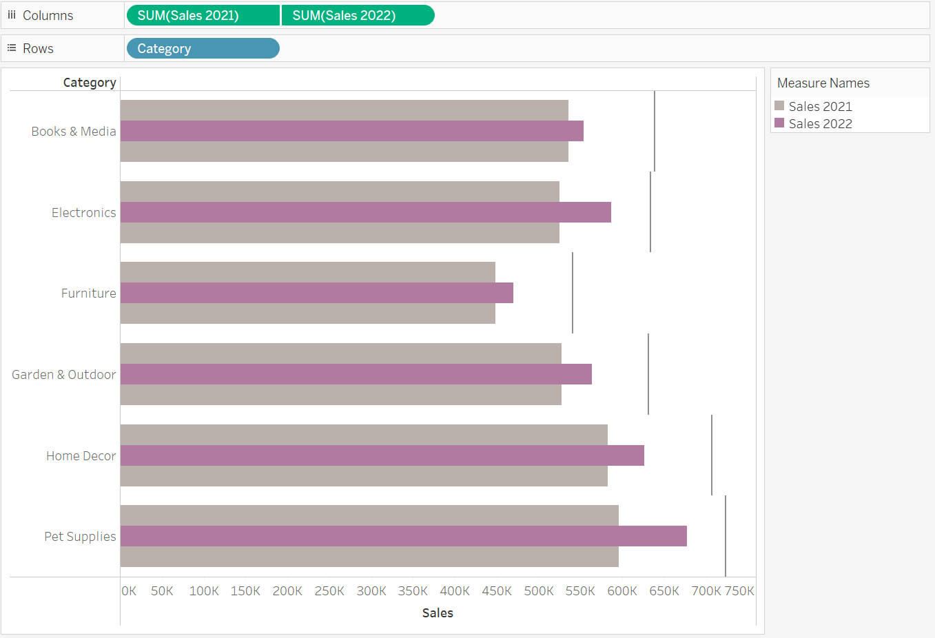
Given the variety of chart options available, it's important to choose one that conveys the message most effectively. For performance-based questions in organizations, a Bullet Graph is an excellent choice for tracking progress against multiple measures. It can effectively display goals, current performance, and historical data within a single, clear visualization.
What can you analyse with Bullet Graphs?
Bullet graphs are typically used to compare forecasts with actual numbers, such as measuring progress toward specific goals or evaluating customer load on a given day versus the average. By incorporating a reference line, like a sales target, along with additional measures such as past performance or projections, a bullet graph provides detailed insights while fitting more information into a compact space.
What is the structure of Bullet Graphs?
Although Bullet Graphs are highly efficient and fit a lot of information into a limited space, they are less commonly used and may not be immediately understood by all audiences. Therefore, it is recommended to ensure the audience is familiar with them before use. In a Bullet Graph, a single bar, typically in a bold color, represents the primary measure. A vertical reference line indicates a quantitative goal, while additional dimensions—such as forecasts or past performance—are shown as shaded areas around the main bar for added context.
When are Bullet Graphs not ideal?
Avoid using Bullet Graphs when data sets cover different time periods or when comparing a quantitative measure against a qualitative range is not required. They're unsuitable for analysing trends, part-to-whole relationships, or data distribution. Instead, Bullet Graphs are most useful for making direct comparisons. To keep the visual clear, limit the comparison to a few categories and use a minimal color palette.

