As someone interested in continuous improvement, I’ve decided to revisit my old visualizations and refine them, dedicating roughly the same amount of time as I initially spent creating them. These charts and dashboards, originally created during Makeover Monday, could benefit from a makeover to enhance their informative value.
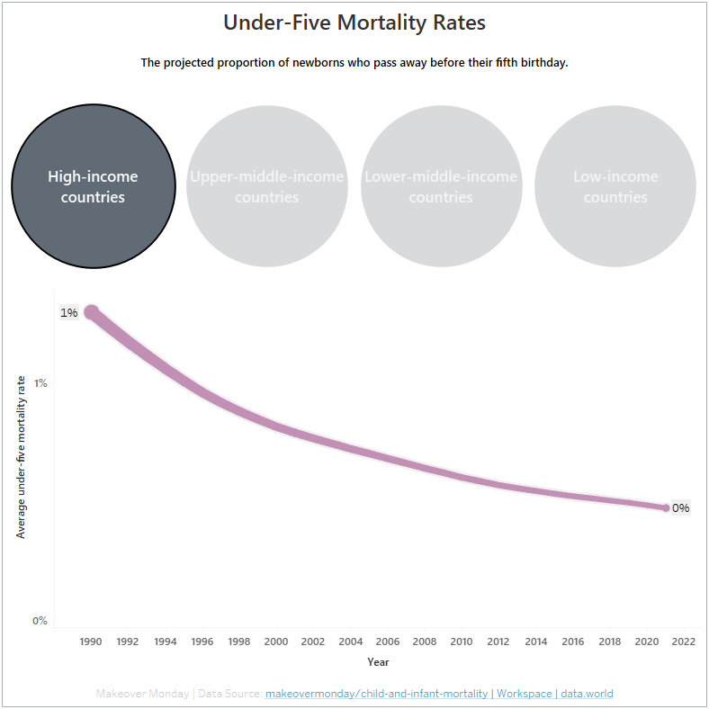
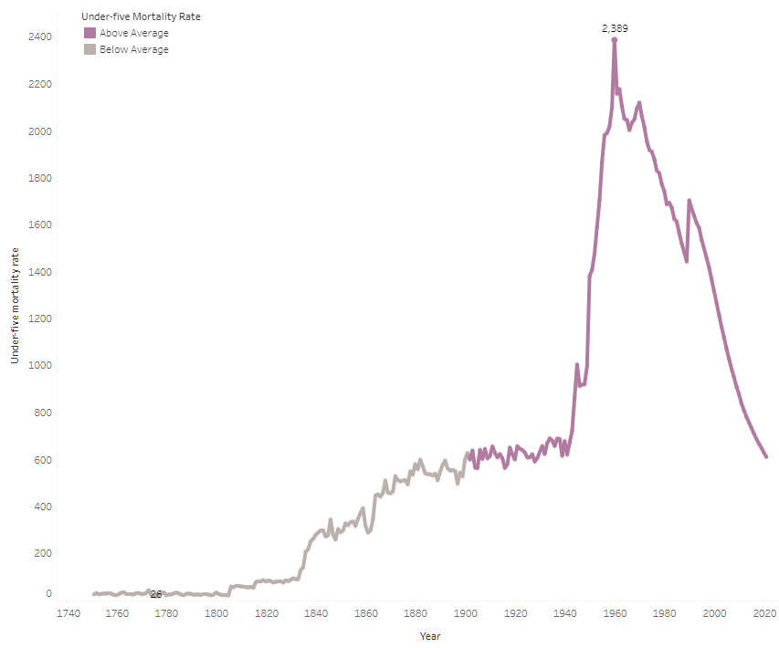
The first chart was about child mortality rates and first thing I noticed was that the mortality rates were aggregated, which is not how it should be. Furthermore, there is a floating legend that may travel around the viz on other displays, so that should be changed as well.
I introduced a few improvements to the new interactive version by breaking down all countries into four categories. Luckily, they were already grouped in the dataset. Furthermore, I enhanced the look of the line chart by adjusting its thickness according to the rate and displayed the mortality rate in percentage. The year-axis has shrunk due to the absence of some entities in the chosen categories. I added borders to the whole dashboard to be able to see them. Finally, I added some information on the data and linked the source.