To give a bar chart a softer, a more modern appearance, you might consider creating a rounded bar chart. In this blog, I’ll walk you through the steps to create one.
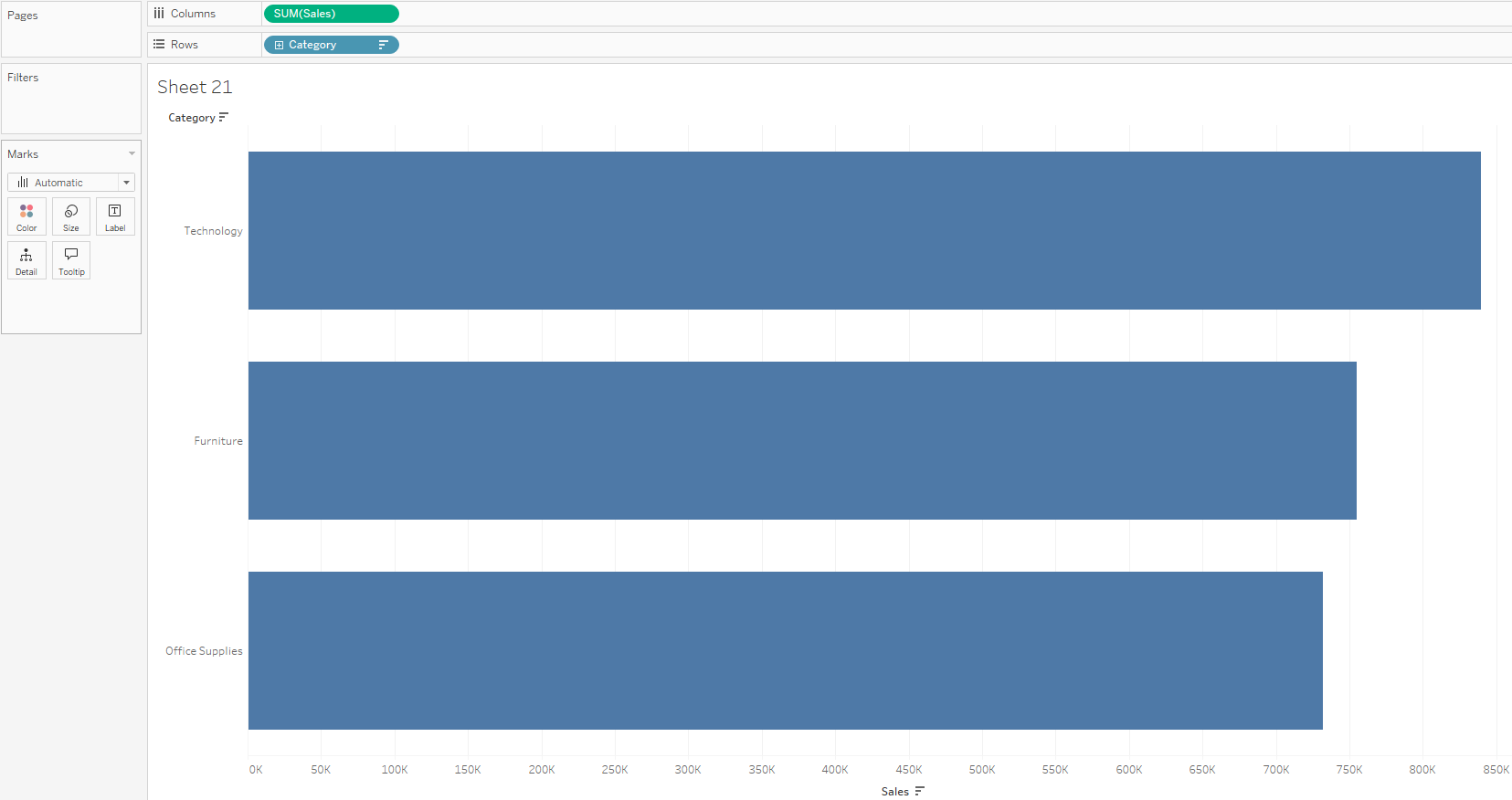
- Create a simple bar chart with measures and dimensions, such as e.g. sales per category.
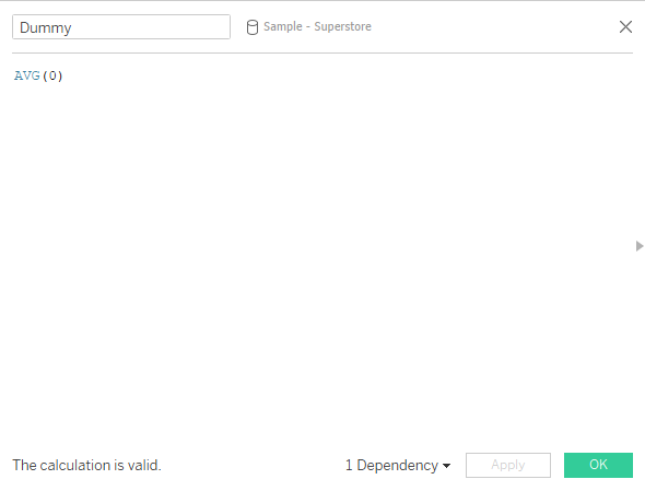
- Create a dummy variable such as MAX(0) or AVG(0) that will be important in creating the rounded ends.
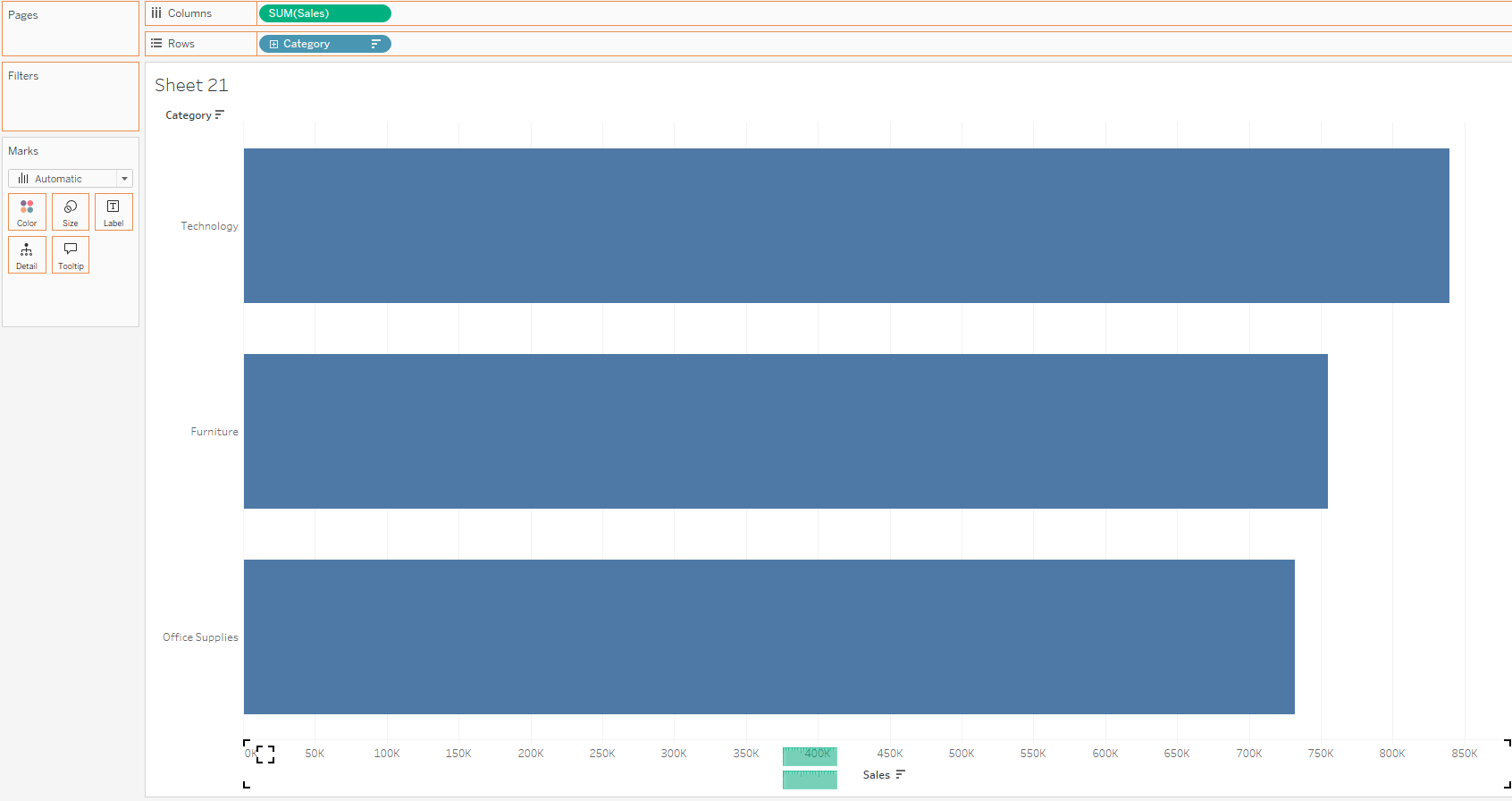
- Drag the dummy variable on the sales axis and it is going to create measure names and measure values.
- Bring a copy of sum of sales back to the columns shelf and create a dual axis, then synchronize the axis.
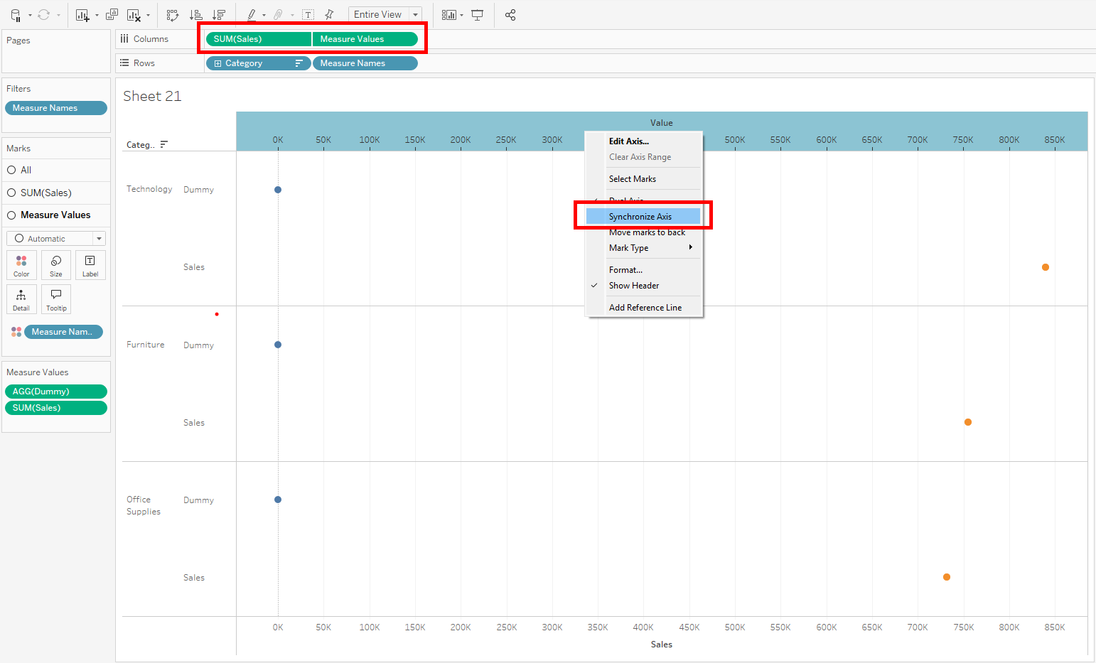
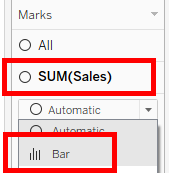
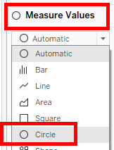
- Change the sales mark to bar and measure values to circle.
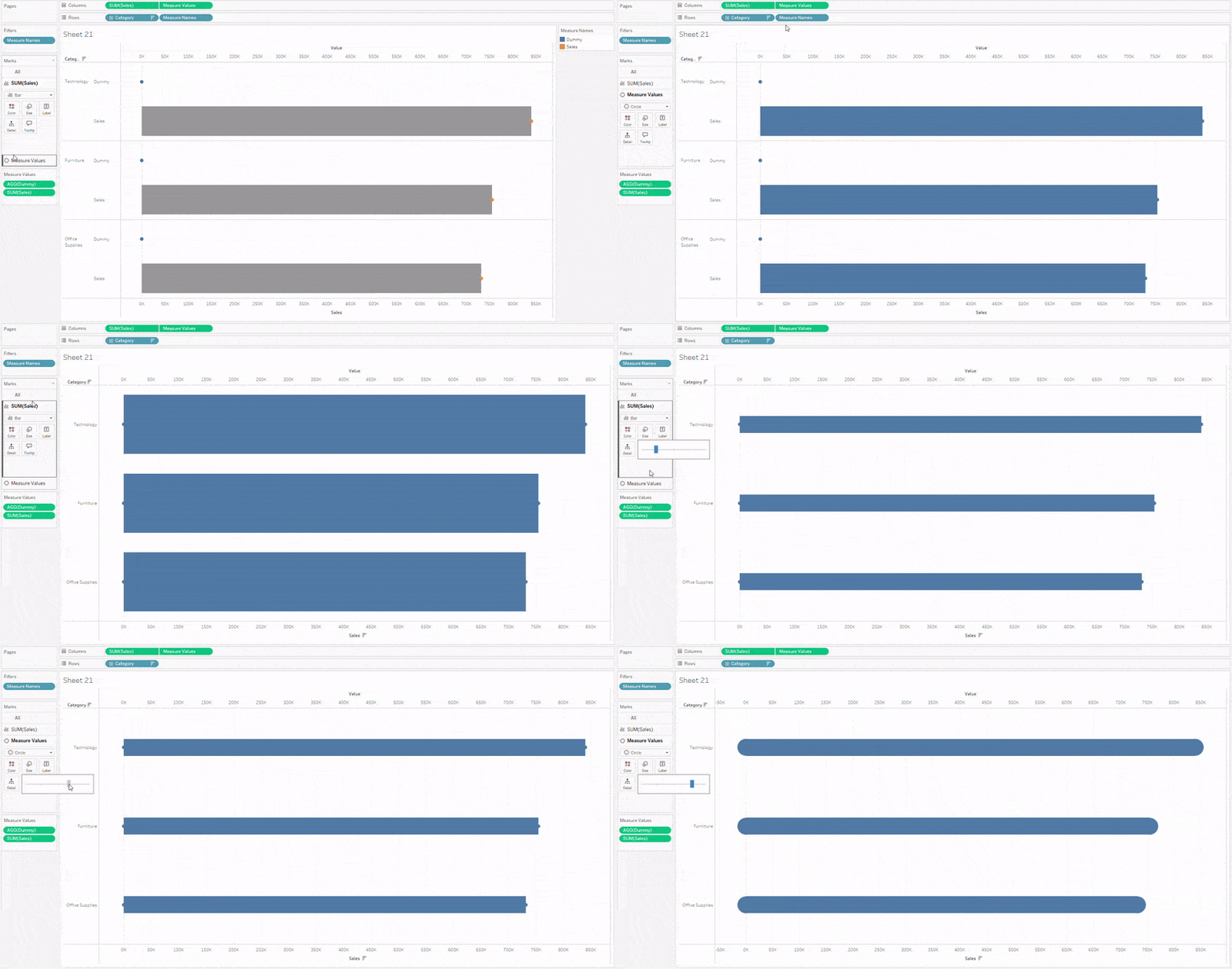
- Remove all the measure names. Change the size of the bars and the circles in the marks card.
- Once you are satisfied with how the rounded ends look, you can edit the sales axis and bring the start a bit closer to 0.
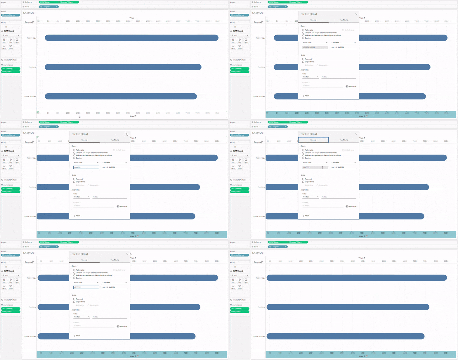
- Finally, hide the value axis.
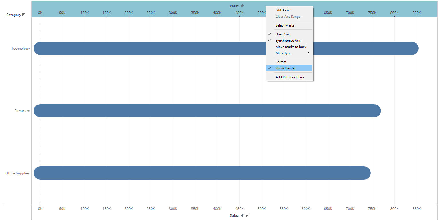
Although rounded bar charts are visually appealing, one should beware that the round ends add on the lenght and slighly alter the actual value. Therefore, the use of this type of chart is more suitable for cases where the representation of a precise value is not strictly necessary.
