In Power BI, both Map and Filled Map visuals are used to represent geographical data, however, they have certain key differences.
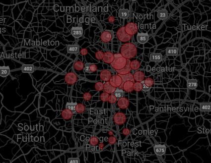
Map visual displays data points as bubbles on specific locations such as countries or cities, which is advantageous for displaying exact locations and comparing measures at specific points.

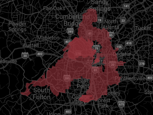
The Filled Map visual, on the other hand, fills entire geographical areas with shading.

For example, based on the value of the data, areas such as regions, countries and states would be shaded with a matching color on a spectrum. Filled Map is ideal for displaying data distribution in larger areas and identifying trends and patterns. A great example would be visualizing population density across different countries.


Depending on the purpose of your map, one can both display data points in specific locations or opt for a filled map and show an entire area portion such as city, country or district.
