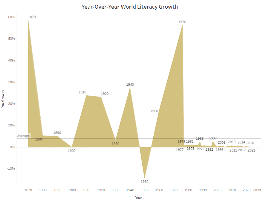
The next Makeover Monday focused on global literacy rates. I created an area chart with years on the x-axis and year-on-year literacy growth on the y-axis. The result was a bit pointy since the year field contained individual years that were not necessarily in a subsequent order.
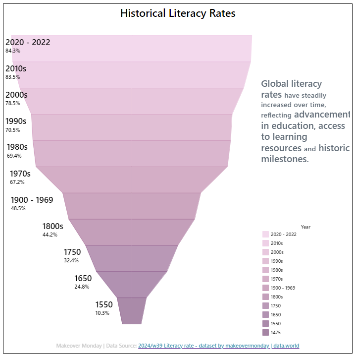
I am using this opportunity to both improve my previous vizzes and learn something new, so for the new version, I created a funnel chart. Years were grouped into sensible periods based on the years available in the dataset. I added a legend for additional reference, a text that conveys some historical context, and a link to the data source.
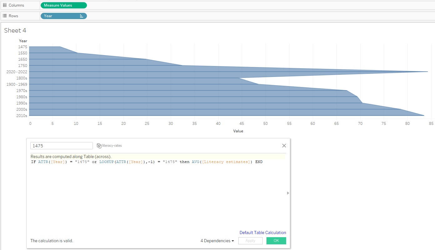
Creating a funnel chart in Tableau involves several steps:
- drag Measure Values on columns and remove sums and counts from the Measure Values card, leaving only the year groups. Here, years are separate calculated fields that work as a conditional statement to return the average of literacy estimates. In the Measure Values card, change all years to compute using Table (down)
- drag Year (the dimension) on rows. In this case, the Year was already grouped into individual year groups or decades
- Change the mark type from automatic to area in the Marks card. If not already done, go to Analysis -> Stack Marks -> Off
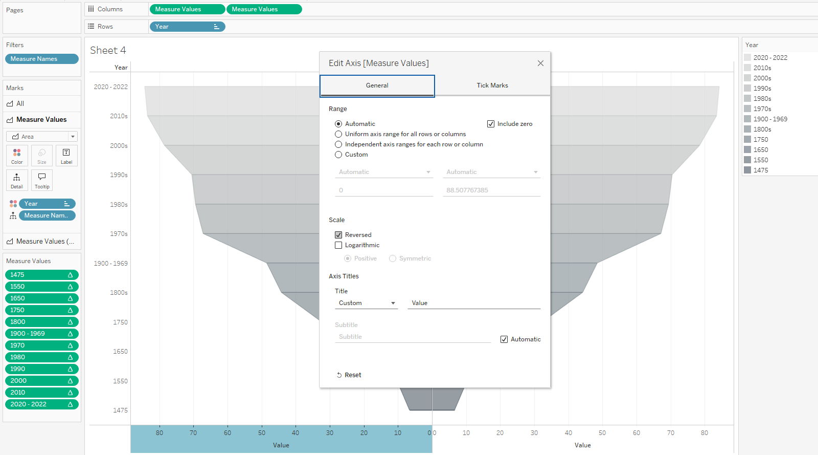
- Sort and put year on color. Reorder years if needed.
- Duplicate the Measure Values on columns, right-click on the left x-axis and reverse.
With further formatting of font, color, labels and tooltips I put the chart on a dashboard and provided additional information. The new dashboard has a clear subdivision into years and shows the average literacy estimates for each time period.