


Task: create a best practice business KPI dashboard using the Superstore dataset and write a user story. One KPI must be Profit. Overall, the initial analysis ideas were:
- count of returned orders
- return rates by year and month
- average number of items in the returned orders
- seasonal trends in returns
- correlation between discounts and returns
- return orders and shipping mode
User story:
A quality assurance analyst would like to analyze product return rates across regions to identify patterns and improve product quality.
Business questions to answer:
- What is the return rate?
- Are there identifiable patterns in the returns?
- How are the returns doing over time?
- What can we do to improve and decrease % of returns?
Sketch:
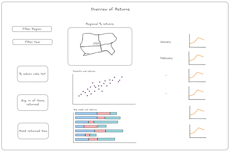
The resulting report looks like this:
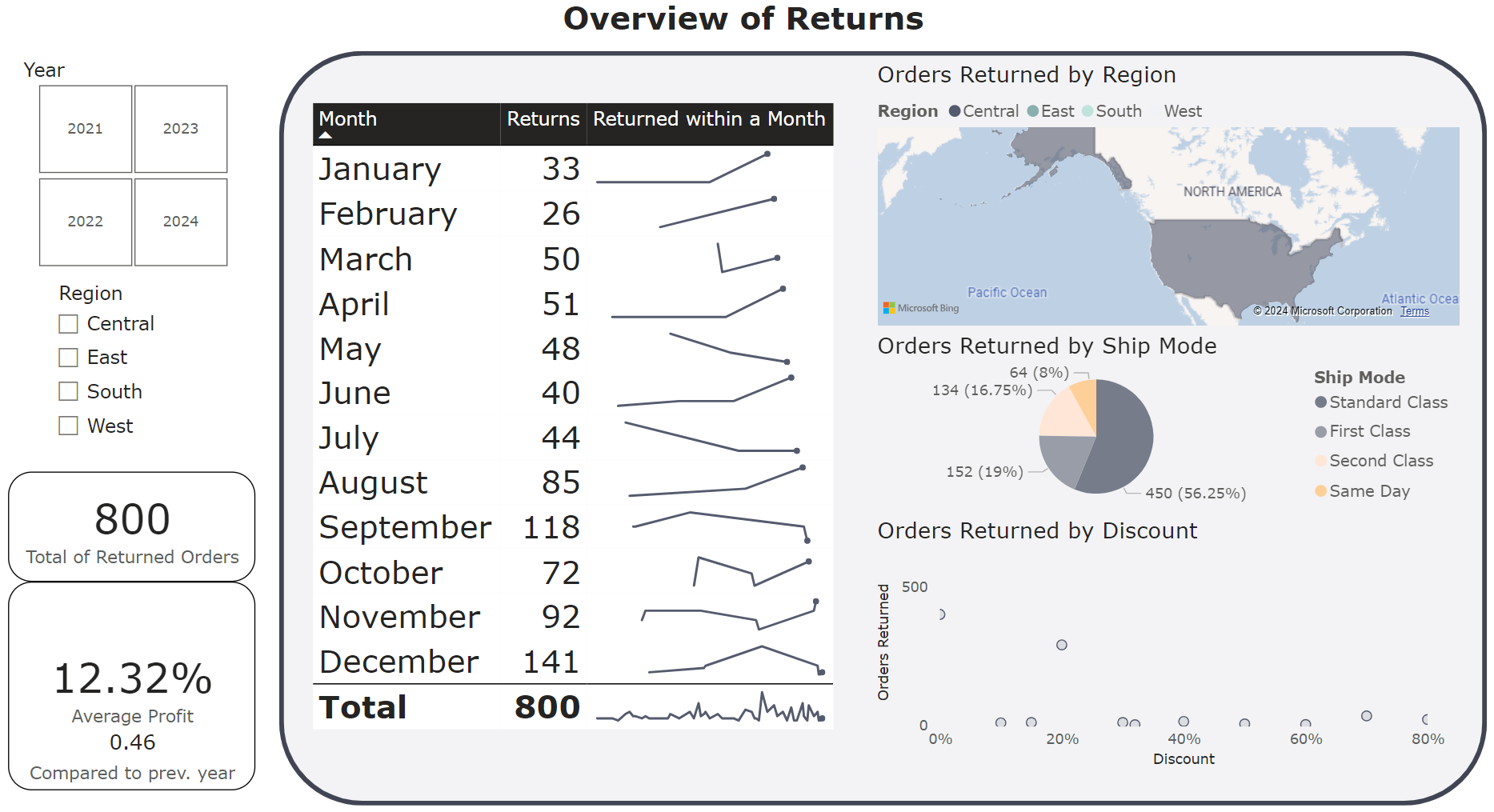
What changed:
- the sparklines moved closer to the filter & KPIs to see the breakdown by months immediately
- the number of KPI cards decreased - only included those that were required/made sense
- replaced the stacked bar chart with a pie chart since there are only a few categories
The final report after some feedback and adjustments looks like this:
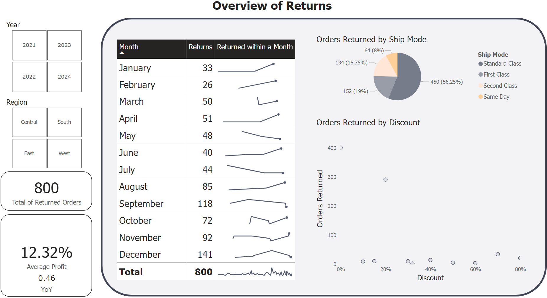
What changed:
- the map was removed to create more space for the scatter plot
- changed all font to Tahoma
- decreased the size of the months in the table
- changed the region filter into boxes as well