


If you've spent time scrolling through Tableau you might have stumbled upon the #MakeoverMonday hashtag, but what is it?
Makeover Monday is a challenge that occurs weekly. On Monday, the data community is given a dataset to visualize, focusing on effective visualizations.
Sounds simple enough, right? It's not!
But that isn't a bad thing.
For DSNY4's first challenge, we had one hour to view the data and create our own visualizations. My jaw dropped and my palms got sweaty. I have never challenged myself to create an informative visualization in such a short amount of time. Where would I even begin? The truth is I had no idea what I was doing and it showed.
My Process (60 minutes)
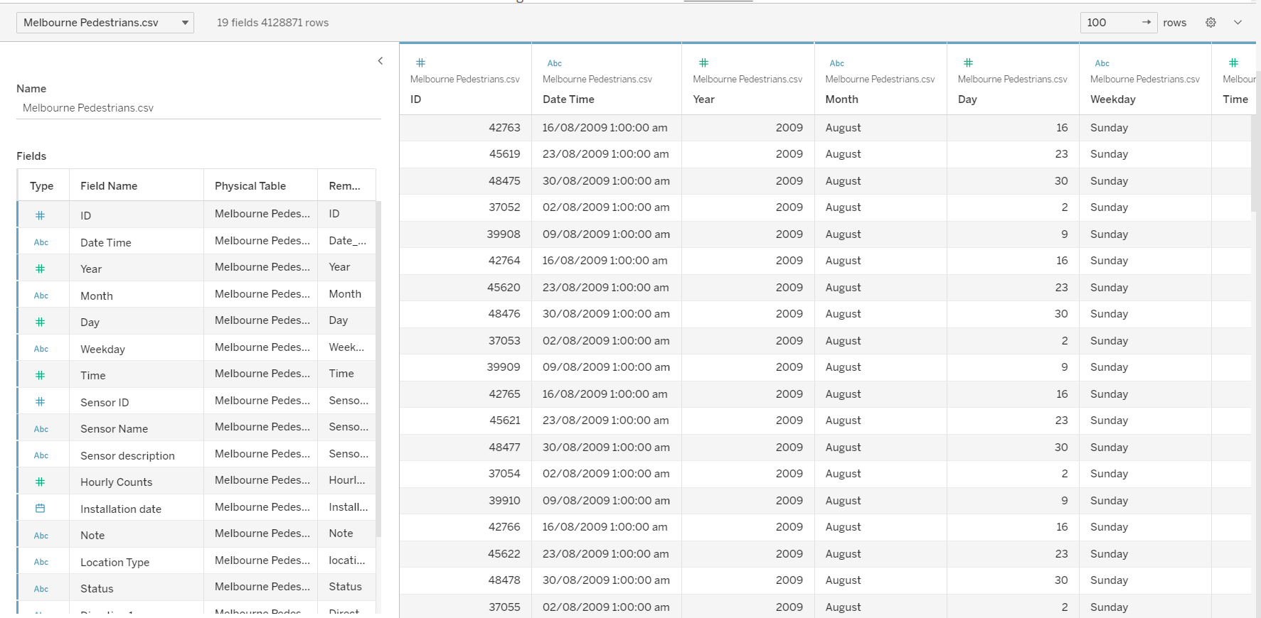
- Upload the dataset into Tableau. For this Makeover Monday we used the following dataset. (4 minutes)
- Take a look at the data. (6 minutes)
3. From there I jumped into creating a bunch of different charts. During that time I created 6 different sheets. (40 minutes)
4. Began panicking for time.
5. Built the below dashboard, posted on Twitter. (10 minutes)
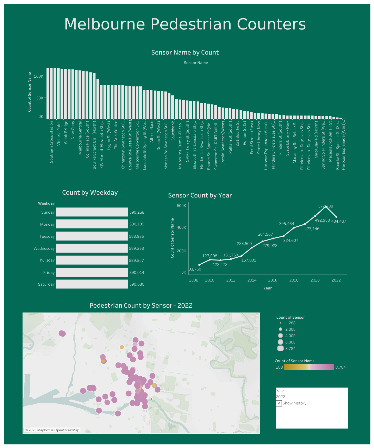
Interact with the dashboard here.
Mistakes Made:
- Spent too much time executing too many charts instead of creating a clear story.
- General lack of focus.
- Nothing I was working on helped to answer a question.
How I Would've Better Spent My Time:
- Examine the data before starting with charts to find a clear story.
- Determine which questions I was looking to answer.
- Don't overcommit.
- If something isn't working move on.
This first Makeover Monday was a huge lesson for me. It showed me that there needs to be a balance between creativity and presenting information in a set amount of time. I also discovered that sometimes it's better to focus and present a clear story than to do a vague overview.