Recently, I learned how to make sunburst charts in Tableau using map layers. Map layers are a powerful function in Tableau and can be used to create many different charts and tables outside of multi-layered maps. It is currently Dashboard Week and this type of chart worked perfectly for what I wanted to show. Here is a simple step-by-step guide to building these charts in Tableau.
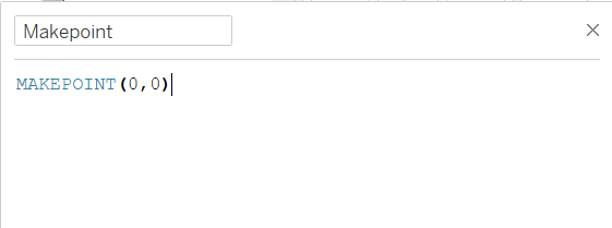
1. Makepoint
The first step is to create a point, this will allow you to access map layers in Tableau. Makepoint returns a spatial object constructed from a given latitude and longitude. Since this will only be used to build our sunburst, I set the lat and long to (0,0). The calculation should look like this:
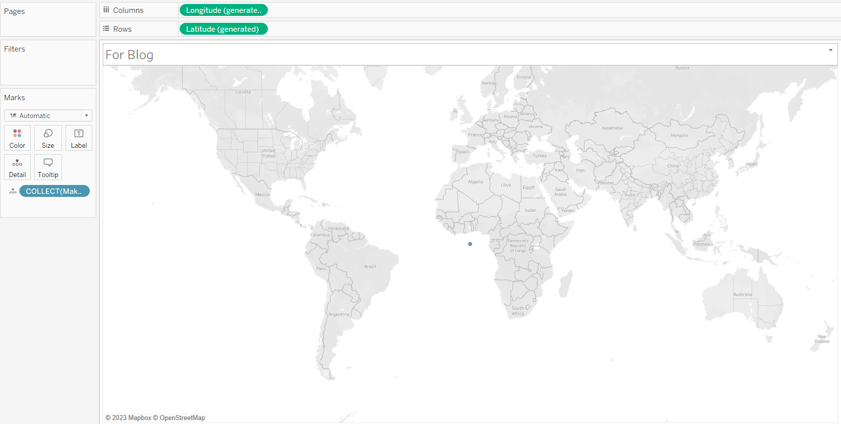
2. Drag in Makepoint
The next step is to drag in the makepoint calculation to the view. Your view should look something similar to the one below.
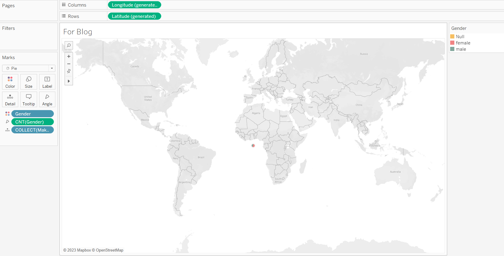
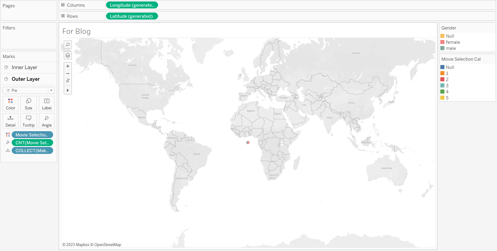
3. Build the Inner Layer
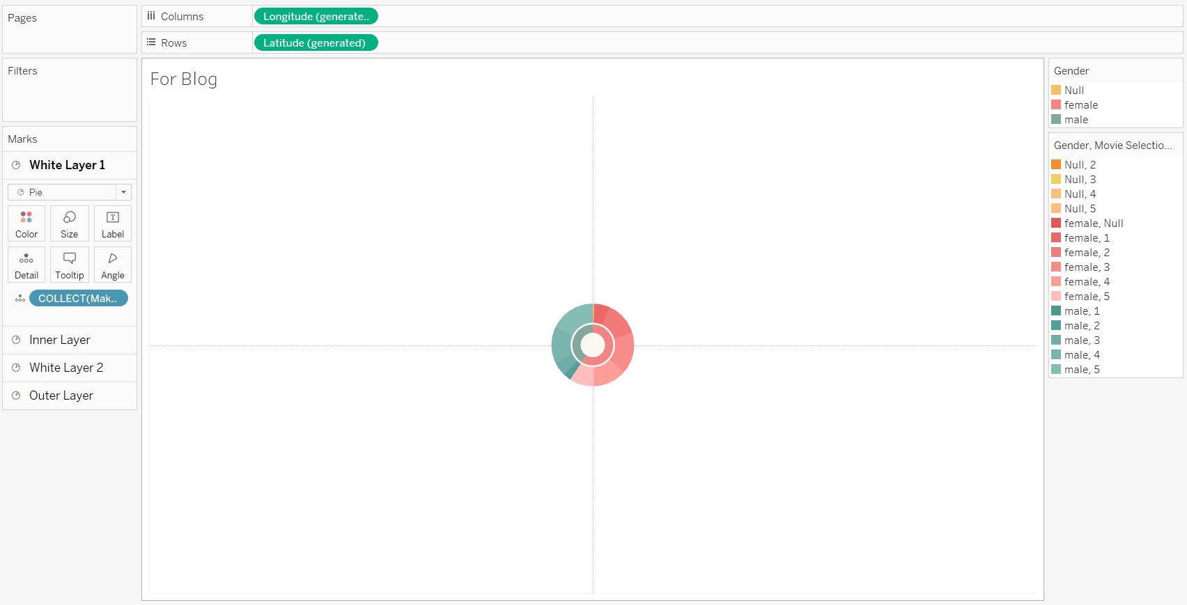
A sunburst has an inner layer and then is broken down into smaller parts as it grows out. To build the inner layer the mark type needs to be switched to pie. Then build out your pie. The example below shows gender in color and count of gender in the angle. The pie will be very small but we will adjust this later on.
4. Repeat steps 2 + 3
To create the outer portion you will have to repeat steps 2 and 3. This time I will be using the field I want to see broken down further. In this case, I am breaking down movie ratings and will also use that count in the angle. I also like to rename my layers so I don't get confused later on in the build and reorder them accordingly.
In order to get the coloring to match my gender colors I dragged the gender field into detail. Once in detail, I click and switch gender from detail to color.
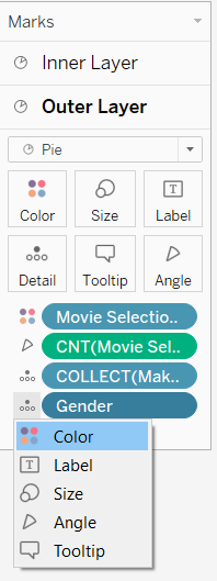
The final step will be to move gender above movie selection so it colors according to gender first.
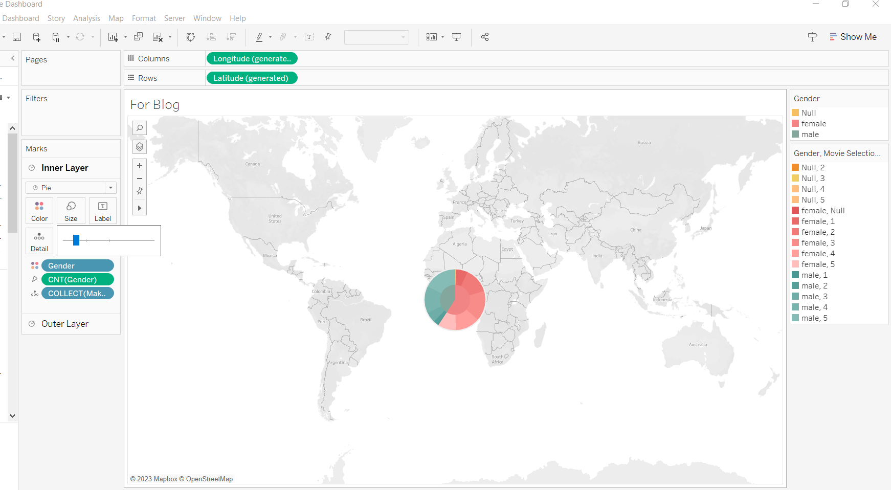
5. Zoom In & Resize
Once I create everything, I begin to zoom in. This can be done by clicking ctrl + shift + b (to zoom out ctrl +b). Next, resize your pies. I normally start by making the inner layer smaller.
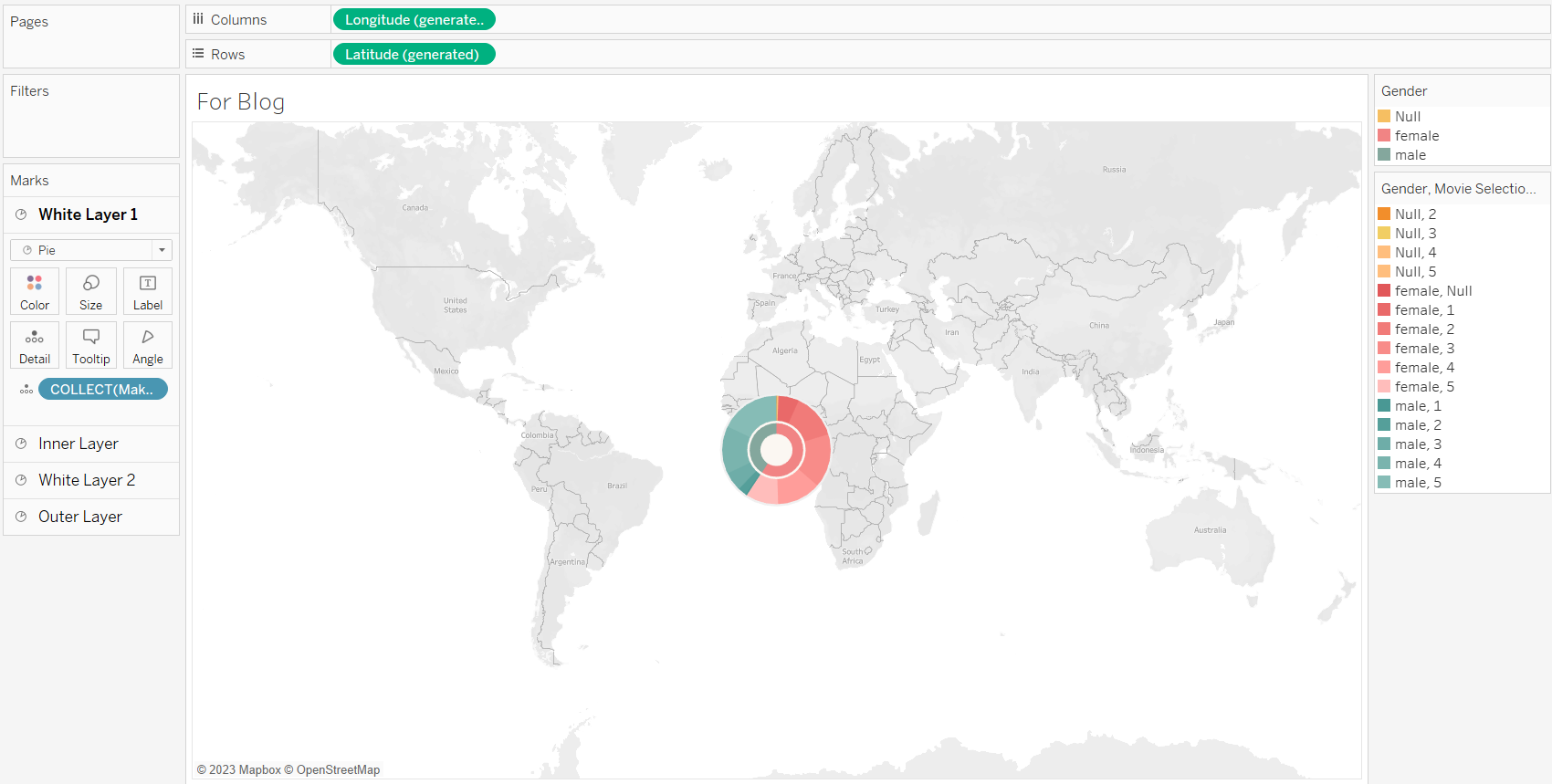
Here the sunburst is starting to take shape. I normally add a few more layers to give the chart space to breathe, like below.
6. Formatting
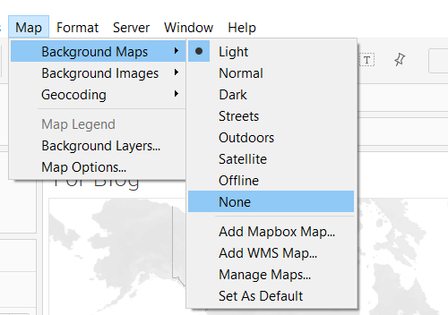
The final step is formatting. If you haven't noticed yet there is still a map in view to remove this go into Map -> background maps -> select none.
Lastly, remove any extra lines and your sunburst is complete!
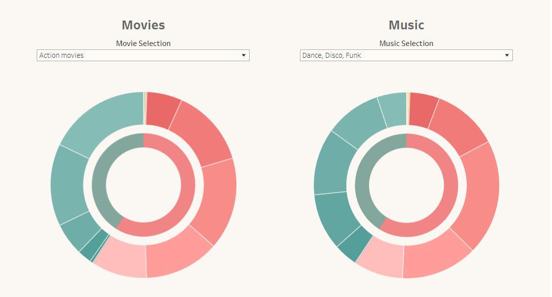
Here is how my final charts looked!