


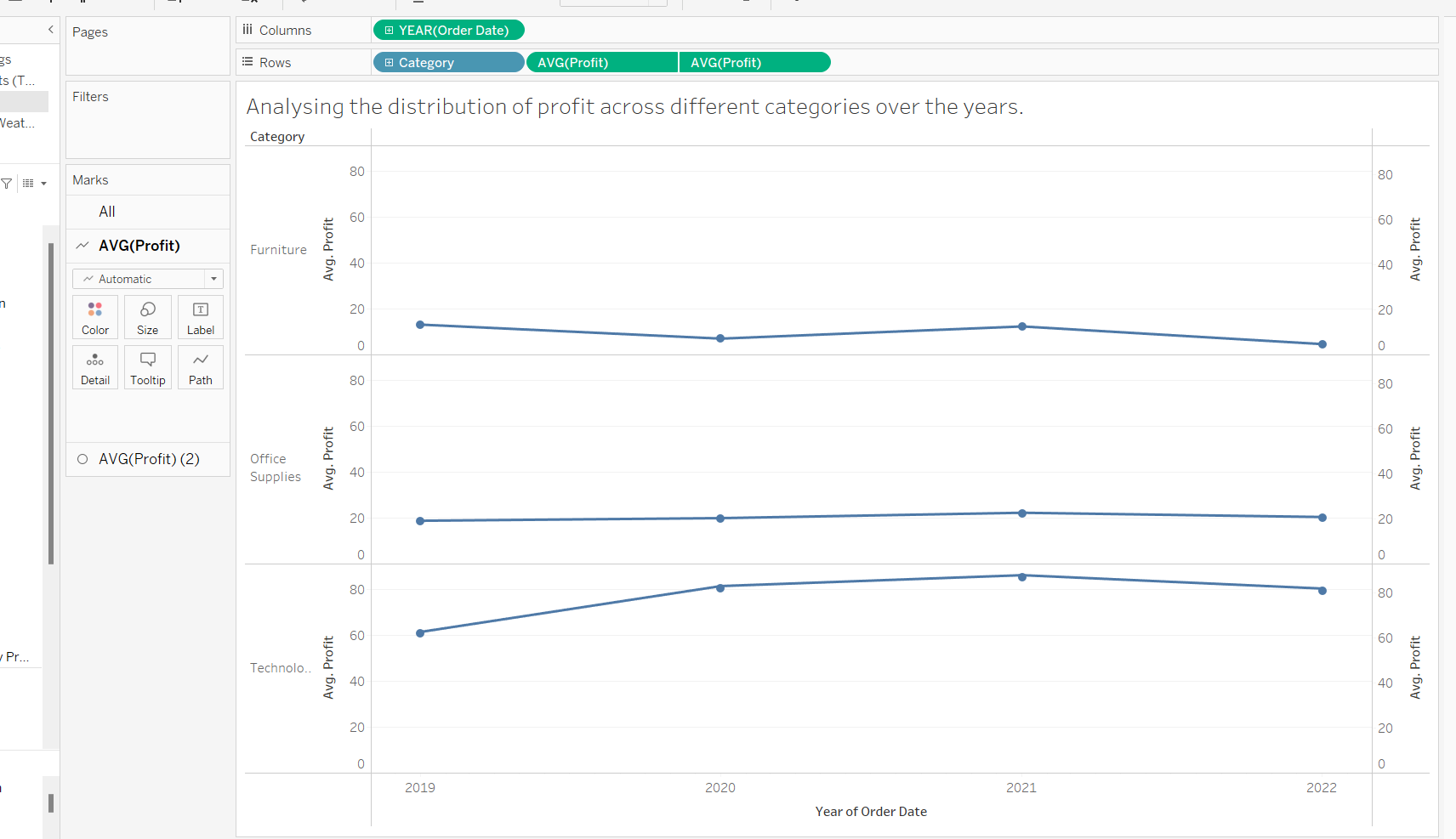
Standard deviation chart is a good tool to explore your data and gain insights about outliers in your data. The standard deviations show how far a data point is away from the mean (average) and allows you to create segway's for further analysis.
To create this chart you would need the following steps.
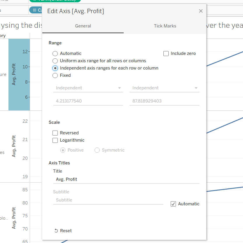
Step 1: Create your view and format your Axis's
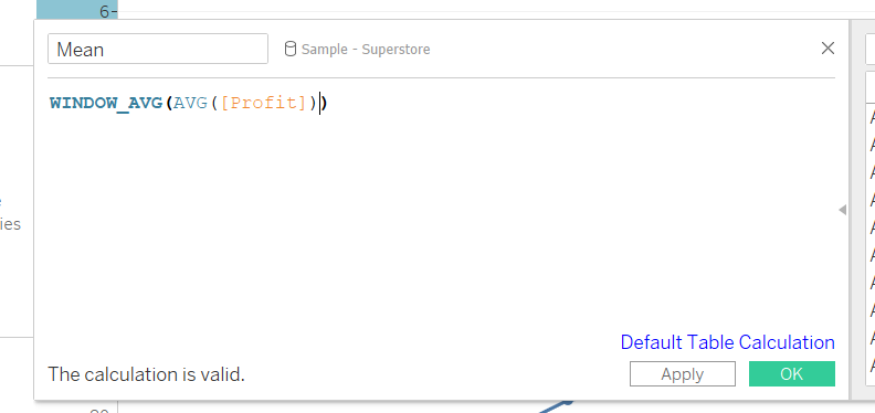
Step 2: Calculate the mean of your data
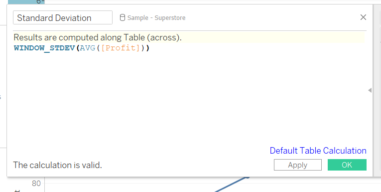
Step 3: Create your Standard deviation calculation
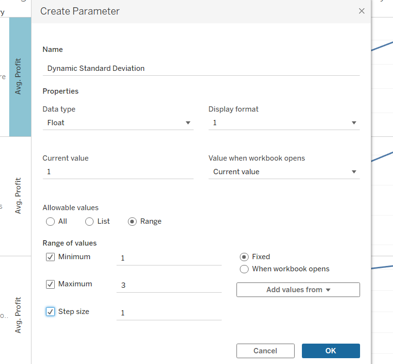
Step 4: Create a parameter to make your standard deviation dynamic
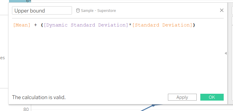
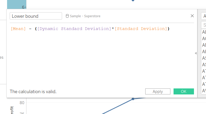
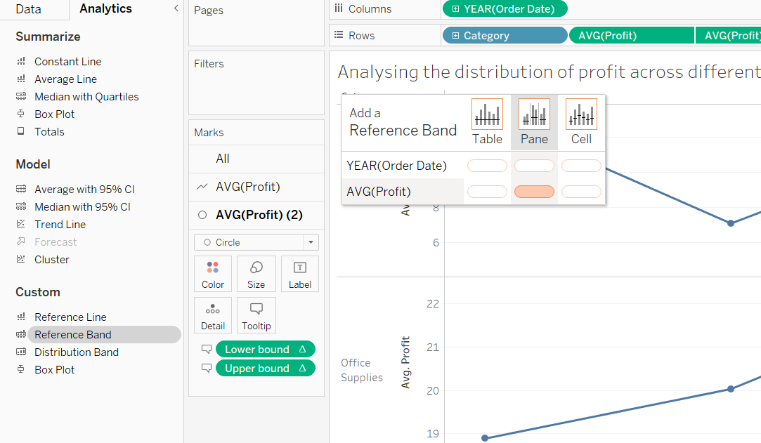
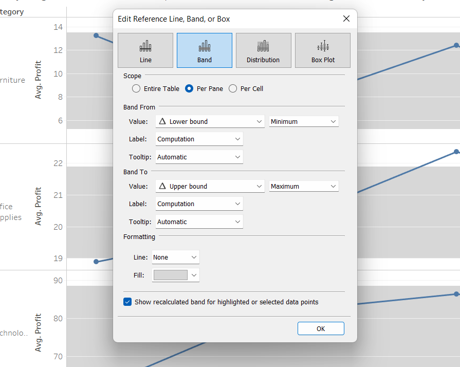
Step 5: Create Upper and lowe bounds
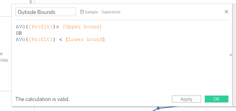
Step 6: Create your outside of bounds calculation to highlight outliers
Step 7: add your calculations to your tooltips as need and add reference bands to view.
( the most important one to keep in your tooltips or on detail is your upper and lower bounds to reference at a later point)
then
& add average lines
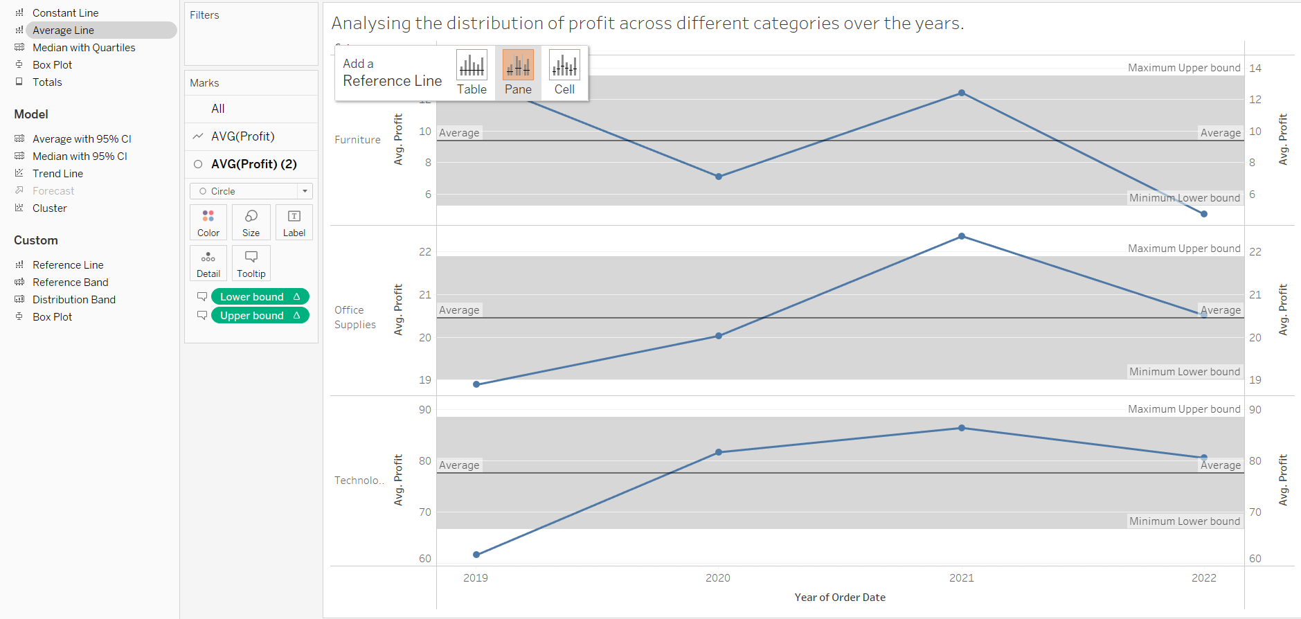
Step 8: add outside bounds calculation to colour
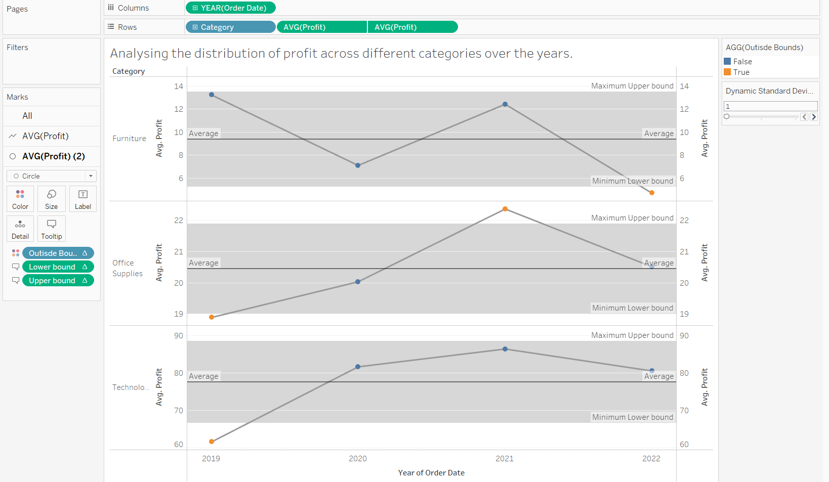
we see a few points that fall outside our standard deviation which would then spark further exploration.