Today's task was to create a dashboard with accessibility in mind. We received a dataset from the Glasgow City Council, with information about reported potholes and pavement/footpaths issues.
What is accessibility in reference to data visualization?
It is being aware of accessibility requirements when creating visualizations. This may consist of, but is not restricted to:
- Colour blindness
- Motor-issues
- Neurodiversity
- Vision-impairment
I focused on making my dashboard accessible to those with motor issues, color blindness and other sight issues.
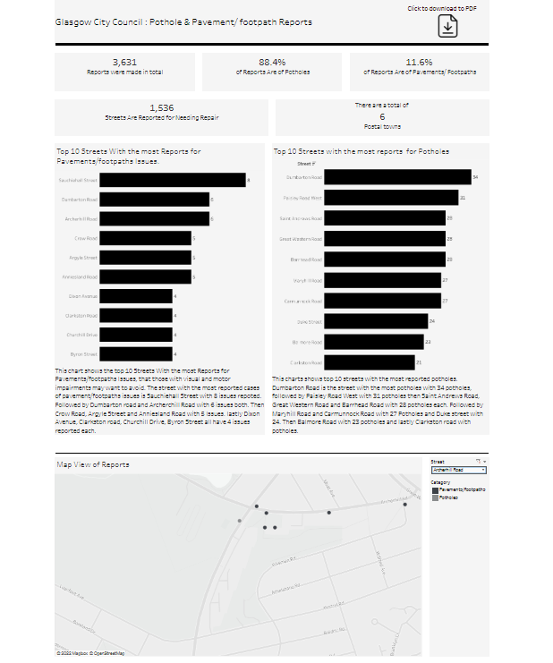
I Look through the data and realized there wasn't a lot of insight to pull out so making a user story for the dashboard was really useful in helping me to scope the work and pulling specific insight out.
My main takeaway was, to make things a grey scale or to use the https://coolors.co/contrast-checker/333333-f5f5f5 to decide what colors would contrast.