First and foremost, if it hasn't been said already, do not make BANs just a raw text box - you should definitely link them to the data with actual values (I definitely didn't do this).
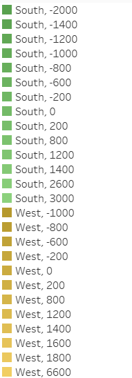
One of the useful things I have learnt recently in Tableau is the ability to add multiple dimensions on the colours mark. Previously, I had made this effect by creating a dual-axis view, with one axis having a semi-transparent colour to overlap the other axis (effectively creating a gradient of 2 colours - overcomplicated).
The much better way of doing this is to control select all of the dimensions that are necessary, and then to drag and drop this onto the colours mark:

The result is a colour scheme that looks like this:
The second useful tip that I learnt is a more general one; the formatting of the worksheet tab. Colour coding the different worksheets is an instant visual upgrade, and is a quick way to distinguish between different sheets as well as grouping sheets that have a similar use.
The worksheet tab can also be shown in a tile format; giving a quick representation of each worksheet.