


Jittering is a method that is used for visual clarity in scatterplots, and can be very useful to show the amount of data points that are in the dataset.
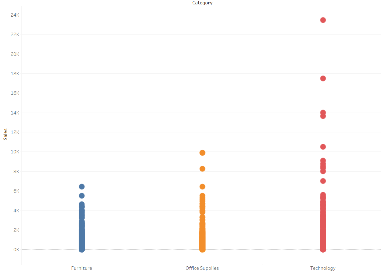
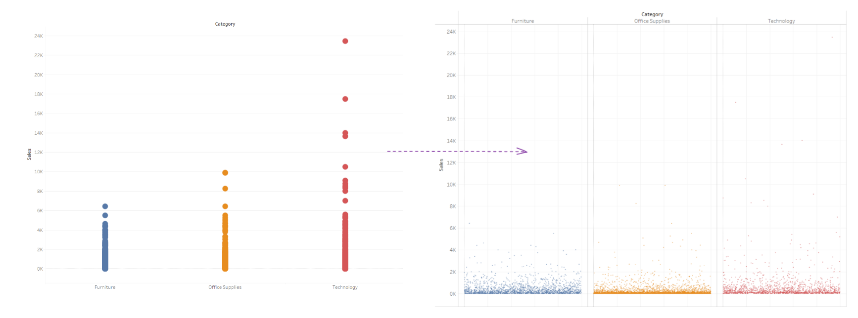
As shown below, the 3 categories against sales are represented by circles, but because they are overlapping it is hard to see how many points there are.
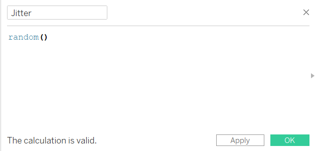
In order to fix this, we can jitter the scatterplot by creating a calculated field:
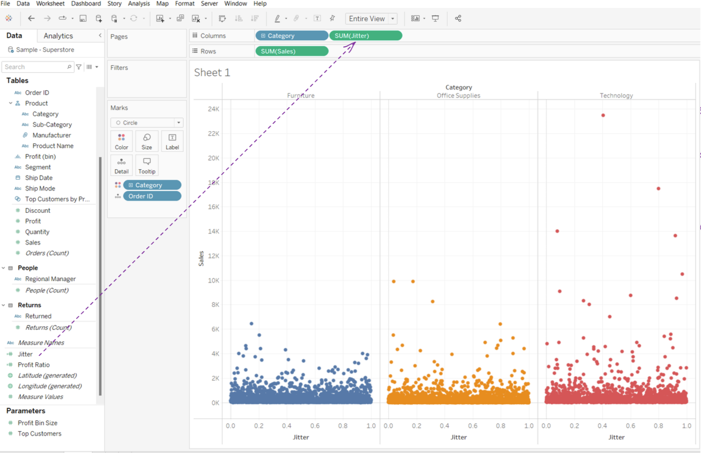
Then we drag the new calculated field onto the columns:
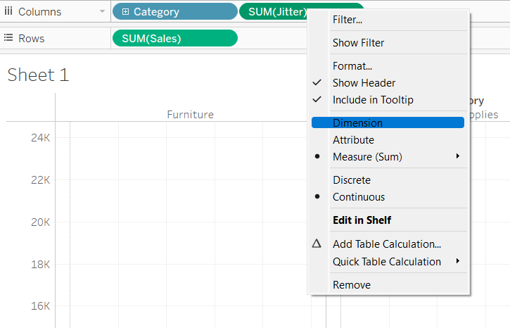
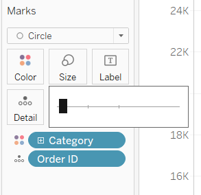
Then we change the field to a dimension:
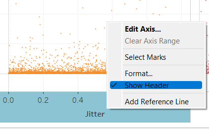
And finally we do some formatting tips, like change the size to a smaller level, and remove the header:
Here is the final comparison after using the technique:
It is important to note that the field on the columns is a discrete one, as a continuous axis may be confused with the jittering - i.e. the horizontal deviations do not have importance.