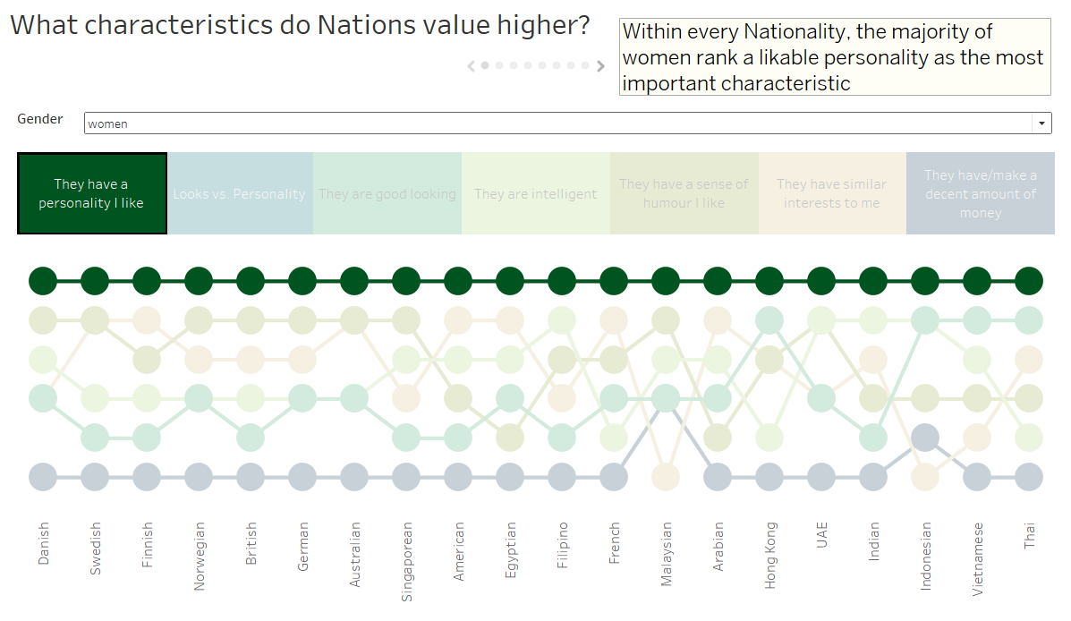
For day two of dashboard week, we were looking at the results of a YouGov survey on whether various Nationalities rate looks or personality as a more important characteristic. You can find the details of the survey, it’s data and the original article in Andy’s blog.
The day started a lot smoother than day one. The data was given to us in a PDF, which once we’d converted it to an excel, was quite fun to clean using Alteryx. The dataset was very different to Monday’s as well, mainly in it’s size.
So I imagine you’re thinking an easy to clean, small dataset – must have been easy?
Wrong.
One of Andy’s stipulations was that we had to use story points. I’ve never used them before and it turns out they’re quite different to what I’m used to. I spent a lot of time playing around with the data in my usual way, but when it came to putting what I’d produced in to story points I came across a number of issues (mainly formatting). I couldn’t work out how to lay out the visualisations I’d produced and pull out the key points I wanted to make.
Lessons Learnt
Plan. Draw. Use the techniques we were taught by Caroline Beavon (you can find a brief recap of them in Charlie’s blog post here).
Don’t get me wrong, I noted down the key points as I explored the data. However, once I’d started to form my story, I should have gone back to pen and paper and thought more about how best to pull the story together.
My story ended up essentially being one dashboard with a few different filters and highlights, but there would have been a number of other options to show it more clearly.
Click on the screenshot below to see the story I produced.

