


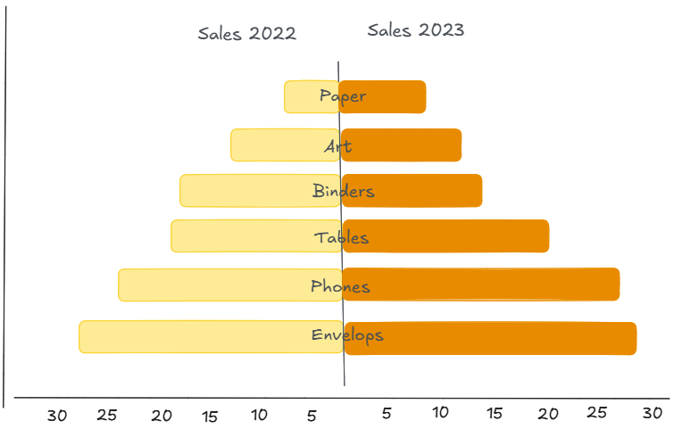
A butterfly chart is an effective way of comparing two sets of data side by side. For example, it can be used to compare values from two different years. In this example, we will use a butterfly chart to compare store sales across various categories for the years 2022 and 2023. Sales for 2022 are shown on the left, and sales for 2023 are shown on the right.
Here's a rough draft of what we're going to build:
Step 1: Create the Year-Specific Sales Fields
The first step is to create two calculated fields. These will give us a separate variable for sales in both 2022 and 2023.
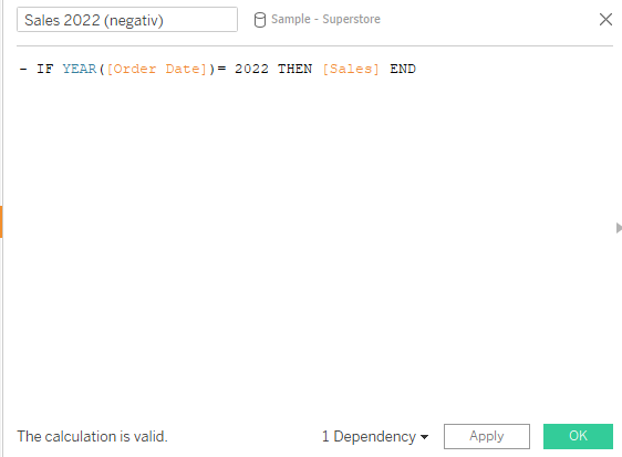
The following formula can be used to create the calculated field for the year 2023:
IF YEAR([Order Date]) = 2023 THEN [Sales] END
To create the 2022 counterpart, we duplicate the above calculation and make the result negative so that the bars extend to the left. In order to achieve this, all we need to do is add a minus sign at the beginning.
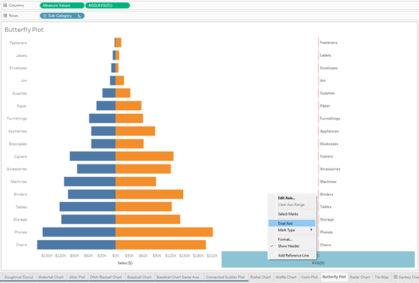
Step 2: Set Up the Butterfly Chart Layout
Drag Measure Values onto Columns, and filter the measures so only the two calculated sales fields (2022 and 2023) remain.
On Rows, place the Product Category (or, in this case, Sub-Category) field. This allows us to compare the sales of each sub-category of product across the two years.
Next, we want to position the product category names in the centre of the bars. To do this, we need to add another vertical axis by double-clicking next to 'Measure Values' on columns and typing 'AVG(0)'. Place the Product Category in the Labels field on the marks card for AVG(0), then set up a dual axes and synchronise the charts.
Step 3: Fix Axis Ranges for True Comparison
At this point, you may have noticed that both sides of the bar look symmetrical, but have different axis ranges.
You could manually set the axis ranges, but that won’t update dynamically as your data changes. Instead, we can use calculated fields to determine the axis limits based on the data itself. To do this, we need to find the maximum value of our sales to determine how far the axis should extend.
Create the following calculation to finde the maximum value:
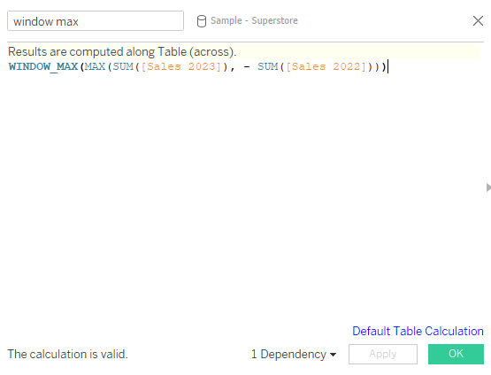
This captures the highest sales number from either year. For the minimum (left side), duplicate the field and add a minus sign in front of the calculation.
Now, add reference lines (To make the newly created variables available for use in the reference lines, you need to add them to your chart for example by placing them on Details):
- On the Measure Values axis, add the minimum reference line using the negative calculation.
- On the AVG(0) axis, add the maximum reference line using the positive calculation.
- Set the label for both to "None" for a clean look.
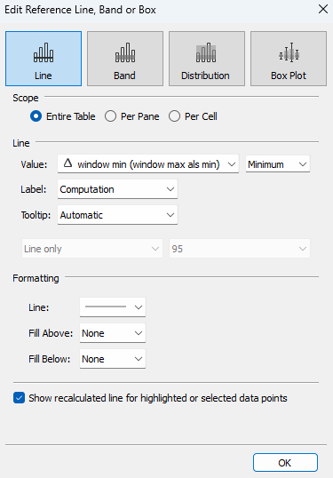
These reference lines define the same absolute maximum in both directions, ensuring that the chart has a consistent scale left and right and automatically adjusts to the data range.
Step 4: Final Touches
Now for the finishing touches:
- Sort by total sales to create the butterfly effect visually.
- Use subtle colors to distinguish the years.
- Optionally, add tooltips for interactivity.
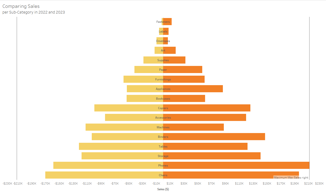
The result is a dynamic butterfly chart that makes it easy to compare yearly sales side by side.