


Introduction
Synchronizing axis across two charts is not a native feature of Tableau but it's definitely something that can be done with a smart work around! This might seem like extra work, but in some situations, it's important to have the same axis in two different charts to give additional context when comparing things.
Take a look a this simple example:

I have two charts: one looking at the top 5 super store sub categories by sales the other of the bottom 5 super store sub categories by sales. At first glance it seems like the bottom 5 sub categories aren't doing as bad as the top 5, but that's because the axis are completely different. One should be able to realize the axis are different, but it's still hard to compare the bars in the two different graphs.
Synchronizing the Axis
Let's synchronize the two axis now! The main idea behind this work around is to use a reference line to push the shorter axis to extend to match the longer axis. Feel free to follow along with the super store data:
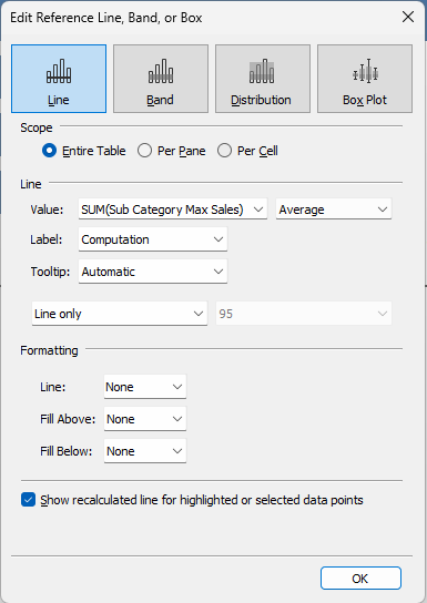
- First we need to find the sub category that is our max in sales. This calculation will be: { MAX( { FIXED [Sub-Category]: SUM([Sales]) }) }
- Drag this calculation and drop it onto the details mark card.
- Next, we'll create a reference line by going to the analytics pane and dragging reference line under custom and dropping it onto the table option that shows up. (You can switch on the top left from the data pane to the analytics pane.)
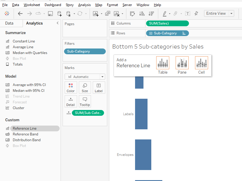
- Change the value of the reference line to the max sub category's sales.
- Change the aggregation method to average or max. The max exists for every row of data at the sub category level so we don't want to sum it up.
- Under formatting, change line to none.
And tada, the axis is synchronized now!
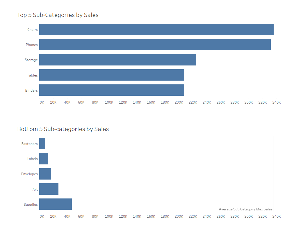
I left the line visible to show what exactly is happening here. Two extra things to keep in mind:
- You might want to add 50 or some other random value to the max to give the axis some extra padding.
- It's also a good idea to add the same reference line to the other chart just to be extra safe.
And that's it, a pretty neat trick to add context to our charts and dashboard!