


Welcome to my weekly review series! Every week, I plan to do a quick highlights post of some of the stuff that we learned in the previous week. This would serve as (1) a great overview of the Data School training for those who are curious about the week to week, (2) provide some tips and insights on what you can use/add to your dashboards when applying to the data school, and (3) a great way for me to review core concepts and cement them into my head. Here's the first of 15 upcoming posts!
Overview
Week 2 was mainly about Tableau best practices and fundamentals. We dove into basic terminology, design principles, and fundamental core concepts.
Highlights
1. Pre-attentive Attributes

Most people don't realize how much information our brains process before we consciously analyze the world around us. They're especially good at pattern recognition and categorization (though sometimes this may lead us to false conclusions when we encounter false patterns). This is what I was reminded of when we were taught good design principles, and more specifically pre-attentive attributes.
Pre-attentive attributes refers to information that the brain processes almost immediately or, essentially, what catches our attention right off the bat. You can imagine why this is important when creating and presenting dashboards as we want the important things to be apparent as quickly as possible, so users can understand what we're trying to convey without effort. Data can be complex and overwhelming so utilizing these attributes to create contrast is key to good chart design.
Here's a list of all the pre-attentive attributes courtesy of Tableau:
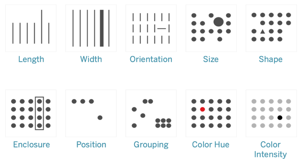
Just from the graphic, I think it's pretty self explanatory how these attributes create contrast. You don't actively have to memorize and think about all the attributes as you create your dashboards, but do constantly think about how you can highlight the most important thing or the main takeaway of your visualizations.
2. Parameters

Parameters was a major feature that I learned about since it was something I didn't use in my application dashboards. Parameters allow users to interact with dashboards in various ways by converting constant calculations to dynamic ones. In short, users can change parameters to alter calculations. Here's a simple example to compare a static chart and a dynamic one to illustrate how great parameters can be:
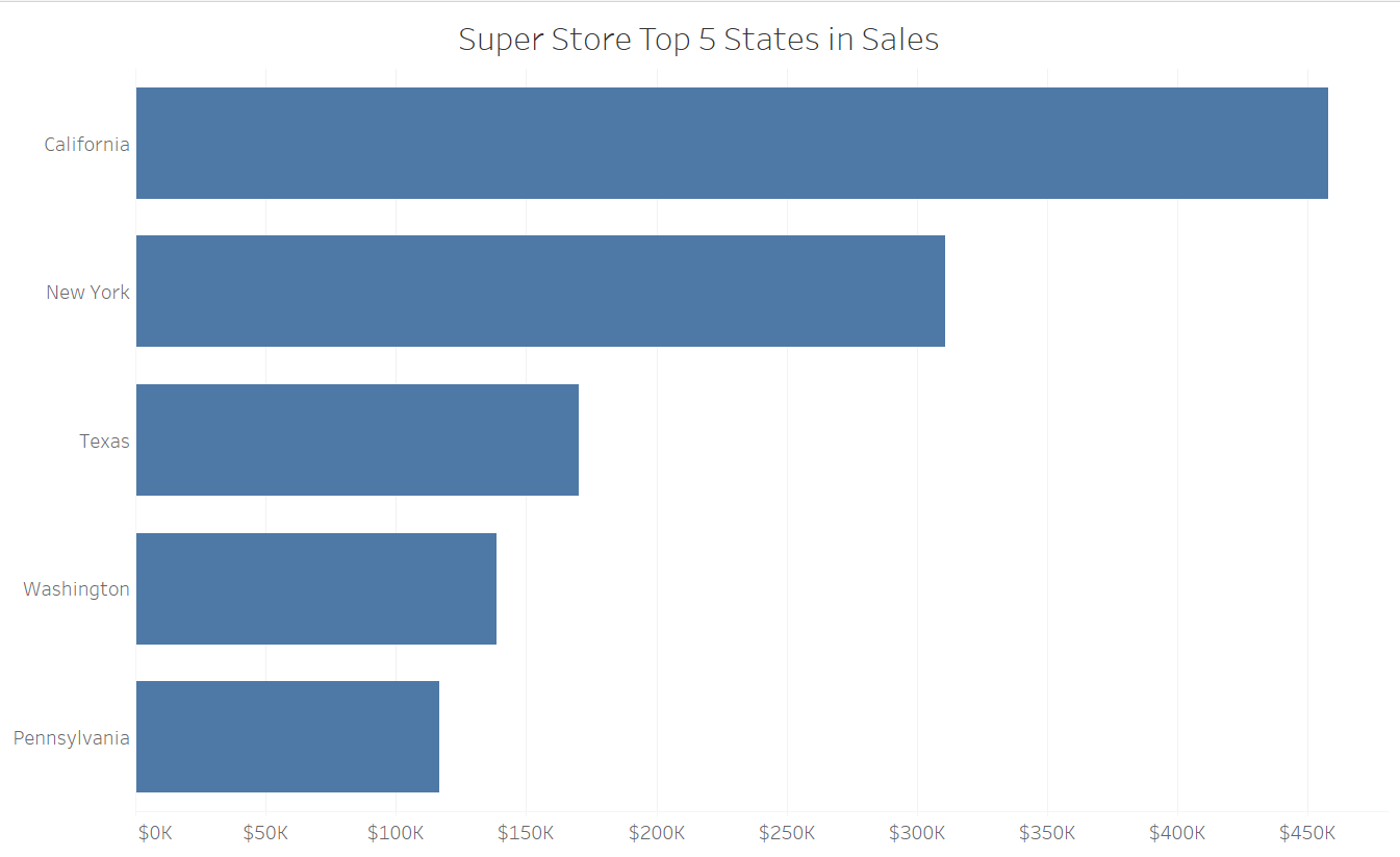
Above, you'll see a simple bar graph of the top 5 states in sales for Super Store, everyone's favorite Tableau data set. This is great, but what if users of our chart were curious about the top 10 states? There's no way for users to explore the data like that... yet. Let's add a Top N parameter and see the difference.
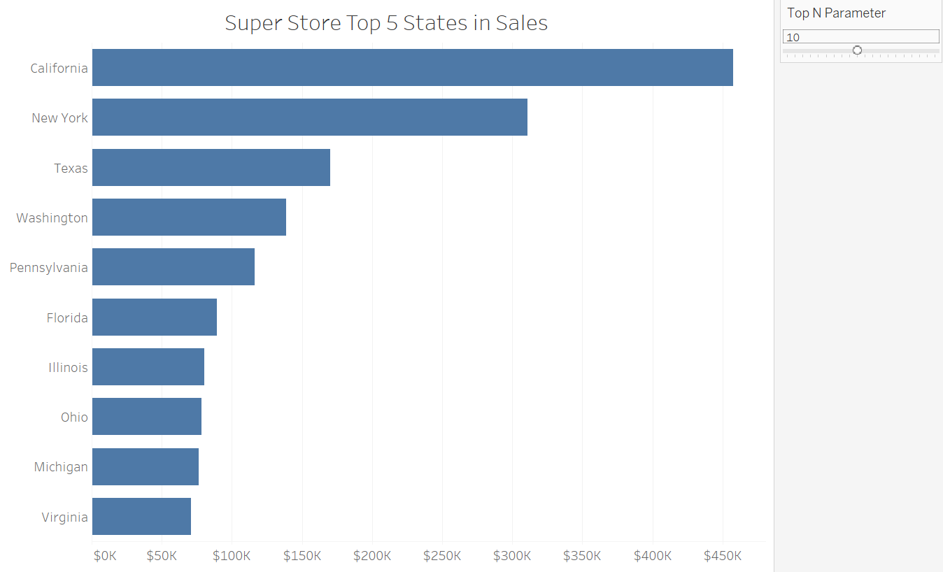
As you can see, we now see our handy parameter on the right, which allows us to change the number of Top N values we can see in our chart! I had it default to 5, but moved the slider over to show the top 10 states instead; super handy! Do be careful with a parameter like this as it can affect the overall usability of our charts and dashboards. For example, it's probably a bad idea to allow users to be able to set the parameter to show all 50 states.
I'll skip over on talking about exactly how to create parameters as there are already quite a number of posts on the Data School blog detailing how such as these ones by Charles Yi, Michael Bellamy, and Vivian Ng. If you're an aspiring data schooler definitely consider using some parameters in your dashboards to add user interactivity!
That's all for week 2. See y'all next week!