


When making charts for dashboards, very often we analysts have decided which measures be to the x/y axis. However, what should we do if there are too many measures or if we want the user themselves to control which measure to show on the chart? In the blog today, I am gonna tell you how to take advantage of the parameter function in Tableau to create a dynamic axis.
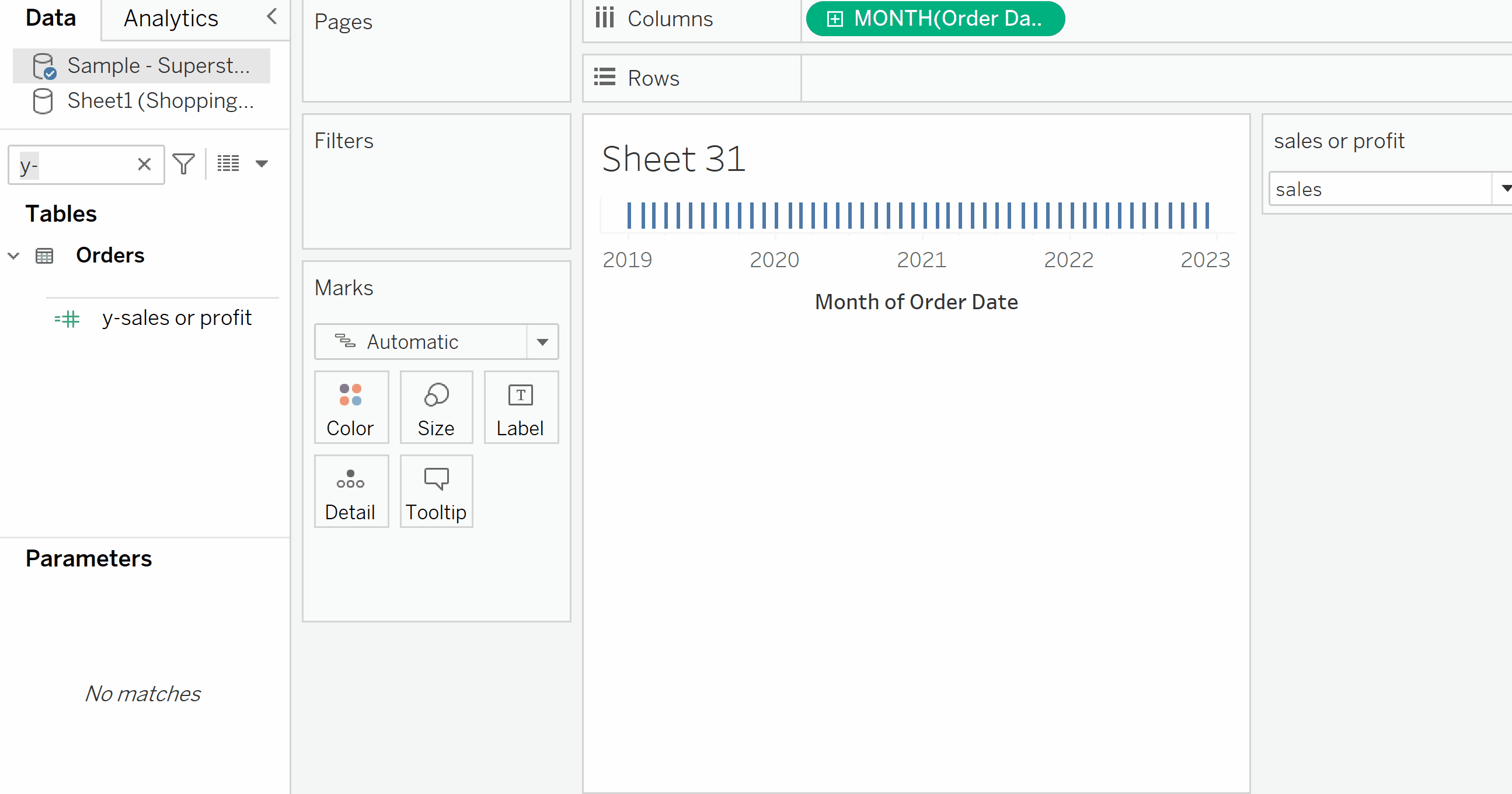
Here I used the defaulted superstore data. Let's say we want to users to explore the sum of sales/ profit across the month of the order date. So, sales or profit would be the y-axis, and the month of order date would be the x-axis.
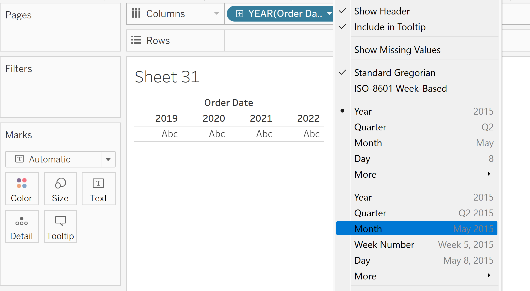
(1) put the field 'order date' on the column shelf. Right-click the pill and change it to 'Month' format. The pill should turn green.
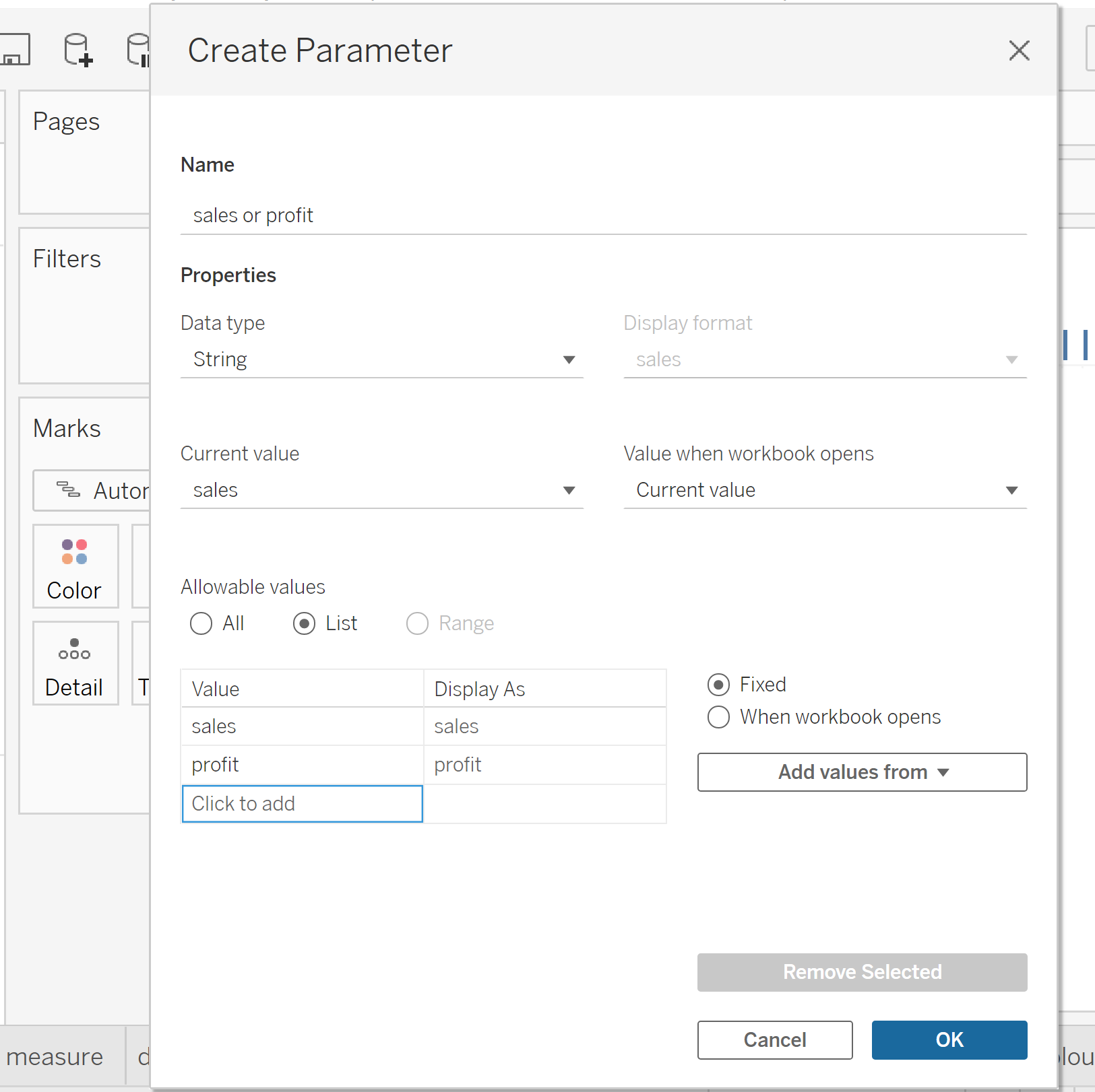
(2) create a string parameter. I call this 'sales or profit'. Select the 'allowable values' to be 'List'. Click the cell and add two values 'sales' and 'profit' on the table below.
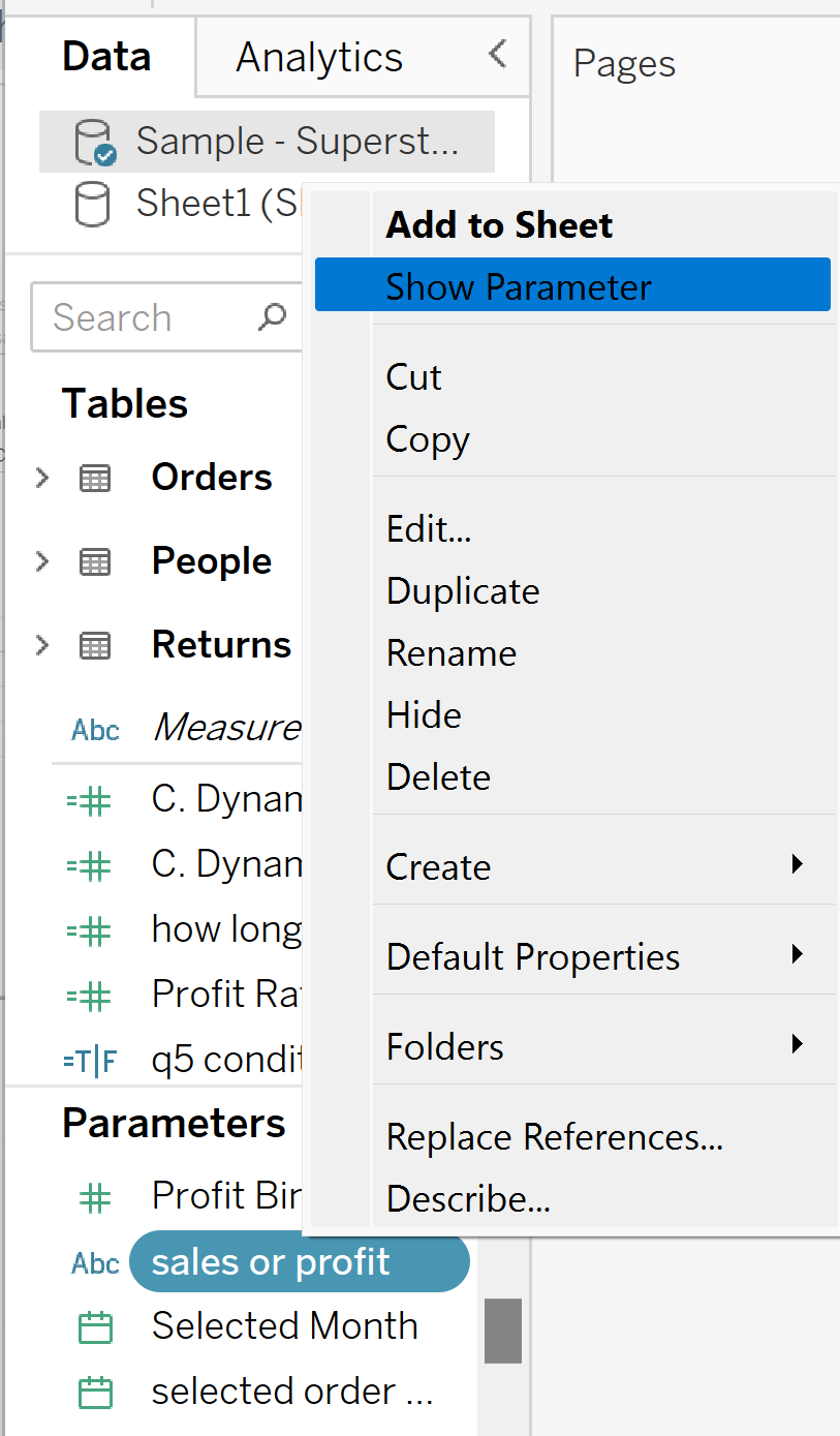
(3) show the parameter on the right hand side of the view
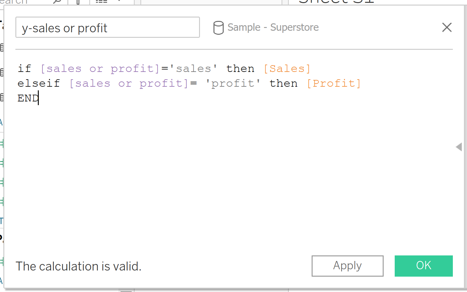
(4) create a calculated field, so that when the user selects one option either 'sales' or 'profit'. The field would change into sales value or profit value correspondingly.
(5) put the new calculated field on the row shelf. Changing the parameter on the right of the view will lead to the switch of the y-axis. Here you go!
To make it more appealing, we can also format the axis label and change the line color to make the two measures distinguishable. Time to explore yourself!