In the last blog, I discussed how my failed application viz to DS was terrible. Today I have redesigned it in a more pleasant way!
The link to the redesigned viz is here:
https://public.tableau.com/app/profile/stanleykinnok.chan/viz/redesignoldviz-sharkattackincidentsinAustralia/Dash1-overall
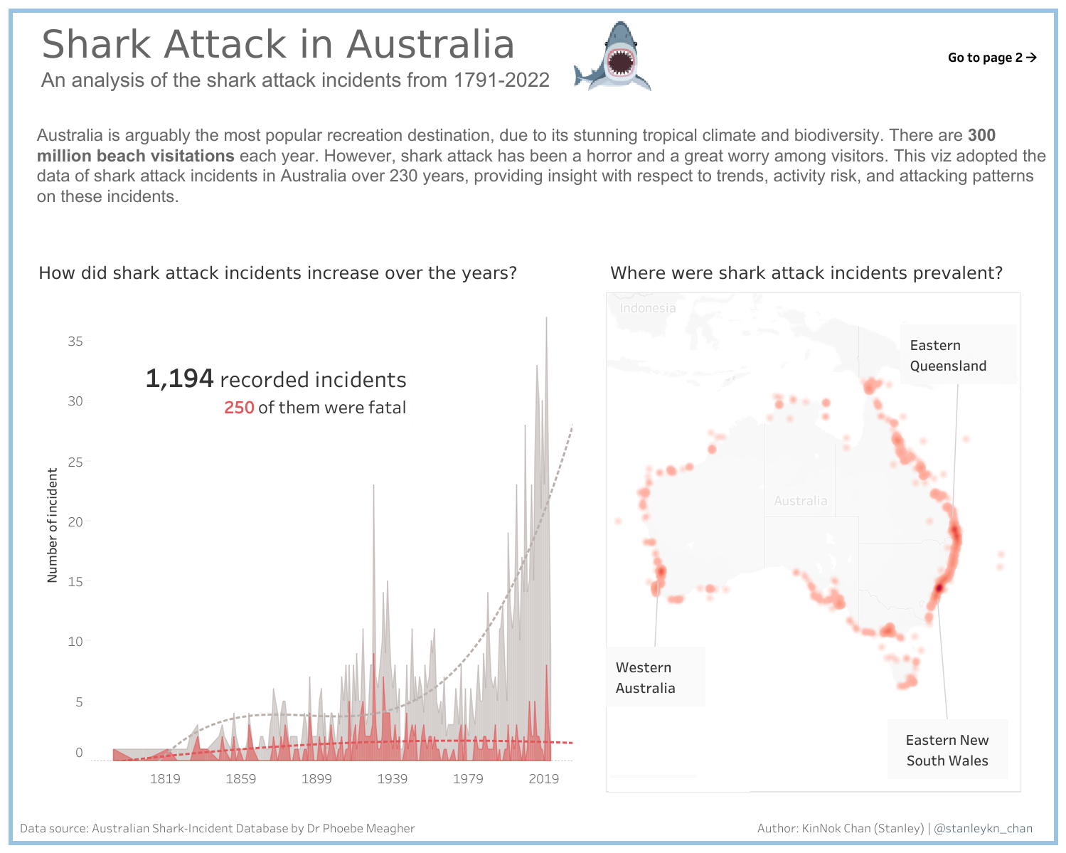
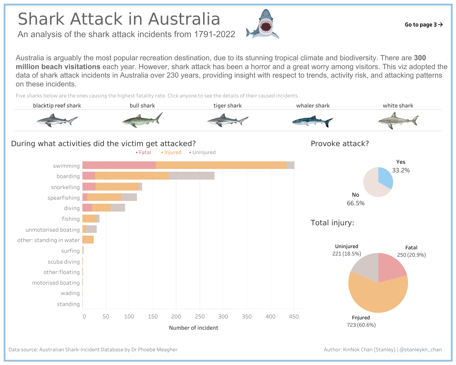
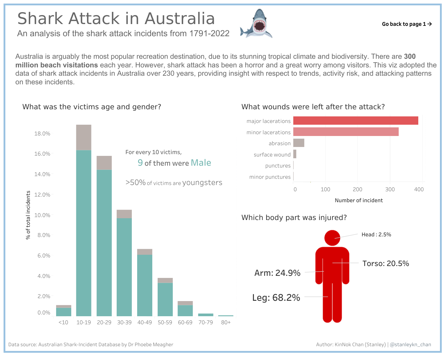
In my original viz, there was so many redundant color and an awkward title. Besides, I didn't really tell a story. I just made the charts using most of the data I can find in the dataset and put everything on the viz. To tweak this, I broke down my redesigned viz into 3 pages with a small and clear layout. Each of them was framed with a light blue tinge with white background, giving people a connection of the sea while not overwhelming the readers.
The first page is about an overview. I added two trendlines so that the readers can observe the trend much easier from the wriggling real data. I also used simple wordings and annotation to highlight the chart rather than putting long and boring description text.

The second page is about the attacking pattern of sharks. One can click the sharks above the chart (they were the top 5 killers) to filter out the overall data into the incidents related to that selected shark. Although the chart is not fancy and complicated, I think they did a good job on presenting those figures.

The third page is about victims' demographics and their injuries. I use a similar approach as the second page did. But I keep the infographic from the original viz. Because it looks good by putting it here as well!

That's my redesigned dashboard. It is an embarrassing experience to see the awful work I did before. But hey, where I failed is where I stand. I did think it improve a lot, don't you think so? Just keep learning! :D
