


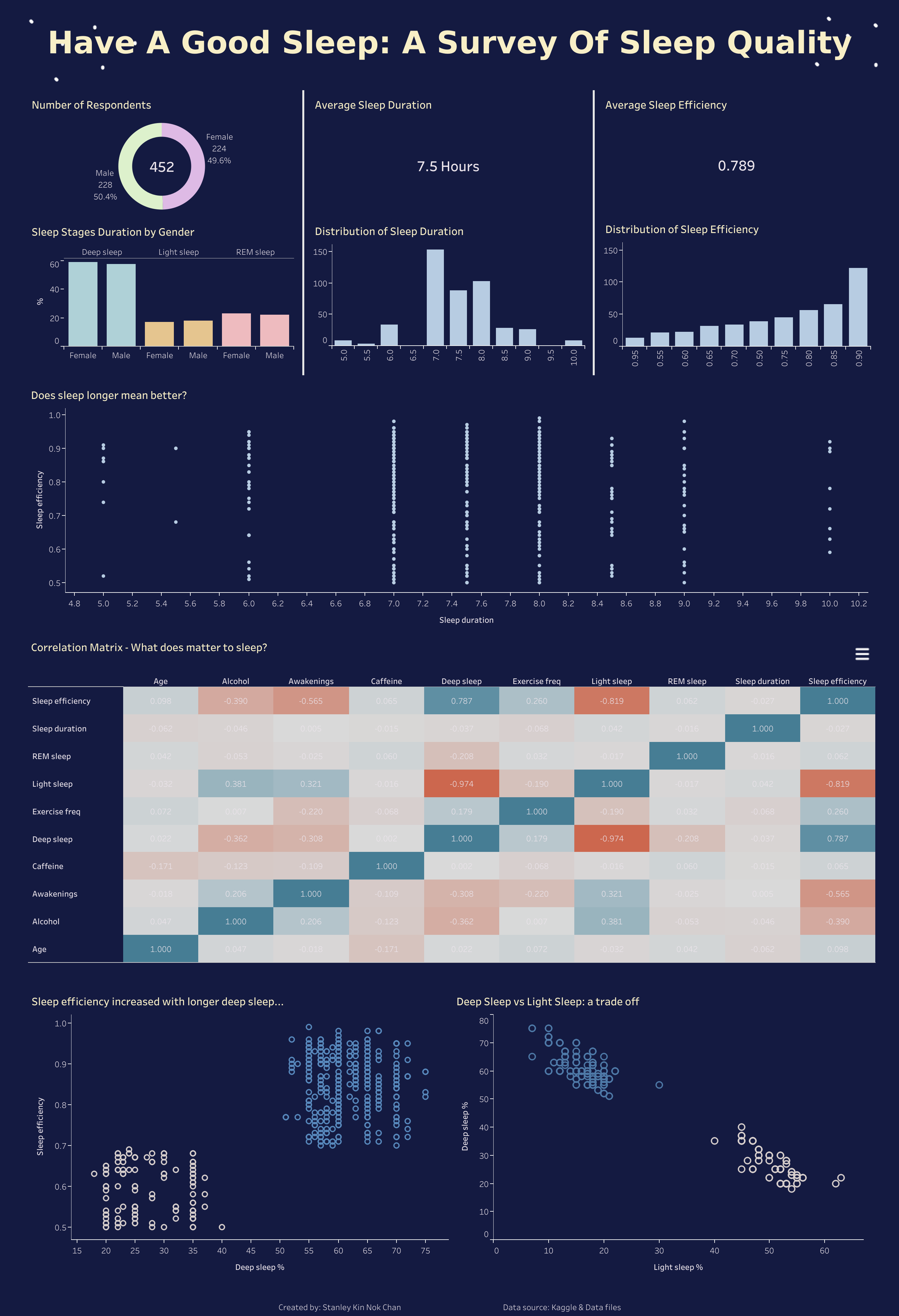
Last day of the dashboard week! I am very happy to announce that I made it! Today task is visualize the data from Sleep Efficiency Dataset (https://www.kaggle.com/datasets/equilibriumm/sleep-efficiency) in 3.5 hours. The time is rush, but I am glad that the dataset itself is clean and we can go straight to visualization part. After doing some exploration of the data, I think of several questions that I want to ask?
- the composition of the respondents
- the distribution and the average of the sleep indicators (eg sleep efficiency and duration)
- what is related to a good sleep?
- The impact of substance consumption on sleep
Because there are quite a lot of numeric fields in the dataset, so I decided to take advantage of the correlation matrix. By doing this I don't need to investigate the pairwise relationship one by one. As a result, my designed dashboard would be quite short and easy to use.
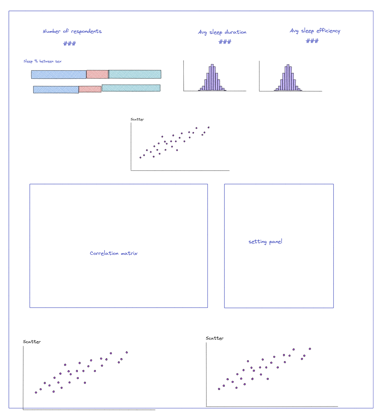
Here is my design:
And this is my output:
I absolutely adore Dashboard Week! Although the week can be intimidating, it offers an excellent opportunity to develop a resilient mindset while honing skills in scoping and project management. As someone who tends to doubt myself, I understand how nerve-wracking the experience can be. However, if I can do it, you can too! Embrace the challenge as a chance to learn and grow. And if you ever need any assistance, don't hesitate to reach out to me – I'm always happy to help!