Today is dashboard week day 4. The data was taken from Season 2's Real World Fake Data (#RWFD; https://exchange.tableau.com/en-gb/products/621). In this dashboard I redesigned the original dashboard from Tableau Accelerators, but still answered their key business questions:
- What CSRs are we managing?
- What type of CSRs are most commonly submitted?
- Which CSRs should we focus on first?
- How many CSRs are opened each hour on average?
- What is the capacity of our departments to answer citizen requests?
- In which neighborhoods should we priorities efforts?
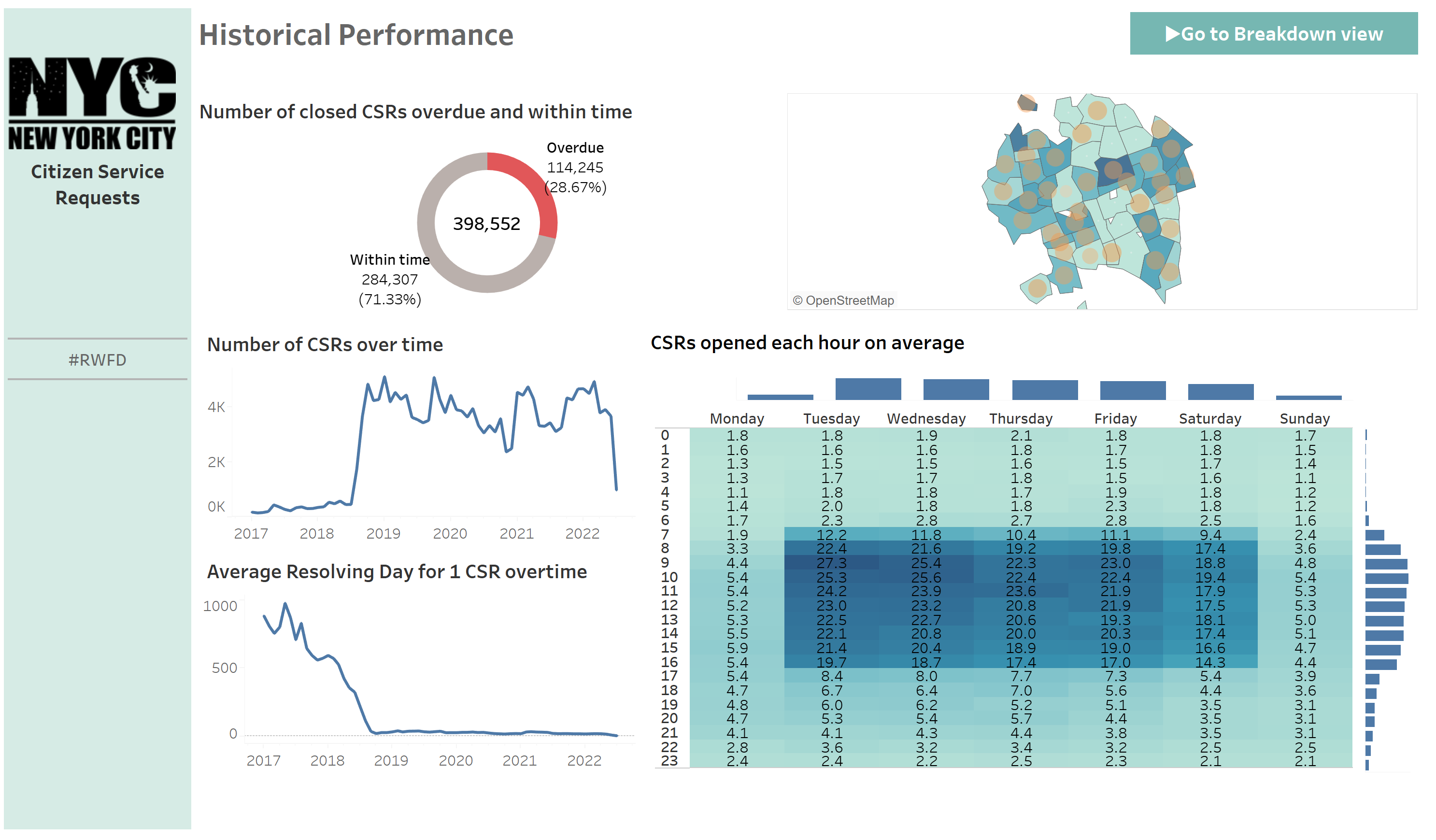
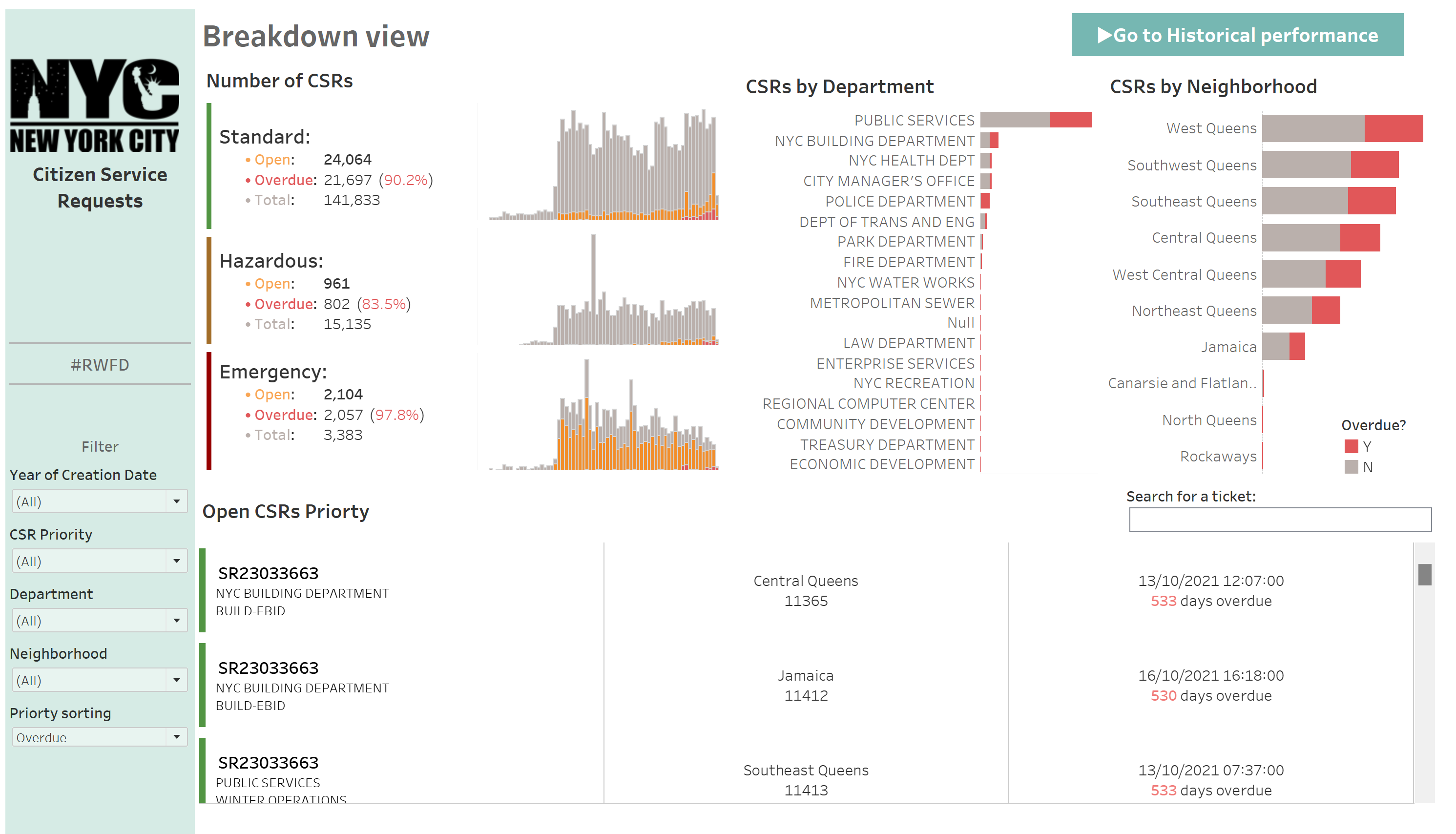
While the original dashboard is decent, it suffers from the drawback of breaking down the view too much, resulting in visual redundancy and usability issues. In my own design, I utilized the dynamic filter filtering the data to the specific department or neighborhood so that we can immediately know the KPIs without struggle to find a small number on a dashboard. I also separated the historical performance for the closed tickets, so that people can know which area they should improve when providing the citizen service.
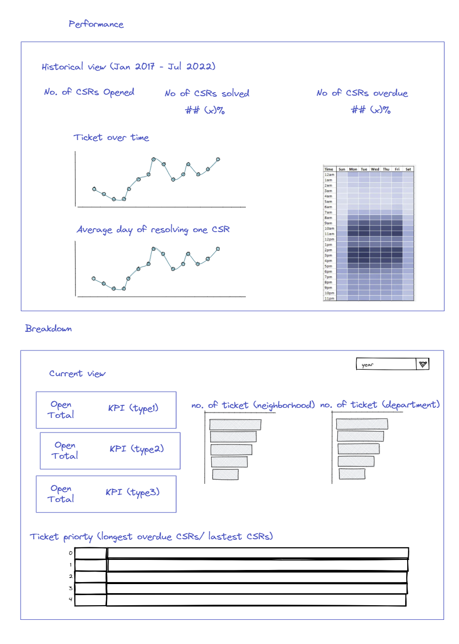
This is my planning.
and this is my dashboard.